A case study on false affordance and the hidden costs of deceptive UI feedback.

Back in September, I was at the airport preparing to fly back after a few days of work deadlines, more travelling and little sleep. Normally, I pride myself in being an organised traveler — I always check in online beforehand and download my boarding pass to my phone wallet so that I have less things to think about while at the airport.
This time, however, I couldn’t find my boarding pass. Naturally, I opened the airline’s app to download it again but realised it wasn’t there either. I scrolled through the app trying to find it but all I saw was a timeline with a series of steps, each of which had a reassuring green checkmark, including ‘check-in’.

Weird, because I still couldn’t find the boarding pass. I kept tapping through every possible menu and spent a good few minutes hunting for it, feeling increasingly frustrated. Eventually, I admitted defeat and walked to the check-in desk, assuming I’d somehow missed the download step.
When I explained the situation, the airline clerk looked up my booking and told me I hadn’t checked in… so I pointed to the app and showed him the green checkmarks in protest. It mustn’t have been the first time this happened because the look he gave me was something in between understanding and pity, and then he told me to ‘read more carefully’.
Only then did I noticed the faint grey text under the checkmark: “Online check-in is not available within three hours prior to the scheduled departure time. Please proceed to the airport check-in desk”.

Turns out that because I was within that three-hour window, online check-in had closed — and on top of that, I now had to pay a €48 late check-in fee.
Technically, the mistake was mine as I should have checked in earlier, and I didn’t. But from a design perspective, this isn’t really a user error, but truly just a poor UX pattern.
The interface communicates that “everything is done” when, in reality, the most critical action — checking in — has failed. The visual language of the app gives a false sense of completion, hiding essential information behind low-contrast text. In that moment, the design not only didn’t protect me from a mistake, but it actually led me into one.
What went wrong in the UX
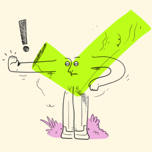
A green checkmark is one of the most universal symbols in user interfaces. It signals completion and success. We’ve all been conditioned through decades of digital (and physical — think of traffic lights) feedback loops, to see green as go.
A checkmark, in particular, implies something is done, verified, safe or confirmed. It’s an unspoken design language, deeply ingrained in our mental models.
In the airline app, instead, the green checkmark simply indicated that the check-in step existed on the timeline. The visual design borrowed a cue that, in almost every other context, represents success — and reassigned it to something ambiguous and deceptive.
This is what makes it a dark pattern in disguise: it exploits a learned expectation by telling the user “everything’s fine” when, in reality, a critical action has failed.
The issue is compounded by hierarchy and contrast as the grey message stating that online check-in had closed was way too easy to miss. From a usability perspective, low contrast can make text less readable and from a psychological one, it signals low importance. Our eyes naturally prioritise bold, high-contrast elements so it visually communicated that it could be ignored.
Moreover, the responsibility to recover from error shouldn’t fall on the user without necessary and helpful guidance, especially when caused by a limitation of the service (like in this case, being able to check-in online only within a specific window of time).

What could seem like a small choice had a cascading cognitive effect especially when put into the real life context where this product is used: in the airport, rushing and overloaded with information, users most likely will rely on pattern recognition, not close reading, by scanning for affordances like colours and symbols.
But perhaps the biggest issue is about the misalignment between system state and user perception. The app knew I hadn’t checked in — it knew that the window for doing so had closed — and yet, it presented the interface as if everything was fine instead of guiding me toward resolution.
Good UX design should always acts as a bridge between system logic and user intention so that during errors it’s able to inform and remove friction, confusion, and ultimately, avoid a penalty.
How This Could Be Designed Better
What makes situations like this so frustrating is that they’re entirely preventable with a few basic human-centred design choices.
The first, and most obvious, is using visual language that reflects the system’s state. A green checkmark shouldn’t appear unless something is actually completed, a more honest interface would show the check-in step as pending or errored, making the blocked state immediately visible without requiring the user to read fine print.

Equally important is the hierarchy of information. In time-sensitive flows like travel, anything that prevents progress needs to be unmistakable. A message that the online check-in window has closed shouldn’t be styled like a secondary footnote. It should take visual priority, acknowledging that users in this context are scanning quickly, juggling attention and under stress.

Another simple improvement would be proactive communication. I actually didn’t receive any notifications prior the closing time of the online check-in. The system knows when check-in closes and it certainly knows when a user hasn’t completed it yet, so it would be a given for the the app to notify the user before the cutoff. Time-based tasks are fundamentally different from static ones, and they demand a different level of visibility.
One important role for design is to be the bridge between system logic and human intention, and this interface is an example of how easy it is to make that bridge collapse. But it’s also a reminder that users don’t fail alone — they fail with the systems that are supposed to support them, so one of our goals is to always design with context and cognitive reality in mind to protect people in the moments when they’re most overloaded and least able to slow down.
When the dark pattern is a glaring green checkmark was originally published in UX Collective on Medium, where people are continuing the conversation by highlighting and responding to this story.