
Understanding unintended consequences in design and how to plan for them.

Co-written by Martin Tomitsch and Steve Baty
Each minute, millions of teens scroll through videos on social media platforms. These platforms are designed to connect people, but their overuse among young users is leading to serious, unintended consequences.
The impact of social media on teen mental health has received significant media attention. After Facebook became available to American college students, their rates of depression rose by 7% and anxiety by 20%. In Australia, 44% of teens report negative online experiences, including being excluded from events or social groups.
But the effects of endless scrolling go beyond mental health. Consuming video content on social media also takes a toll on the environment. Watching TikTok for just one minute generates 2.63 grams of CO₂ equivalent emissions.
With one billion users spending an average of 46 minutes per day on TikTok, this adds up to 14.7 million tonnes of CO₂ emissions annually—equivalent to flying the entire population of London to New York.
The law of unintended consequences
As designers, we constantly make decisions. Whether we design objects, devices, websites, apps, or policies, we choose one option over another, setting parameters for subsequent actions to unfold.
Designing an object like a chair involves decisions about what materials to use, how the product will be manufactured and transported, how to address cost considerations, its use function, and what happens at the end of its life span.
Designing a website includes making decisions that shape how people will use the site and putting the elements in place that influence how much time users spend clicking and scrolling their way through the site.
The law of unintended consequences observes that every decision made can have both positive and negative outcomes that were not foreseen by the person making the decision.
As Jony Ive put it in a recent interview:
‘I think when you’re innovating, of course, there will be unintended consequences. You hope that the majority will be pleasant surprises. Certain products that I’ve been very, very involved with, I think there were some unintended consequences that were far from pleasant.’
Visualising unintended consequences with systems maps
To identify unintended consequences requires us to understand the underlying elements of a product, service, or initiative and how these elements influence each other.
These so-called ‘feedback loops’ create ripples that carry across to the very edges of a system. Systems maps help us visualise the systems behind our designs.
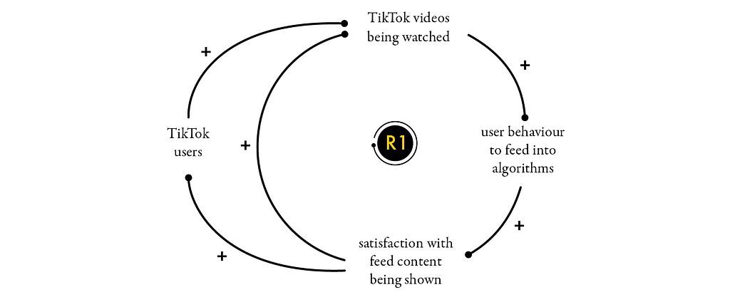
TikTok uses a reinforcing feedback loop to increase user engagement. Based on the user’s interactions, like swiping and watching video content, TikTok’s algorithms build a model of the kind of content a user likes.
Every additional data point (such as likes and comments) is absorbed by the model to generate more relevant content feeds. As the model becomes more and more attuned to the interests of individual users, they will respond by staying longer on the site watching more content.
But TikTok’s systems map also includes the infrastructure on which the company’s servers operate — in charge of processing data points, generating models, and selecting video content that is sent to the user’s device. Data centres use as much energy as France, and AI systems are predicated to account for half of total data centre consumption by the end of the year.
A ripple effect of TikTok’s recommendation algorithm is the increased need for more data centres and the greater use of energy to power TikTok’s servers. This increases pressure on the electricity grid and ultimately more raw materials need to be mined to keep up with the demand created by the feedback loop.

Another effect that can be observed through extending TikTok’s systems map is that watching videos reduces time available for socialising and studying. This in turn has a damaging effect on the user’s mental health, academic performance, and quality of life and opportunities.

These are unintended but not necessarily unpredictable consequences. So why aren’t social media companies addressing them from the start? Because their business models offer little incentive to look beyond the immediate feedback loop (R1).
This is where government and regulation come into play—applying pressure on private firms to ensure that products and services do not harm communities, societies, or the systems that sustain human well-being.
Companies that ignore the broader impacts of their design decisions—failing to recognise the systems and feedback loops at play—often face serious consequences. Take Juul, for example: the company paid a $439 million fine for marketing vaping products to teens.
Mapping the impact ripples
The best way to start planning for unintended consequences is by creating a systems map. Once we have captured the elements within a system and how they influence each other, we can turn to tools like the impact ripple canvas to identify intended and unintended consequences.
By placing them on a canvas, consequences become a tangible possibility, and we are able to start thinking about ways to address them. As a tool, the impact ripple canvas helps us to visualise and think about the impacts of our decisions in a multi-level and networked way.

In systems thinking, the indirect (second order) impacts are often delayed consequences of an action or decision. For example, a decision to cut costs in one area of a business may lead to increased costs in another area due to the need to hire additional staff or invest in new technology.
Big picture (third order) effects refer to the additional consequences caused by the second order effects. For example, the decision to cut costs may negatively affect customer satisfaction, resulting in a decline of sales and profits.
Revealing the invisible elements
In organisations, unintended consequences are difficult to identify and consider because they are largely invisible (until their second and third order effects start to show). We can use iceberg visuals to map out the visible and hidden components of a system.
Organisations typically focus on what’s visible, as these components can be controlled and measured. This includes aspects like technology, processes, and policies. Unintended consequences typically emerge from those components that are invisible, such as the culture, values, and beliefs of people or organisations.

The value of the iceberg visual is to highlight the hidden components that are responsible for unintended consequences. When Uber launched in South America, it failed to consider the societal issues that cities like São Paulo faced.
The company only realised they needed to improve their safety mechanisms when the consequence of this oversight — the murder of an Uber driver — was reported in the news. In fact, armed robberies were an unintended consequence of Uber’s attempt to turbo-charge growth in a crucial new market by allowing customers to pay in cash for their rides.
The Uber example is a stark reminder of the law of unintended consequences. Small changes in one part of the system can have big, unexpected impacts elsewhere in the wider system and adjacent systems.
Small changes, big impact—the UX butterfly effect
Chaos theory describes the observation that even tiny perturbations like the flutter of a butterfly can lead to dramatic, non-linear effects elsewhere over time. Seemingly small changes or decisions that we make as designers can have significant and often unforeseen consequences.
As designers, we can’t directly control the chain of reactions that will follow an action. Reactions are difficult to predict, as they occur depending on factors beyond our direct control.
But by using tools like systems maps, the impact ripple canvas, and iceberg visuals, we can take potential reactions out of the unpredictable pile and shift them into the foreseeable pile.
A systems map helps us to quickly situate our organisation and its offering within a broader societal and systemic context. It helps us to see the relationship between what we do, the choices that we make, and the impacts those have.
Just as critically, is the conversation that needs to take place in order to create a systems map, impact ripple canvas, or iceberg visual, which requires making explicit relationships and impacts, defining boundaries between what’s ‘in’ and what’s ‘outside’ of our control, and justifying those distinctions.
For organisations looking to innovate in terms of their business model, service delivery, or even purpose, a systems map provides important context.
Additionally, a systems map can help demonstrate second and third order impacts — direct and indirect effects — that can help us and our organisation better understand our role in society.
Generative AI disclaimer: No AI tools were used in the writing of this article and the authors take full responsibility for the accuracy of the content. AI use was limited to generating the alt text for the illustrations and diagrams and brainstorming title and subtitle options.
Acknowledgement: This article is adapted from chapter 5 of our book Designing Tomorrow, which introduces strategic design tactics for changing the planetary impact of design practice and organisations.
The UX butterfly effect was originally published in UX Collective on Medium, where people are continuing the conversation by highlighting and responding to this story.