
Trust in financial products isn’t built by branding. It’s won or lost in micro-moments most teams never design on purpose.
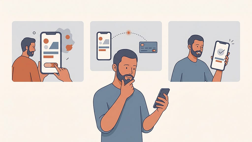
I’ve spent thirteen years designing financial and technical products. Six at PayPal, and almost five leading design at Highnote, a card issuing and embedded finance platform. And the honest answer, after all that time, is something slightly uncomfortable:
The things we present in portfolio reviews are almost never the things that determine whether users trust a product.
The brand system matters. The onboarding flow matters. But trust, the actual behavioral kind, the kind that shows up in retention numbers and support ticket volume, gets decided in a handful of small moments that most teams treat as engineering details rather than design problems. A loading state. A confirmation screen. The half-second between pressing “send” and knowing what happened to your money.
None of this is a new observation, exactly. Jakob Nielsen put “visibility of system status” at the top of his ten usability heuristics back in 1994, and “error prevention” sits at number five. What I want to argue is that in payments, these two old heuristics stop being items on a checklist and become the entire emotional architecture of the product. And that most teams, including mine at various points, systematically underinvest in them because they’re small, unglamorous, and owned by nobody.
I want to walk through three of those moments from products I’ve worked on. I’ll also be honest about what we didn’t resolve, because some of these tensions don’t have clean answers.
Moment 1: When money moves too fast to feel safe
When we built instant payments at Highnote (near real-time payouts from issued cards to external debit cards, the rails that power things like gig worker payouts and instant refunds) we ran into a debate that anyone designing for money movement will recognize.
The entire value proposition was speed. Funds arriving in seconds instead of days. So naturally, the early conversations all pushed one direction: make it feel fast, strip out any friction. Which sounds right. It’s what every growth playbook says.
But I’d seen where that road goes. Years earlier at PayPal, I worked on a fast checkout experience with almost no friction at all. And users hated it, in a way that surprised everyone. They didn’t feel comfortable that they never got a chance to review what was happening. Some were genuinely startled to discover the transaction had already gone through. We’d optimized away the exact moment where confidence gets built.
The industry has known about this effect for years, even if most teams forget it when their own deadline arrives. It’s why the Domino’s Pizza Tracker became one of the most beloved interfaces of the 2010s despite tracking something you cannot influence at all. It’s why TurboTax famously shows you a “checking every deduction” progress sequence that takes longer than the actual computation, a deliberate slowdown that increased user confidence in the results. A pair of Harvard researchers eventually gave the effect a name, the “labor illusion”: we trust services more when we can see the work being done, even when seeing it costs us time. (Ryan Buell’s broader writing on operational transparency is worth any product designer’s afternoon.) The mechanism transfers directly to money movement. Speed, presented raw, doesn’t read as impressive. It reads as alarming. Did that actually work, or did something just swallow my money?
There’s also a useful threshold framing from Nielsen’s classic work on response times: under about 0.1 seconds feels instantaneous, under 1 second keeps flow, beyond 10 seconds loses attention. Payments break this model in a strange way. For practically every other interaction in software, instantaneous is the goal; whole engineering careers are spent shaving milliseconds. The payment is the rare interaction where landing inside the instantaneous threshold can be a design failure. The result every other product aspires to is precisely the result users distrust when money is involved.
So at Highnote, I pushed for a little friction on purpose. We made three design decisions, and each one is a small case study in trust mechanics:
We made the speed legible before the action, not after. A lightning bolt icon and explicit copy (“funds in seconds”) set the expectation up front. This sounds trivial. It isn’t. When users know in advance that something will be fast, fast feels like the product working. When they don’t, fast feels like something skipped a step.

We added deliberate friction at the moment of commitment. A confirmation step before the transfer fires, and a slide-to-confirm interaction on the button itself rather than a tap. The gesture has a lineage worth honoring: it descends from the iPhone’s original slide-to-unlock, which existed for exactly the same reason, preventing an action too consequential to trigger by accident. The argument you’ll hear is that friction is the enemy. The honest answer is that unchosen friction is the enemy. Friction the user performs deliberately, at exactly the moment their money is about to move irreversibly, isn’t a cost. It’s the user physically enacting their own intent. It converts anxiety into agency.
It’s worth being precise here, because “friction” has become a loaded word, and for good reason. Everyone has lived the hostile version: the subscription you can only cancel by phone, the account deletion buried four menus deep behind guilt-trip copy. These are the deceptive patterns Harry Brignull has spent fifteen years documenting: friction deployed against the user’s intent, and it deserves every bit of the bad reputation. What I’m describing is the opposite: friction in service of the user’s intent, at the single moment where their intent deserves a second confirmation. Same material, opposite ethics. Collapsing the two is how the “all friction is bad” orthodoxy took hold.

We kept a processing state even when we barely needed one. The transfer is near-instant. We showed motion anyway: a brief processing visual communicating that money was moving. Not a fake delay, just an honest visualization of a real (if brief) process. This is the labor illusion applied deliberately. Users don’t experience an instantaneous state change as a transaction. They experience it as a glitch. Showing money in motion is what makes the result believable.

Now, the part I can’t tie up neatly. Did the added friction cost us anything in conversion? I’d love to tell you it was free. The honest answer is that it’s genuinely hard to isolate: the confirmation pattern shipped alongside other changes, and the businesses using our rails each had their own funnels on top. What I can say is that the fear that drove the original “no friction” argument, meaningful drop-off at the confirmation step, didn’t materialize in anything we could detect. But I hold that conclusion loosely, and if your data shows deliberate friction hurting completion in your product, you should trust your data over my anecdote.
At the end of the day, the thread connecting all three decisions is this: in payments, perceived control and perceived speed are not the same axis. Trust lives on the first one.
Moment 2: The configuration screen where someone can ruin their quarter
Consumer fintech gets all the attention in design writing, but some of the highest-stakes trust moments I’ve designed were in B2B tools. Specifically, the operator-facing surfaces where businesses configure their own credit programs.
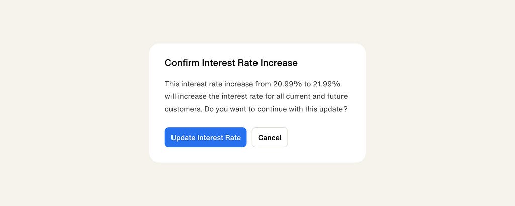
When we launched Highnote’s credit products, the people using our dashboards weren’t making a $40 payment. They were setting interest rates and defining spend rules, decisions that would apply to thousands of their own end users. A mistyped value here isn’t an inconvenience. It’s a compliance incident, a P&L problem, a board conversation.
I know this because we watched it happen. Early on, a user accidentally updated the interest rate on their entire card product. We also had a handful of incidents where operators set up their own spend rules and ended up blocking perfectly legitimate transactions, which their customers experienced as the product simply failing. Nobody did anything wrong, exactly. The interface just treated a catastrophic change and a cosmetic one with the same level of ceremony.
So we redesigned the configuration experience around a principle I’d describe as graduated ceremony: the weight of the confirmation should match the blast radius of the decision. Routine changes flowed freely. But the big, hard-to-reverse decisions, like interest rate adjustments and spend rule changes, got layered confirmations and checks, deliberately interrupting the operator’s flow at exactly the moments where flow is dangerous.
I won’t pretend this idea is novel. Anyone who has worked in software has watched a user click through a warning dialog on pure autopilot, and most of us have been that user. Nielsen Norman Group has documented this failure mode thoroughly: confirmations that appear too often stop being read at all; muscle memory carries you through the warning exactly as automatically as it would through nothing. That failure mode is precisely why graduated matters more than ceremony. If every action gets a confirmation, no action effectively has one. The design work isn’t adding checks; it’s rationing them ruthlessly so the rare heavy ceremony retains its meaning. The best-known example of getting this right isn’t from fintech at all: GitHub lets you do almost everything with a click, but deleting a repository requires typing its full name into a field. Developers mock that pattern affectionately and have copied it everywhere, which is exactly what a trust pattern earning its keep looks like.
And here’s the tension we never fully resolved: habituation doesn’t care about your rationing in the long run. An operator who adjusts spend rules weekly will eventually glide through even a well-designed heavy confirmation. Type-to-confirm patterns like GitHub’s resist muscle memory better than buttons, but it’s an arms race against human adaptation, and human adaptation is undefeated. If someone has genuinely solved long-term habituation in high-frequency professional tools, I’d love to read it, because we managed it rather than solved it.
There’s a second trust lesson in that credit work, and it’s about meeting users where they actually are rather than where the happy path assumes they are. Not every business, and not every end user, qualifies for the same product. Rather than designing a single credit product with a binary yes/no gate, we built a range: secured and unsecured options serving different risk profiles. From a pure conversion standpoint, this worked. More prospects found a product they could actually launch with. But the deeper effect was on trust. A “no” converted into a “here’s what you can do” fundamentally changes the user’s relationship with the platform. Rejection states are product design’s most neglected surface, and they’re where the most loyalty quietly gets won and lost.
Moment 3: when the product is an abstraction, show the use, not the features
Virtual cards posed the opposite problem to instant payments. The challenge wasn’t reassuring users about something fast. It was helping them believe in something invisible.
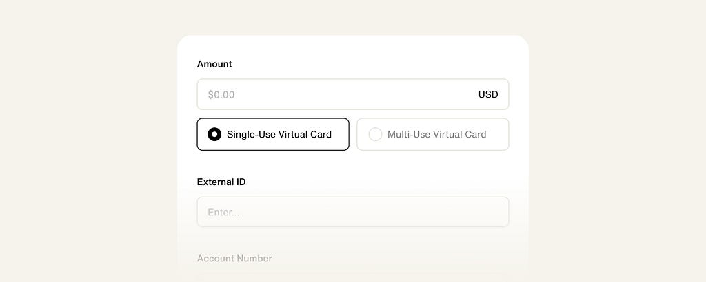
When we built Virtual Card Express, the research kept surfacing the same blocker: prospects couldn’t visualize how they’d actually use virtual cards. The capability was abstract. Card issuance, in most people’s mental model, means plastic, contracts, and quarters of integration work. A virtual card program you could stand up quickly didn’t fit any existing schema, so for a lot of prospects it didn’t feel real.
Our answer was radical narrowing. Instead of presenting virtual cards as a flexible platform capability (which is what they technically are) we designed the entire flow around one concrete job: invoices and bill pay. Nothing else. Every element that wasn’t in service of that single use case came out.
Readers who live in product circles will recognize the shape of this: it’s jobs-to-be-done thinking, the framework Intercom’s team did more than anyone to drag out of business school and into everyday product work. People don’t buy products, they hire them for a job. What surprised me wasn’t that the framing worked. It was where it worked: not in the marketing, but in the interface itself. The narrowing wasn’t a positioning exercise. It was the product design. The interface arguing for one job was what made the abstract capability believable.
I should argue the objection, because it’s a real one. Narrowing has costs. Prospects with a different job to hire for (corporate travel cards, say) saw a product that apparently wasn’t for them, and a platform company narrowing its own platform makes sales teams nervous for understandable reasons. The bet was that a concrete product converting well beats a comprehensive product converting poorly, and for us the bet paid: launching a virtual card product went from several months to a few weeks, and adoption followed. But it was a bet, not a law. If your market is a small number of sophisticated buyers who want the full capability map, the same move could backfire. Context decides.
This violates an instinct most product teams have, which is to show off the full power of the platform. But abstraction is the enemy of trust in exactly the same way invisibility is. A focused product that a prospect can immediately see themselves using beats a powerful product they have to imagine using, almost every time. Specificity isn’t a limitation of scope. It’s a trust device.
The pattern, and why it’s organizationally hard
Three different products. Three different trust problems: speed without reassurance, consequence without ceremony, capability without concreteness. One pattern underneath:
Trust in financial products is established at the moments of maximum user uncertainty, and those moments are almost never owned by anyone.
The confirmation step lives at the seam between design and engineering. The decline-and-redirect experience lives at the seam between design and risk. The processing state is usually whatever the front-end framework does by default. These moments fall through organizational cracks precisely because they’re small, and they’re where the entire emotional outcome of the product gets decided.
If you lead design in fintech, my suggestion is blunt: inventory your product’s moments of uncertainty the way you’d inventory your design system components. Every loading state, every confirmation, every decline, every irreversible action. Assign explicit ownership. Measure them (support contact rates, abandonment at confirmation, disputes driven by confusion) with the same seriousness you measure activation funnels.
The question I can’t answer yet
I’ll end with the thing that’s currently keeping this topic alive in my head, because I’ve changed jobs and the ground has shifted under everything I just wrote.
I now lead design at Deck, working on infrastructure for computer-use agents: AI that logs in, navigates, and completes workflows through interfaces designed for humans. Which means a growing share of the “users” encountering payment flows like the ones above won’t be people. They’ll be agents acting on a person’s behalf.
And I genuinely don’t know what happens to trust design then. Every pattern in this essay was built for a human’s anxiety. The slide-to-confirm exists to let a person physically enact intent. The processing state exists because a human needs to see money in motion to believe it moved. An agent needs none of that. So: does the ceremony move upstream, to the moment a human delegates authority to the agent? Does friction become something we design into the agent’s protocol rather than the interface? When an agent slides the confirm button on your behalf, who exactly is being reassured?
The honest answer is that nobody knows yet, including the people building it. What I do know is that the underlying principle survives the shift: somewhere in every financial interaction there is a moment of maximum uncertainty, and someone has to design for it on purpose. The moment is about to move. The work is figuring out where it lands.
If you’re designing for this already, I’d genuinely like to compare notes.
The hidden UX of payments was originally published in UX Collective on Medium, where people are continuing the conversation by highlighting and responding to this story.