
Perfection used to prove a person had tried. Now a machine conjures it in seconds, for nothing. So what is polish actually worth?
Volunteers in a 1960s psychology study were played a tape of a man auditioning for a quiz team. He was dazzling, reeling off answer after answer, until near the end he clumsily knocked a cup of coffee over himself. Oddly, the people who heard the spill warmed to him more than those who heard a clean run. The blunder, not the brilliance, was what tipped him over into likable. Psychologists call it the pratfall effect, and it is bad news for anyone paid to make things look perfect.
The design industry, after all, is sanding every last coffee-spill out of its work, and doing it with real discipline.
Spend an afternoon scrolling through its recent output. Everything is good. The corners curve to the same friendly radius, the gradients melt without a seam, the copy reads like the copy on every other site. It is all competent and tidy and precisely where it should be. The longer you look, the harder it gets to remember any of it.

This sameness is a survival strategy. Teams are leaner than they were, deadlines arrive sooner, and the same stretch of hours now has to cover work once shared between several people. Under that kind of strain, a visible mistake feels like a luxury few can afford. No designer wants to be the one whose wonky kerning slipped through to the client, so it gets smoothed away fast, and the version that ships is the one least likely to land anyone in trouble. Defensible beats interesting when your job might be next.
And flawless is wonderfully defensible. Nobody ever got fired for a tidy grid. It gives a jittery team something solid to stand behind when the money is short and the feedback is brutal. You can see exactly why a trade under pressure reaches for it. The instinct is sound. The timing is a calamity.
Why flawless stopped being impressive
For most of this trade’s history, polish was proof that someone had bothered. A crisp line meant a steady hand and a great deal of practice. A seamless layout meant somebody had wrestled with it well past midnight. The smoothness was a receipt, and we stopped noticing we were even reading it.
That receipt is now worthless. A generative model will turn out the same line and composition, along with dutifully on-brief text, in the time it takes to type the request, and charge a pittance for the favour. The craft is still there. It has just gone invisible, because the finished thing looks identical whether it cost a fortnight or four seconds.
An irony is folded into that speed. The model can summon that perfection only because it learned from millions of human-made pieces, each one the product of the very effort it now appears to skip. Its flawlessness is borrowed, congealed from human labour that no longer shows up anywhere on the page.
So here is the design industry, sprinting flat out toward the one quality it can no longer be paid for. The faster it runs, the more its work comes to resemble the free, instant, machine-made version it is trying to rise above. Perfection used to mark out a human who cared. Now it is the shortest path to being mistaken for a machine that didn’t.
Which leaves an awkward question hanging. If a perfect finish no longer proves anything, what does? Inconveniently for everyone, the answer is the very thing the field has spent the past few years teaching itself to delete.

The competence catch
That coffee-spill experiment dates to 1966, and its finding was not simply that mistakes are charming. It came with a sharp condition attached.
When the clumsy candidate was someone who had just answered most of the questions correctly, the spill made him more appealing. When the same coffee went flying from a candidate who had fumbled the quiz, it cost him. The blunder only flattered the people who were already good. On everyone else, it just confirmed the doubt.
That condition is the part most people skip, and it is why “embrace imperfection” is such treacherous advice on its own. A rough edge on confident, accomplished work reads as character. The same rough edge on a weak piece reads as exactly what it is. Imperfection is not a substitute for skill. You earn the right to show it.
What we were paying for all along
The pratfall explains why a flaw can flatter. It does not explain why we are so drawn to human creations in the first place. For that, look at what happens when people make something themselves.
Back in 2012, three behavioural researchers had volunteers assemble plain IKEA storage boxes, fold origami and build Lego, then asked what the results were worth. The builders consistently valued their own slightly shonky attempts far above what anyone else would pay, and assumed strangers would see the genius too. The team behind the study named it the IKEA effect and found it held only when the task was finished. Abandon the flat-pack halfway, and the warm glow disappears.
The effort, then, was never incidental to how we valued the object. It was woven into it. A related strand of work makes the point even more plainly. Marketing scholars found in 2015 that simply describing a product as handmade led people to rate it more attractive and pay more for it, a pull they traced to a sense that such items “contain love” from their makers. The same mug is worth more once a person has shaped it.
Notice what these studies are not about. None of them concern how the finished thing looks; they get at what we believe went into it. We were never only buying the line or the layout. We were buying the hours, the judgment, the proof that another person had spent a part of themselves on our behalf. Automation is superb at the line and the layout. It spends none of itself.
Telling people a machine made it
If the human trace is what we are paying for, then being told a machine made something should change its value, even when the object itself is identical. It does, and the size of the effect is hard to ignore.
The clearest evidence sits in a 2023 study from Columbia Business School, spanning six experiments and nearly three thousand people. They showed participants pieces of art, labelling some as human-made and some as AI-made, and often swapped the labels around on identical images so that any difference in response could only come from the tag.
It did a remarkable amount of work. Anything attributed to AI was judged less skilful, less valuable and less deserving of the word “art”, even though more than seven in ten participants admitted they could not tell the human and machine images apart. In one experiment, the AI label alone knocked an estimated 62% off a painting’s value and 77% off how long people guessed it had taken to make. Nothing had changed but the story of who made it.
There is a twist that should interest anyone earning a living alongside a model. Placing a human-made piece directly beside an AI counterpart made it look more creative than the same piece did among its own kind. Contrast with the machine flattered the maker. The researchers suggest artists might do well to invite that comparison rather than dread it.
You can watch this happen to a brand in real time. In late 2024, Coca-Cola remade its much-loved 1995 “Holidays Are Coming” advert largely with generative AI. The result was technically slick yet emotionally hollow, and audiences said so at volume, calling it “soulless” and noting the irony of a “Real Magic” tagline on a film barely any human had touched. Coca-Cola defended the experiment and ran another AI version the next year, to much the same reception. The timing is the point: at the exact moment a campaign is meant to feel warm, the machine-made polish read as the opposite.
The reaction was widely shared. In the same year, a Getty Images survey found that around nine in ten people wanted AI-generated imagery disclosed, and reported thinking less of brands that used algorithms to create images of people or products. “Made by a human” is quietly turning into a selling point. What backs up that label is the evidence a person was here at all: the wobble, the texture, the choice a machine would have averaged into mush.
The mistake that stuck
Sometimes the flaw does more than signal humanity. Every so often it is the better product outright, and design history is full of examples.
In 1968 Spencer Silver, a chemist at 3M, set out to invent a much stronger adhesive. He produced the opposite: a weak, low-tack glue that clung lightly and peeled away without a trace. By the terms of his own brief, it was a dud. He spent years touting it around the company regardless, finding no takers, because nobody could work out what such a feeble glue was for.
The answer arrived in 1974, when his colleague Art Fry grew tired of the paper bookmarks that kept sliding out of his church hymnal. Silver’s useless glue happened to be ideal for a bookmark you could lift and reposition without tearing the page. The Post-it note, now stuck to a few billion surfaces, is a flaw that found its purpose the moment somebody stopped treating it as a defect.
It would be glib to file this under “mistakes are good”, because most lead nowhere, and the rest merely pave the way for what does. Silver’s glue mattered because Fry was paying close attention to spot a use everyone else had missed. That is the harder lesson hiding inside the happy accident. Surprises only pay off in a process with enough slack to notice them, and enough nerve to keep the strange result rather than bin it for missing the spec.
Putting the flaws back in
Slack and nerve are exactly what is in short supply right now. The reflex, when the pressure is on, is to polish everything until it gleams. That made sense when a flawless finish was scarce and costly. The logic barely holds now that it is available to anyone with a subscription and a spare afternoon.
The more useful instinct is the opposite. Leave the fingerprints in. Keep the asymmetry a grid would have straightened, the word slightly too human to be predicted, the texture that survived because someone decided it should. Let the work show that a person was behind it, small, deliberate irregularities and all.
Two warnings keep this honest, both from the research. One concerns competence: a pratfall only rewards what is already good, so this is no licence for sloppiness dressed up as style. The other concerns attention: a happy accident counts for nothing until someone is alert enough to keep it, which takes a process with room to spot a useful slip before it gets tidied away. None of which is an argument against skill. Polish is still hard won, and still worth wanting. What it no longer does is convince anyone to pay a premium.
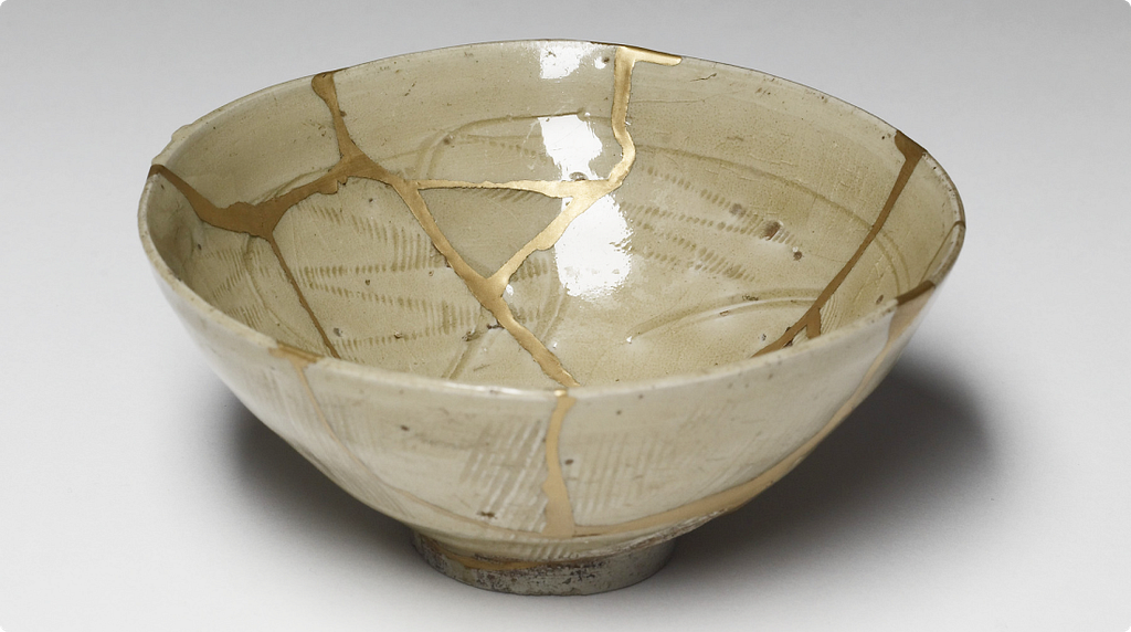
For years, a flaw was something to fix and forget. It may now be the most valuable thing you can leave in. The feature, all along, was the flaw.
If you enjoyed this, follow me on Medium for more on design, psychology and technology.
References & Credits
Aronson, E., Willerman, B., & Floyd, J. (1966). The effect of a pratfall on increasing interpersonal attractiveness. Psychonomic Science, 4(6), 227–228. https://doi.org/10.3758/BF03342263
Fuchs, C., Schreier, M., & van Osselaer, S. M. J. (2015). The handmade effect: What’s love got to do with it? Journal of Marketing, 79(2), 98–110. https://doi.org/10.1509/jm.14.0018
Getty Images (2024). Building Trust in the Age of AI. https://newsroom.gettyimages.com/en/getty-images/nearly-90-of-consumers-want-transparency-on-ai-images-finds-getty-images-report
Horton, C. B., White, M. W., & Iyengar, S. S. (2023). Bias against AI art can enhance perceptions of human creativity. Scientific Reports, 13, 19001. https://www.nature.com/articles/s41598-023-45202-3
NBC News (2024). Coca-Cola causes controversy with AI-generated ad. https://www.nbcnews.com/tech/innovation/coca-cola-causes-controversy-ai-made-ad-rcna180665
Norton, M. I., Mochon, D., & Ariely, D. (2012). The IKEA effect: When labor leads to love. Journal of Consumer Psychology, 22(3), 453–460. https://doi.org/10.1016/j.jcps.2011.08.002
University of Colorado Boulder (2013). Origins: Post-it Note Adhesive. Coloradan. https://www.colorado.edu/coloradan/2013/12/01/origins-post-it-note-adhesive
The flaw is the feature was originally published in UX Collective on Medium, where people are continuing the conversation by highlighting and responding to this story.