Designing a book cover isn’t about aesthetics. It’s about anticipating the reader’s behavior throughout the entire lifecycle of the book.

Writing this piece is quite a challenge because, on the one hand, I want to explain my approach to design, and on the other — I really don’t want to ruin the experience of reading the books I mention by giving too much of them away. Wish me luck and let’s get into it.
Or actually — no. Let’s not rush. Stop. Brake. Let’s think for a second about what a book cover even is, because it’s quite an interesting thing.
We can think of it as packaging for content. After all, the content is the essence of the book, and the cover somehow holds and protects it: both literally and metaphorically making sure it doesn’t fall apart. And if we follow this “packaging” thread a little further, it quickly turns out to be a very strange kind of packaging. Unlike a cream label or a tea box, we experience the cover throughout the entire process of engaging with the content. When we have cream on our face during the day, we generally don’t care about the packaging anymore (unless it doubles as bathroom decor). Same with tea — we drink it while the box politely waits in the kitchen for its next turn.
We can also think of a cover as a representation of a product focused on creating the desire to own or experience it — in other words, a form of advertisement. And here, the analogy of a movie poster immediately comes to mind. But again, we quickly hit a dead end. A poster works most powerfully before the experience itself, and its role usually ends before we engage with the content (I say “usually” because there are exceptions — like the Polish School of Posters, where artists often designed visual riddles whose meaning only revealed itself after watching the film).
So a book cover is partly protective packaging, partly a representation of the content, partly an advertisement — but it doesn’t disappear after purchase, and it isn’t consumed only once. And that’s fantastic, because it has the potential to change meaning (seriously, it’s a little bit magical) together with the reader’s growing understanding. That’s exactly what makes it such an interesting problem from the perspective of user experience design. If we take these moments into account and learn how to play with them, it turns out that aesthetics in the sense of “prettiness” — or its deliberate absence — is merely a tool for building a complete experience, not the goal itself. Because the cover here is not an object to be looked at, but a relationship the reader enters into for a long time.
And here, let’s take a short break for an outrageously good example.
In 2015, Marcin Wicha published How I Stopped Loving Design with Karakter — in my opinion, a groundbreaking book about design. The cover was designed by Przemek Dębowski, and it absolutely blows the whole system apart.
Why? Wicha writes about design that was supposed to serve people through usefulness — and ended up as an exclusive gadget: an empty word, a synonym for something expensive and not necessarily comfortable. So what does the cover designer do? He picks plain uncoated paper (the least fancy paper), Times New Roman (the least fancy font), and sets everything in capitals (yes, it’s shouting), with no variation in type size, with blunt center-alignment — and designs the most sublimely sophisticated cover ever. And does it all in Word.
This is a masterpiece. This is magic. This is the intelligent abandonment of decoration in favor of meaning. And it’s so good that after all these years, I simply cannot stop marveling at it — because this is not a cover to look at. This is a cover to experience.
The timelessness of this cover comes from the fact that it isn’t simply an illustration, but something that builds a relationship grounded in a shared and deep understanding of the problem — between the author and the reader. Its meaning matures with the reading — and alongside the reader (or with the reader’s own growth).
See for yourself, and notice how it “shines” on the publisher’s website among the other books.

So how do you actually approach this kind of design? You start by poking around the subject — mapping the touchpoints and thinking through what value you can offer the reader at each one. Rather than talking about this in the abstract, I’ll take a very concrete case — Aga Szóstek’s latest book Niewidzialna klatka (The Invisible Cage) — and walk through the context, the concept, and the process of designing its cover. No formulas, but plenty of inspiration from a real use case.
Grab a coffee, a tea — and let’s see how it works in practice.
Context — nothing here is typical
Let’s start by setting the scene. Aga Szóstek has spent many years helping organizations with strategic user experience design; she has published two business books, both very well received. She has a strongly established brand (and branding to match). Niewidzialna klatka is her fiction debut — and, more importantly, the fulfillment of a long-held dream of writing prose. On top of that, Aga decided to go with self-publishing.
Look at this: nothing here is typical (including bringing in a UX designer to create the cover, which is usually the domain of graphic designers and illustrators!) — but that’s exactly what makes it a great opportunity to show how UX tools can be applied to design in the broadest sense, even in complex business contexts. This won’t be a text about UX as a set of techniques, though. It’s about UX as a way of thinking — one that lets you design meaning, relationships, and value even where, at first glance, there is no interface.
How do you design a cover that builds a value relationship with the user across every touchpoint — rather than being just an aesthetic add-on to the content?
We actually have several tools from our UX toolkit to draw inspiration from here. And I say inspiration deliberately — because using them literally will only lock us into a rigid framework that obscures all the beauty of building an experience.
A book is a book is a book
Not quite. In the waiting room of an upscale dental practice, you’d experience the wait very differently flipping through a Manolo Blahnik shoe design album, a copy of Good Housekeeping, or a guide on how to stop bleeding after a wisdom tooth extraction. The specific nature, purpose, and context of a book matter enormously for its design — and I mean everything from color choice and paper texture to how large the author’s name appears on the cover. In other words: when designing a book, we’re not designing an object. We’re designing the situations in which someone reaches for it — and those situations should be driving our decisions.
So first, it’s worth asking: what is this thing, what is it actually for (for the author and for the readers), and what do we want from the user? Let’s not shy away from the basic questions — they’re the ones that will give the project its direction.
Niewidzialna klatka was meant to be bought, read, and recommended — in short. It wasn’t meant to be a pretty object sitting in a showroom or on an office shelf, but something that gives hope for change to readers who are themselves stuck in “invisible cages.” It was meant to stay close to the reader, to have a form that supports the kind of moment where you think “let me just have a quick look” — and then you sit down and read it cover to cover, breathless. That’s what the content is like, and that’s exactly what Aga and I wanted the form to support.
The “buying” part is no simple matter either — debut authors, especially those without the promotional backing of a major publisher, have a genuinely hard time earning trust and inspiring a purchase. In this context, “recommendation” becomes the key factor determining success, and with it, the possibility of future novels coming into existence. There’s simply no escaping the business dimension.
Once we know why we’re doing this, what we’re giving the reader, and what we want from them — we can get to work on building the relationship.
A relational object is built through a sequence of different experiences over time — not through first impression alone.
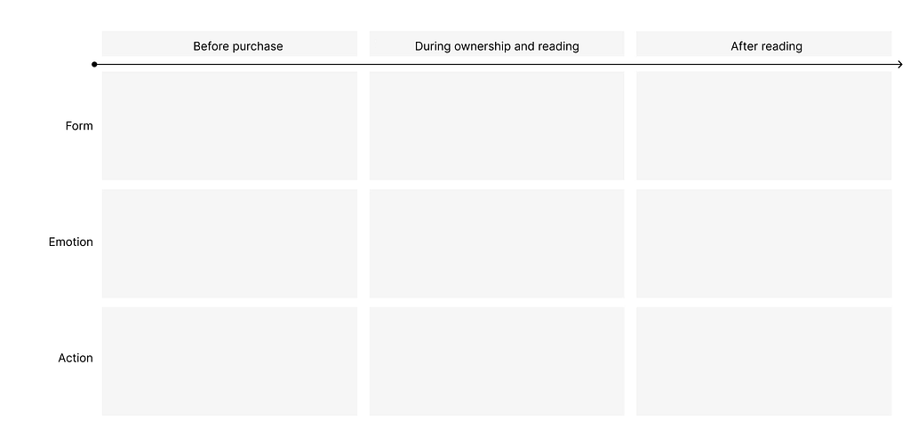
To keep all of this from blurring together, we need a simple structure that lets us see how the relationship unfolds step by step. Let’s start with time, and its simplified representation as a timeline. On it, we can mark out areas that follow the user journey: what happens before purchase, during reading and ownership in general (let he who doesn’t have a stack of books on the windowsill cast the first stone), and after finishing the book.
A blank touchpoint mapping table might look something like this:
The haptics of paper, an icon on a smartphone, a post on social media
The next element — and the next layer on our timeline — is the form of the cover, the channel through which it’s represented, and the context in which it appears, each of which places a different set of demands on us. We have to remember that the cover — and with it the entire physical form of the book — will need to function in a wide range of extreme situations. Its life often begins as a digital signal: a thumbnail in an online bookshop or an audiobook app. And this is where we enter purely design territory, specifically accessibility — we need to make sure the title remains legible even at 150×150 px on a smartphone screen. But that same cover, moments later, has to become a worthy representation of the author at book signings, where readers hold it in their hands — before it ultimately spends 95% of its life on a shelf. There, as a narrow spine with just 3 cm of surface area, it still has to communicate its presence.
The physical form of a book can be thought of as a tactile interface: UV varnish, soft-touch laminate, and embossing are not just aesthetic choices — they’re elements that can build a shared experience with the content of the book. The feeling of touching something slippery that looks wet (think snake skin, or fish) is completely different from the feeling of natural fabric under your fingers (closeness to nature). And on top of all that, there’s weight. You can print on bulky but lightweight paper, or use heavy coated stock — and there’s research in psychology and behavioral economics suggesting that physical heaviness tends to be associated with a sense of value or importance. What matters is that all of this happens before the reader has read a single sentence — often entirely outside their conscious awareness.
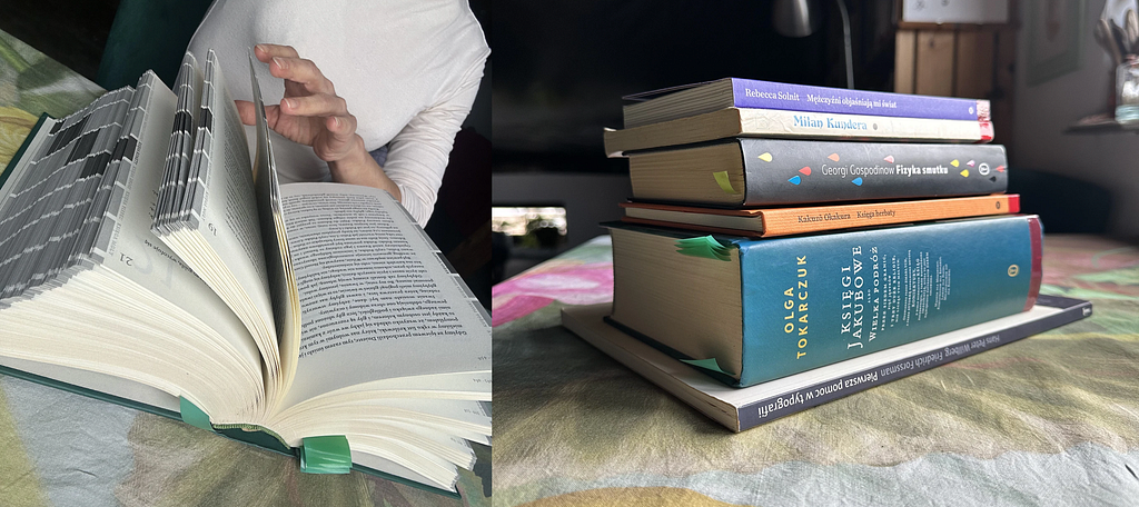
A striking example of this physical dimension is Olga Tokarczuk’s The Books of Jacob. The publishing form itself is a hefty, heavy tome — one and a half kilos — and this directly affects how the book is read. And I mean that quite literally: how you sit with it. You can’t comfortably lounge on the sofa with The Books of Jacob — it’s too heavy and too large. The reader has to adopt a kind of “chronicler’s posture” to manage the reading at all — and that physical position, that slight discomfort, amplifies the content in an extraordinary way. The reader ends up experiencing the story almost physically. Why do I mention this? Because it’s proof that as designers, we are designing not just an object, but the way the reader physically inhabits it. I bring it up not as a literary curiosity, but as evidence that the form of a book genuinely co-creates meaning — rather than merely wrapping it.
Take a look at how The Books of Jacob “plays” in relation to the reader’s body and to other books:
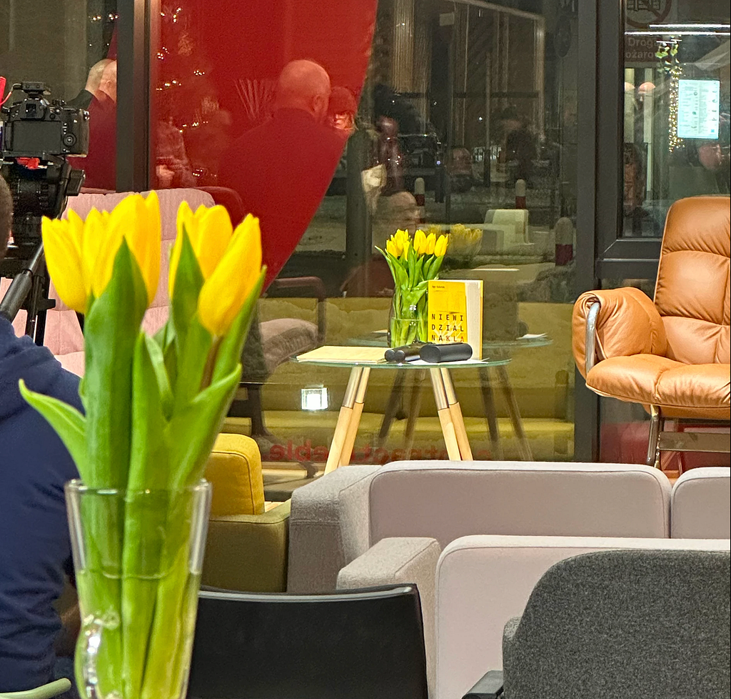
Finally, there’s one more form to consider — one that supports the entire social proof of the story: how the book looks in photographs on social media. Whether it’s “visible” and legible in them, and simply easy to photograph. UV varnish, for instance, looks beautiful in person but can reflect light in uncontrollable ways in photos. Blind embossing, on the other hand, feels wonderful to the touch but requires some skill with lighting to photograph well — and not every reader can be expected to have that. (We’ll come back to the cover as part of the reader’s identity a little later.)
This photo gives a pretty good sense of that “visibility”:
Another important element is what I’d call the not-so-obvious “contextual brand contexts” (OMG, that came out clunky). What I mean is the kind of conditions that are specific to this particular case. When designing Niewidzialna klatka, it mattered that the book looked good alongside Aga Szóstek’s other publications and sat naturally within her brand. And please don’t get me wrong here: the point wasn’t for the book to be “in Aga’s branding” (as yet another corporate asset), but to function within it naturally. We knew that Aga was publishing this book independently and that we were building a dedicated landing page for it (as we do for all her books, actually) — so this specific brand context was key.
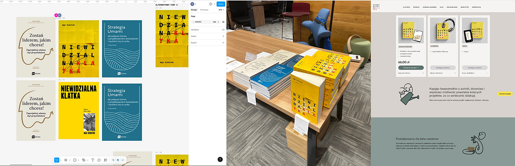
Below is an example of a proposal that didn’t pass the adaptability test. On one hand, it had a lot going for it: clean space, a minimalist font, a strong “warning” color, and a deliberate absence of the dark, mysterious palette typical of thrillers. I also used a small drawing and a handwritten typeface — a recorded gesture as a carrier of emotion, which was very important to us (but I’ll explain that later). The image on the cover neither illustrates nor explains the content directly, so the potential for discovering meaning during reading remained intact. The design even looked good alongside Aga’s other books. What ultimately decided its rejection was simply how poorly it worked as a thumbnail. It was a conscious decision to let go of a design that “looked good” in favor of one that had a chance of functioning well in the reader’s actual life.

Gutting soft toys and drawing squares — or, how to design emotions
At this point we can add emotions and/or behaviors to our timeline. I’d rather not get into the debate about which comes first — the emotion or the behavior — as that’s a complex question and not what this text is about. What matters is thinking through which emotions and which behaviors are triggered by specific design decisions at different stages of use.
At this stage, the timeline stops being a chronology of forms and becomes a map of tensions: from the promise made by the cover, through the dialogue with it during reading, all the way to the moment when the book becomes part of the reader’s home library — or an element of their identity on social media.
And here’s an interesting thing: at the pre-purchase stage, we don’t necessarily need a finished cover at all. Sometimes we don’t need one at all. We can show fragments, variants, threads. Test different directions — not to validate them in the classical sense, but to spark curiosity, activate the imagination, and build tension. It’s a bit like inviting the reader into the space before the decision, before anything has been named or settled.
In the case of Niewidzialna klatka this happened quite literally: Aga started “telling the story” of the cover before it existed. She published generated proposals, various visual directions — not as a product announcement, but as an invitation to conversation. This meant that the relationship with the book began earlier than the purchase itself — not through the promise of the content, but through a shared circling around the subject.
And while you can experiment freely with those early samples, it’s worth being more careful with the final proposal — because a sense of intrigue can very easily tip into unease, and unease works in exactly the opposite direction from the desire to buy. And here I’ll reach for another cover proposal as an example.
The backdrop of the book is the unhealthy reality of a Polish corporation producing children’s toys, and the story shows it from the inside. So I thought: what if we took that literally? I bought a little eagle soft toy, gutted it, turned it inside out, and photographed the resulting creature. (Actually, it was my friend Marek who did the gutting, while I was cooking dinner. Fun fact: not knowing anything about the book, he asked at some point: “is this a book about the misery and despair of Polish corporations?” — which was exactly right.)
I was proud of myself: the proposal was intriguing, it hit the nail on the head illustratively, and it promised an “aha” moment that would only reveal itself during reading. So I sent it to Aga for testing. It quickly became clear, however, that the creature was rather too good at being creepy — instead of curiosity, it produced unease. And that, especially in the context of how this book came to exist (described a few paragraphs back), might have been artistically interesting, but from a publishing standpoint would have been shooting ourselves in the foot.
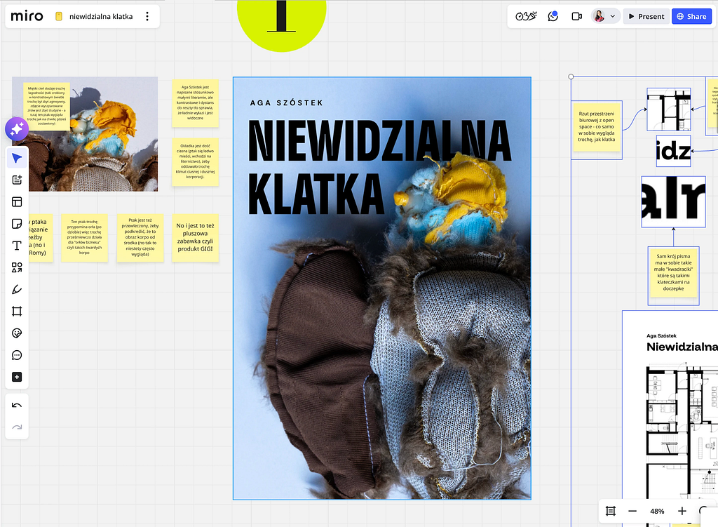
That tension — arising from both the characters’ experiences and corporate politics — still needed to be conveyed somehow. The obvious solution would have been a woman in a blazer, jaw clenched. But that would have thrown away all the potential of the “aha, so that’s what the cover is about” moment.
So I chose a different direction — a more painterly one. Instead of illustrating a character, I decided to show emotion through gesture — or rather, through its trace. The gesture of a hand that absent-mindedly doodles on a piece of paper during a tense (or simply pointless) meeting, to release some pressure. We all know the relief of drawing squares and circles on a notepad during meetings that exist purely to be endured.
Those doodled squares are what ended up on the cover. They carry several meanings at once: they are a record of emotion, they are cages — and at the same time, and this only reveals itself after opening the book and reading the first chapter, it turns out they actually mean something. Their continuation, in a more figurative form, appears on the section pages between each part of the story.
And this is how we arrive at the “aha — so that’s what it’s about” moment, which lands somewhere around the first chapter. We build it through the experience of uncovering a mystery: the meaning of the cover reveals itself gradually, and only becomes fully legible after reading.
A similar function is served by the slightly unnatural accumulation of yellow sticky notes — post-its, the ultimate prop of every corporate workshop. Here they cover the entire surface of the cover so densely that nothing can break through. The only hope of reaching what lies underneath — the hidden emotions, intentions, and truths — is one slightly lifted corner of one note. It leaves us with the thought that perhaps there is something behind that facade after all. Whether there is, and what exactly? That we only find out by reading and discovering the next “aha.”
Then there’s color. We went with a warm shade of yellow — the color that warns of approaching change. We know it from traffic lights: after yellow comes either green — go, act — or red — stop, you’re not getting through. And right until the end of the book, we don’t know which color that yellow will turn into for our characters.
Choosing an intense color and letting it resonate across the entire surface also carries particular weight at the final stage of the user interaction — the visibility of the spine on a bookshelf. That’s where the book will ultimately “live,” and that’s where the next potential reader will reach for it: a cousin, a friend, a son. An intense color catches the eye as it travels along the shelf and works as a visual hook — triggering either a memory (“can you recommend something?”) or pure curiosity (“what is that book that stands out so much?”).

What I’m describing may seem obvious, and yet in practice it is frequently ignored. One of the most striking examples of a conscious fight to preserve mystery is Franz Kafka’s stance on the cover of The Metamorphosis. In a letter to his publisher, the author categorically forbade any depiction of an insect on the jacket, arguing that the insect itself must not be drawn, not even from a distance.
Kafka understood perfectly that a cover functioning as a literal illustration acts as an aggressive spoiler — it strips the text of its oneiric and psychological weight. Contemporary editions that, against the author’s wishes, place an image of a beetle or cockroach on the front commit the sin of excessive literalness: they turn existential dread into horror aesthetics and strip the reader of the right to their own interpretation of the “monstrous vermin” — which in the author’s intention was meant to remain unsaid.
When designing a cover, then, it’s worth remembering that not everything needs to — or should — be shown at once.
The final element on our timeline is everything that happens as the relationship with the book deepens. When the book becomes part of the reader’s identity. People photograph books, post on social media, write reviews on Goodreads, to say something about themselves. When designing a cover, we are designing the “costume” the reader wears in public. Does this cover say “I’m an intellectual” or “I’m looking for a good time”?
Designing a cover is also an act of loyalty — above all, to the author.
Throughout this process, the designer becomes an attentive reader who must catch the pulse of the story and translate it into an image. It is a responsibility: the author entrusts us with years of their work, their dreams — and we must build a home for them that is safe and intriguing in equal measure.
All these layers — from the micro-scale of pixels on a smartphone screen, through the weight of paper, to the things left unsaid in the graphic — add up to something more than just an aesthetic object. Designing a cover as a relational object is, in reality, designing trust.
Instead of shouting “buy me!” at the reader, we try to invite them into a dialogue that doesn’t end when the last page is turned. It’s a process in which form doesn’t dominate content, but waits for it patiently, allowing meanings to mature at their own pace. Because ultimately, a good cover is not the one that looks best on the shelf — it’s the one that is able to change alongside us under the influence of reading. And though it begins as a stranger in a shop, it ends as a witness to our own, intimate journey through the text.
Thank you,
u.
The book cover as a relational object was originally published in UX Collective on Medium, where people are continuing the conversation by highlighting and responding to this story.