Why the best UX often disappears. And when it shouldn’t
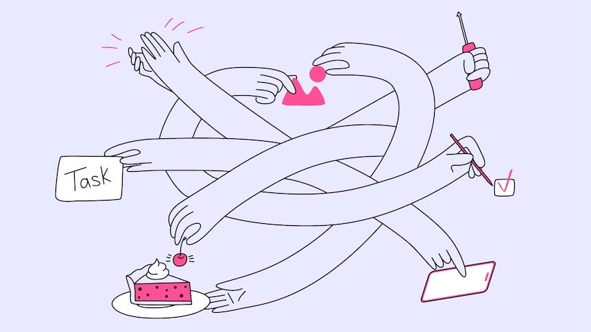
The paradox of “forgettable” design
“Make the experience forgettable,” a senior business leader once told me.
That might sound like a joke to a designer who prides himself on creating memorable moments. But as the head of airport operations, he was dead serious.
Singapore Airlines handles thousands of travellers every day. For these passengers, joy comes from the in-flight experience and on-time departures. The last thing the operations team wants is for a customer to get stuck in a long queue or hit a snag like a failed boarding pass, only to face their wrath and complaints.
At the airport, smooth is invisible. One reason Changi Airport remains among the best in the world is its relentless investment in removing friction.
State-of-the-art passport-less immigration clearance was once thought impossible. Today, Singapore residents and eligible travellers simply walk through automated gantries without whipping out their passports. Within 10 to 30 seconds, they pass through customs, making their experiences at other airports feel jarring by comparison.

Ultimately, the goal is for the airport experience to be completely forgettable.
The three faces of friction
You can see this pattern everywhere. Nobody falls in love with banking; you just want your bank to safeguard your money so you can live your life. That’s why banks like DBS strive to make banking invisible.
Or consider choosing a school for your child. No parent wants to deal with stacks of paper forms or jump through extra hoops just because they fit into an edge-case category. They want a seamless system that gives them immediate peace of mind.
In UX design, friction is anything that slows a user down, prevents them from accomplishing their goal, or causes mental frustration. It usually shows up in three ways:
- Interaction friction: The physical effort required to complete a task, such as five-page checkouts when two steps would do, redundant fields, or tiny, tightly packed buttons on mobile.
- Cognitive friction: The mental tax of a confusing interface; buried navigation, cryptic labels, or layouts that stray so far from familiar patterns that users pause and think, “What do I click next?”
- Emotional friction: The rise in anxiety, annoyance, or mistrust triggered by a poor experience, surprise fees at the end, or apps demanding intrusive permissions before offering clear value.
When these micro-frustrations compound, users give up. They abandon their steps, close the tab, or uninstall the app. So the primary directive of modern product design, like airlines, banks, and schools, has long been to smooth out the digital road, eliminating unnecessary steps and making actions feel effortless.
When frictionless becomes too easy
More recently, the frontier of frictionless design has moved into AI workflows. Platforms like ChatGPT and Claude have made prompting with text, images, or documents so effortless that users get results in seconds. Like a digital genie, modern LLMs can grasp user intent from minimal input. Users keep returning because the experience feels smooth, intuitive, and immediately rewarding.
But here’s the uncomfortable question: if AI can remove friction from simple tasks, why not from everything helping someone grasp abstract math, build software, or expand a few bullet points into a full essay?
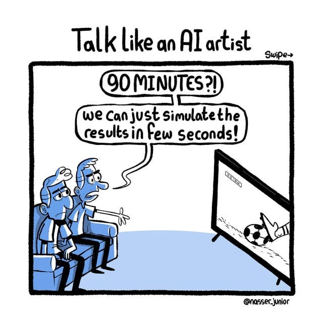
AI can feel like a silver bullet that removes friction from everything. And that, in itself, can become a slippery slope.
Beneath this frictionless ideal lies a business model built on continuous consumption. The smoother the experience, the more we prompt, the more compute we consume, and the more tokens are spent. But when we optimise entirely for instant output over intentional effort, we trade deep, rigorous thinking for a fast, superficial result.
A case for “good” friction
I saw this play out firsthand on a parents’ communication app my team built.
Originally, we designed the feed to be completely frictionless, using standardised announcement formats to make scrolling effortless. And while adoption rates spiked, support tickets surged right alongside them. Parents struggled to retain information, lost track of attachments, and missed key details in the infinite scroll.
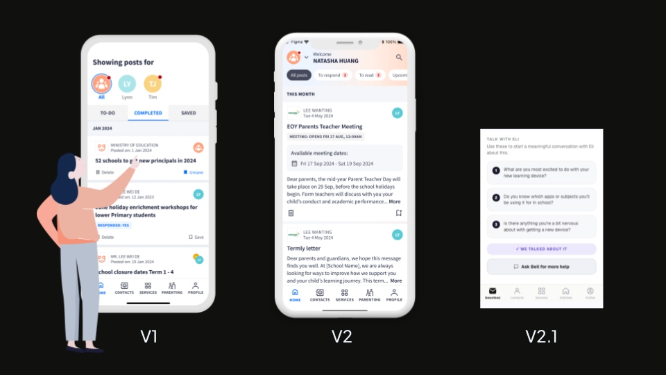
So, we did something counterintuitive: we brought the friction back.
We introduced interaction pauses to draw attention to attachments and events. We added cognitive pauses, such as truncating content, forcing parents to stop, read the summary, and deliberately tap to expand. We even added AI-generated conversation starters to announcements and posts so that parents could pause and reflect on how to talk to their kids after school.
Time spent in the app went up, but there was higher customer satisfaction. The experience wasn’t as fast, but it felt more respectful and more human.
In operations, on a factory floor or at an airport check-in, efficiency is king. Removing friction speeds up the line, and speed feels like progress.
Yet necessary friction points are everywhere. Factories rely on emergency stop protocols; airport check-ins require passengers to pause and confirm they aren’t carrying hazardous goods. Even Newton’s third law reminds us of its value: friction acts as the ground’s resistance that allows us to push forward in the first place.
Designers like Ida Persson have started calling this meaningful friction: friction that protects, clarifies, or deepens human experience rather than merely slowing it down.
So what if friction isn’t actually the enemy? What if some friction isn’t meant to be forgotten, but embraced?
https://medium.com/media/4ab315aeabd77f10eba52a5baaf46eb2/href
Designing for humans, not machines
If there’s one idea I’d build on, it’s this: honour human values, emotions, and decision-making, even when that means keeping friction in the loop.
Machines are built for efficiency. They get something done and then forgotten. Human beings are not machines. We are imperfect, sensitive creatures who hold on to emotions, beliefs, and moral values.
Designers are human beings designing for human beings. It may sound obvious, but sometimes we forget why we design and dream of doing away with designing altogether to get quicker answers.
Frictionless AI risks creating passive users: people who accept the first answer, skip reflection, and outsource judgement to a model that doesn’t share their stakes. A bit of deliberate friction:
“Are you sure?”,
“What are you trying to achieve?”,
“Here’s what you might be overlooking”,
can turn a smooth interaction into a meaningful one.
Remove friction where it blocks progress. Keep it where it shapes judgement, builds trust, or deepens meaning.
Because the goal of design is not just to make things easy but to make them matter.
References
Afterbell. (2026). Afterbell | {build} hackathon. GovTech {Build} Hackathon. https://build.tech.gov.sg/projects/2026/242
ICA Singapore. (2024). Passport-Less Immigration Clearance at Changi Airport. In YouTube. https://www.youtube.com/watch?v=1SdqDIvcvag
Persson, I. (2026, July 27). From Frictionless to Meaningful. UX Collective. Medium. https://uxdesign.cc/from-frictionless-to-meaningful-2dc785d6cc4e
Rekhi, S. (2018). The Hierarchy of User Friction. In Medium. https://medium.com/@sachinrekhi/the-hierarchy-of-user-friction-e99113b77d78
Rethinking friction in an AI world was originally published in UX Collective on Medium, where people are continuing the conversation by highlighting and responding to this story.