What a pair of trainers, Dutch car thieves, 17,000 lost wallets and the pain of paying tell us about the influence of colour.
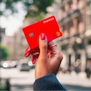
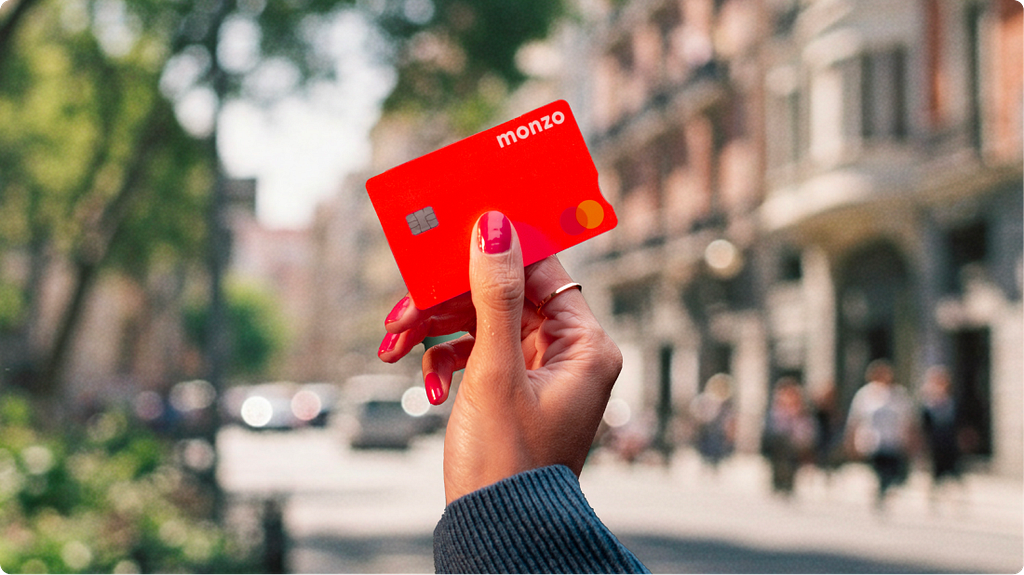
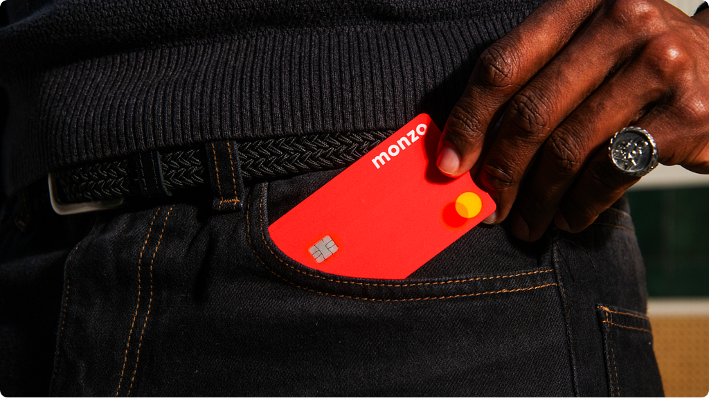
Most bank cards used to look like they had been designed for people who didn’t want to be seen using them. Navy, charcoal, the occasional restrained burgundy. Then Monzo turned up with one the colour of a traffic cone, and many challengers have been chasing distinctiveness ever since.
There is a sensible argument that an attention-grabbing, colourful debit card is a security risk. If it falls out of your pocket on the night bus, a hot coral rectangle on a dark seat catches the eye more than a black one. Easier for you to find in the morning, sure. Easier for the person sitting next to you, too. So which effect wins?
This is where the research thins out. No published study compares pickpocket rates on visually striking cards against discreet ones, or recovery rates of lost neon versions against their navy counterparts. But there is a surprising amount of adjacent evidence, and it tells a more interesting story than the framing suggests. The colour of a payment card turns out to have consequences its designers didn’t always set out to create.
Why Monzo’s card is coral in the first place
The story has been told enough times that it has acquired a slight whiff of corporate origin myth, but it does seem to be roughly true. In the early days of the business, when Monzo was still called Mondo, in-house designer Hugo Cornejo was under time pressure to produce a card design. He looked down at his hot coral Nike trainers and proposed that. The team ran with it.
The colour was initially meant for the beta phase, a sort of “concept car” treatment to signal early-adopter status. Then something the founders had not planned for started happening. At ticket barriers and pub bars, the coral stood out against a sea of black and silver, and strangers asked customers about it. Tom Blomfield, Monzo’s founder, has written about how organic word of mouth drove the company’s early growth, with the card doing a material chunk of the work. While they grew towards their present 15 million customers, the colour scaled alongside. The card had become the campaign.
Monzo did, briefly, try to trademark that bold coral itself. The application failed. As the law firm Azrights noted, trademarking a colour requires the public to associate it strongly enough with the brand to exclude competitors, and Monzo had not yet earned that association decisively. The company has since broadened its palette, which suggests the ambition has been quietly retired.
That wasn’t the end of it, as a creative decision made for one reason produced effects in completely different domains. Coral was picked to feel different, and then it rippled outward, shaping the company’s growth and, quite possibly, the spending habits of millions of people.
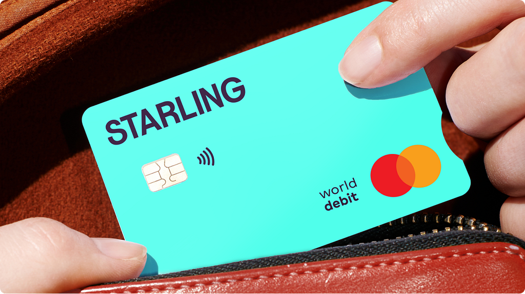
There are, of course, other examples in the market. Starling Bank picked a vivid teal in 2018, inspired partly by the plumage of a starling bird and also because it was one of the sixteen original system colours formulated in 1987.
A September 2025 rebrand intensified the hue, dropped “Bank” from the company name, and leaned harder into the same loud-card strategy. What one company did almost by accident has hardened into a category playbook.
The case against being noticeable
The hunch here isn’t groundless, but the overall view is a bit more complicated. Some studies suggest that highly visible items can deter rather than invite theft, and others point the opposite way.
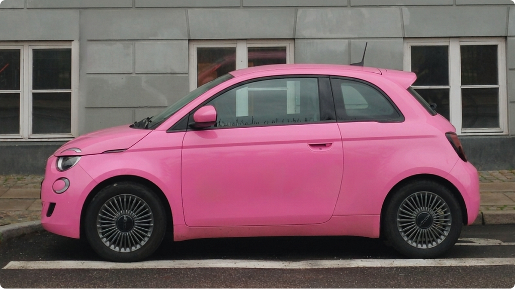
Ben Vollaard, an economist at Tilburg University, looked at Dutch car theft data from 2004 to 2008 and found something he hadn’t expected. Brightly coloured cars were stolen at roughly 40% lower rates than the usual black, white and silver. To add to this, none of the 109 pink cars he tracked ended up getting poached. The reason wasn’t visibility. It was resale value. Unusual colours are harder to shift on the second-hand market, which makes them less attractive to thieves who plan to sell on. Vollaard concluded that an odd colour could deter as effectively as a conventional security device.
However, a payment card is not a car. You cannot resell it on the open market. But the underlying logic holds: standing out can lower risk rather than raise it, which cuts against the gut feeling that loud equals exposed.
Then again, travel writing tells a slightly different story. Most articles suggest that branded, designer-logo luggage attracts theft because the bag itself broadcasts value, while plain dark suitcases blend into the crowd. That leads us back the other way: visibility as an invitation. The trouble is that this theory isn’t rooted in controlled research, just folk knowledge dressed up as advice.
And so we end up with some concrete facts and common sense meshed together, forming a wobbly conclusion. Still, considered with care, the lessons here are useful.
Standing out deters in some cases and invites trouble in others, depending on what the object signals. A logo-stamped designer bag advertises monetary value. A neon bank card advertises which bank you use. These are not the same thing. There’s no buyer for a stolen Monzo card, even if it can be used fraudulently before it gets frozen. App-based banking has shrunk that window substantially.
What happens to lost things
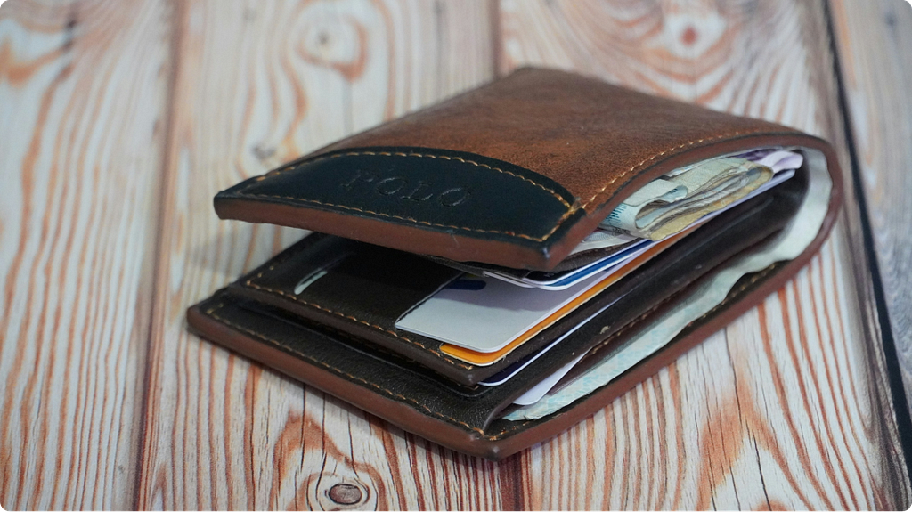
Pickpocketing is one risk. Losing something on the way home is more relevant for most people, and here the outcomes are unusually clear.
In 2019, Alain Cohn and his colleagues at the University of Michigan ran the largest field study of civic honesty ever attempted. They handed more than 17,000 “lost” wallets to receptionists, bank tellers and hotel staff across 40 countries, varying the amount of cash inside. You’d expect not many to come back. The opposite happened. Almost all the wallets were reported as found, and the ones with more money in them came back at higher rates than the empty ones, in 38 of the 40 countries surveyed.
Two things were going on at the same time. People don’t want to feel like a thief, and that feeling sharpens as the sum grows. Many also genuinely care about the owner. Wallets containing a key (worthless to the finder, valuable only to the person it belonged to) were returned at meaningfully higher rates than those without. That’s hard to explain except as concern for the stranger on the other end.
This bears on the payment card question quite directly. A bright one stands out in a coat pocket or under a café table, which means a member of staff finding it is more likely to register it as someone’s property. The data suggests they will then probably try to return it. Colour, in this scenario, is working with the finder rather than against the owner.
There’s a small caveat though. The Cohn wallets included a business card with an email address, which gave finders a clear way to make contact. A bare bank card used to have no such cue. Most issuers now print a customer service number on the reverse, and apps allow instant freezing, which collectively reduces the practical downside of losing a thin, plastic rectangle. Taken together, how visible the card is when lost matters slightly less than it did twenty years ago, since the infrastructure around it has done most of the work.
A different kind of risk
If theft and loss are both less dangerous than they seem, the worry about a bold card has to come from somewhere else. The quieter reasoning, and the one with the strongest proof behind it, has nothing to do with what happens when it goes missing.
A much-cited 2008 paper showed what was called the pain-of-paying effect. The more vividly a payment registers as an outgoing, the more reluctant we are to spend. Cash hurts the most, because handing over a physical object triggers a tangible loss. Meanwhile, cards distress us less, because the money moves invisibly. The researchers’ work suggested that this dulled sensation is one reason credit card transactions tend to be larger than cash ones.
Monzo’s brand argument runs against this grain. The whole appeal of a striking coral card is that you become aware of it, that you feel pleased to pull it out, that the act of paying acquires a small social charge. Whether that increases or decreases spending is an open question. The effect could go either way. The brightness of the object could reintroduce some of the pain that the card form usually erases, or it could simply make the card feel more rewarding to use, and therefore easier to reach for. No one seems to have tested either possibility on coloured cards specifically (yet).
What we do know is what people do with the cards they already carry. The closest thing comes from PYMNTS Intelligence’s 2025 study of US cardholders. Around 78% carry multiple cards but concentrate their spending on a single favourite. The gap is fairly wide. People put roughly $1,900 a month on their primary card and just over $1,200 on their second choice.
Issuers care about this enormously, because being the card someone reaches for first is the difference between a profitable account and a marginal one. To bump up their chances, distinctive design is one of the few things they can change. The exact contribution of colour is hard to isolate from rewards, fees and habit, but the card still matters. This is, again, a consequence the original Monzo design meeting did not plan for. A choice made to be playful and recognisable now sits inside a multi-billion-pound argument about which card wins at the till.
What the colour says, not what it does
Spending behaviour is the hard end of what a card colour does. The softer end is signalling, and the industry leans on a diffuse set of colour associations heavily. Blue is the default in finance precisely because it tests well as a marker of trust and reliability, which is why both American Express and Chase, like most major competitors, use it for mainstream cards. Black functions as a status colour, anchored by the American Express Centurion card launched in 1999, and is now used by banks across the premium tier. Green has acquired environmental associations and is increasingly chosen by neobanks positioning themselves as sustainable. This is not rigorous science. It is closer to collective brand intuition, refined over decades of consumer research and reinforced by repetition.
Card colour does symbolic work whether companies admit it or not. Hot coral announces this is a new kind of bank, one that isn’t trying to look like the old ones. A black card echoes wealth, not because dark is intrinsically expensive, but because the card has spent twenty-five years being held by people who live on the more affluent end. Neither claim has anything to do with the physical properties of the colour. Both are inheriting their power from cultural context, and in both cases, what the colour says was never fully under the designer’s control.
So, is hot coral dangerous?
On the available evidence, probably not, at least not in the way the original question implies. Two pieces of research steer in the same direction. The Cohn lost wallet study suggests that visibility tends to work in the owner’s favour for recovery. Vollaard’s Dutch theft data shows unusual colour acting as a deterrent rather than an attractor. And the practical stakes have shrunk anyway: app-based instant freezing has reduced the consequences of any individual card going missing.
The more interesting risk is the one the pain-of-paying studies point to: that a card designed to be enjoyable to use might be a card that is used more often than the holder would otherwise choose. That is a problem of behavioural design, not physical security. It is also one of the few areas here with genuinely strong evidence behind it, and the implications aren’t flattering.
A thread runs underneath all of this. A coloured card looks like a small decision, the kind that gets settled in an afternoon by someone glancing down at their shoes. The downstream effects show up everywhere except the place it was designed for. They turn up in marketing economics, in lost-property psychology, in trademark law, in the share-of-wallet calculations, and likely in the monthly spending of the people carrying it. A wary instinct about the neon card is correct in spirit, just possibly aimed at the wrong threat. Losing a piece of plastic is a solvable problem. The habit of reaching for it is harder to undo.
If you enjoyed this, follow me on Medium for more on design, psychology and technology.
References & Credits
- Azrights. The strategic power of color in branding: lessons from Monzo’s experience. https://www.azrights.com/blog/the-strategic-power-of-color-in-branding-lessons-from-monzo-s-experience
- Blomfield, T. Monzo Growth. https://tomblomfield.com/post/691384431502557184/monzo-growth
- Cohn, A., Maréchal, M. A., Tannenbaum, D., & Zünd, C. L. (2019). Civic honesty around the globe. Science, 365(6448), 70–73. https://news.umich.edu/moral-concerns-override-desire-to-profit-from-finding-a-lost-wallet/
- It’s Nice That. Ragged Edge makes over Monzo, but keeps the hot coral card. https://www.itsnicethat.com/news/ragged-edge-monzo-graphic-design-021122
- Pathfinders Advertising. How color theory shapes credit card designs and marketing strategies. https://www.pathfind.com/insights/credit-card-designs-color-theory/
- Phable. The unexpected origin behind Monzo’s iconic coral bank card. https://www.phable.io/phable-labs/monzo-brand-origin-inspired-by-nike
- PYMNTS Intelligence and i2c (2025). The Credit Economy: Top-of-Wallet Credit Cards. https://www.pymnts.com/credit-cards/2025/consumers-spend-nearly-2000-per-month-using-top-of-wallet-credit-cards-study-finds
- Raghubir, P., & Srivastava, J. (2008). Monopoly money: the effect of payment coupling and form on spending behavior. Journal of Experimental Psychology: Applied, 14(3), 213–225. https://www.apa.org/news/press/releases/2008/09/credit-cash
- Starling Bank (2025). Starling reveals new-look logo, app and cards as bank launches brand mission to help Britons become ‘Good with money’. https://www.starlingbank.com/news/starling-reveals-new-look/
- Vollaard, B. Research on car theft and vehicle colour, Tilburg University, summarised in Freakonomics. https://freakonomics.com/2010/07/if-you-dont-want-your-car-stolen-make-it-pink/
Is hot coral a feature or a liability? A closer look at the colour of your bank card. was originally published in UX Collective on Medium, where people are continuing the conversation by highlighting and responding to this story.