
What actually goes into a good prompt, and why most advice skips this

If you’re trying to learn how to write good Figma Make prompts, you’ve probably hit the same wall I did.
Most advice stays abstract.
Be clear. Add context. Explain intent.
None of that helps when you’re staring at an empty prompt box wondering what actually needs to go in there.
What’s missing in the industry right now isn’t more frameworks. It’s real examples. Full prompts. End-to-end inputs you can actually read and learn from.
By the end of this post, you should have a clearer sense of what actually belongs in a Figma Make prompt, based on real inputs that already work.
Instead of inventing yet another framework, I looked at what already exists. I studied real inputs, tested them, and compared the results. This post documents that process using real prompts, real tradeoffs, and real constraints.
If you’re new to Figma Make, this will help you get unstuck. If you’ve already used it, this will help you waste fewer prompts.
TL;DR
Most Figma Make advice is vague. It tells you to “add context” without showing what a good prompt actually looks like.
This post breaks down three real approaches designers are already using to write Figma Make prompts:
- using a PRD as the prompt
- translating loose inputs into Make-ready instructions
- pressure-testing intent with a simple checklist
Instead of frameworks, this post shows full prompts end to end, including the tradeoffs, time cost, and limitations that come with them. The goal isn’t better prompts for their own sake. It’s fewer reruns, clearer intent, and workflows that still hold up as these tools become more constrained and more expensive.
If you only read one section, read Applying this in practice.
Why focus on prompts at all?
There are a lot of ways to use Figma Make. You can begin with simple inputs like images or existing files, then move into more advanced options such as the Point-and-Edit tool, connecting a library (organization and enterprise plans only), or editing code.
This post focuses on prompt writing because it offers the most leverage. From a blank canvas, you can create something surprisingly robust, including a working prototype. The ability to build from scratch, clearly and intentionally, is going to be in high demand.
Three approaches worth studying
Each of these comes from a respected voice in the industry and reflects a real way people are already working with Figma Make. I’m using them as concrete examples to break down what goes into an effective prompt, then translating those lessons into a real, actionable prompt you can study and edit yourself.
1. Product requirements document (PRD)
This example comes from a YouTube video by Jesse Showalter of Design Champs and uses a PRD as the prompt itself.
A PRD, or product requirements document, is a written description of what you’re trying to build. It lays out what the screen does, how it behaves, the rough layout, key states, and constraints like responsiveness or accessibility. It’s not a visual artifact. It’s a thinking artifact.
What makes this example valuable isn’t just the output. It’s the input.
The video doesn’t share the full prompt text, but I tracked it down and included it so you can read it end to end. Being able to see the entire prompt makes it much easier to understand why the result works and what kind of detail actually carries weight.
https://medium.com/media/664cd3ac21e30bb8ce1528cf52f9a374/href
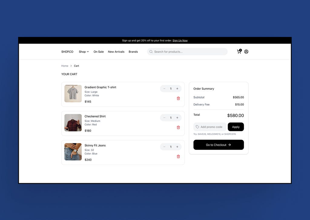
When I reused that same prompt, it produced a solid, interactive prototype for a clothing store experience that I could copy back into Figma and continue iterating on. That’s what made the PRD powerful. It could be reused, and it produced consistent results.

2. Make Prompt Assistant
The Make Prompt Assistant is a custom GPT available in ChatGPT, created by Greg Huntoon, a Design Manager at Figma.
What makes this approach useful is how quickly it gets you unstuck. You can start with something loose, like “create a website inspired by coolors.co,” and it will generate a structured prompt you can hand directly to Figma Make.
https://medium.com/media/35c2b2c7e3de8eef91a455841b8f49d2/href
This approach isn’t as robust as writing a prompt from scratch. You give up some flexibility because you’re not explicitly defining every decision. The assistant fills in gaps for you, which means some intent is inferred rather than specified.
The resulting prototype is a solid starting point. It provides structure and momentum, but it still needs refinement. That’s expected. This works best as a first pass, not a single, fully defined prompt.
Core prompt structure:
- Task: what to build or change
- Context: where it lives in the product
- Elements: literal UI components
- Behavior: interactions, states, logic
- Constraints: device, layout, rules
3. TOKEN framework
The TOKEN framework comes from Nick Babich, Product Designer and Editor-in-Chief of UX Planet, and was originally published on Medium.
TOKEN is the most explicit about structure. Rather than telling you to “be clear,” it defines what clarity actually means by naming the categories prompts often miss.
It doesn’t guarantee a good result, but it significantly reduces the chance that something important is missing from the first prompt.
I don’t think of TOKEN as a rigid script. I use it as a pressure check before handing control over to Make.
TOKEN stands for:
- Task: what exactly do you want the AI to do
- Output: what should the final result look like
- Key design elements: what must be included
- Expected behaviors: how it responds to interaction
- Notable constraints: platform, accessibility, brand, or technical rules
What these approaches have in common
All three approaches required knowing what you wanted to build and having a clear sense of how it should function, what it should look like, and whether there were existing examples to pull from.
None of them worked well without that clarity up front. Before Make could produce anything useful, the decisions were already in place.
Across all three, prompts improved once these basics were settled:
- what was being built
- what it was for
- how it should behave
- which constraints mattered
When those decisions weren’t settled, prompts became harder to write and outputs became less predictable. Prompting didn’t resolve that uncertainty. It surfaced it.
How they differ in structure and intent
Where these approaches differ is how and when those decisions get made.
Using a PRD pushes nearly all of the decision-making up front. You define intent explicitly, which gives you the most control and makes it possible for a single prompt to carry a lot of weight. The tradeoff is effort. Writing that level of clarity takes time.
The Make Prompt Assistant shifts some of that work to the tool. It’s useful when you have a loose idea or reference and want to get moving quickly, but some intent is inferred rather than specified. Refinement happens through iteration rather than a single, fully defined prompt.
TOKEN doesn’t create intent at all. It acts as a checkpoint. It’s most useful right before you run a prompt, when you want to verify that nothing important has been missed.
Once a design already exists, short, targeted prompts tend to outperform any framework. One change. One target.

Applying this in practice
After studying these approaches, I applied them to a real use case to see what actually held up.
I used a marketplace browsing experience similar to Etsy because it reflects the kind of work many designers deal with day to day. Search, filters, product grids, seller identity, favorites, responsive behavior, and accessibility are all common requirements on real product teams. This wasn’t a demo scenario. It was something I could realistically see a team needing to prototype.
I set one constraint up front: one prompt, no edits.
The goal wasn’t to keep nudging Make until it behaved. It was to push as much decision-making as possible into the prompt itself and see whether a single input could produce a functional result without follow-up corrections. The prototype mattered, but the real focus was the prompt.
For comparison, a previous Figma Make game app project I built completely from scratch took around 680 prompts over four days. This experiment took closer to 40 prompts and about eight hours. The difference wasn’t UI complexity. It was how much structure existed before Make ever ran.
Getting to a single prompt that could generate a fully functioning prototype without edits was time-consuming. Each prompt run took roughly 10 to 15 minutes, and as the prompt grew longer, Make would sometimes skip over details that were already written. That meant certain requirements had to be reinforced more than once.
https://medium.com/media/7a31f61c7fa063786f6175e058325526/href
In practice, those gaps were easy to fix by asking Make to review the prompt again and adjust specific areas. But that wasn’t the experiment. The experiment was to see how far a one-pass prompt could realistically go on its own.
I didn’t fully reach that goal.
In some runs, the prompt produced exactly what I asked for. In others, small but important things broke or behaved inconsistently. Filters didn’t respond as expected. Menu states worked in one run and failed in another. Hover text occasionally rendered unreadable. None of these issues were hard to fix with additional prompting, but needing to fix them at all was the point. The variability mattered.
Based on this work, I don’t think Figma Make is consistently there yet. It’s close, but not reliable enough to guarantee that outcome every time.
To be honest, this was frustrating. Figma Make is an innovative tool and a clear signal of where design workflows are headed, but it still feels closer to a beta product than a finished one. It’s powerful for prototyping and exploration, but there’s work left to be done, especially as it moves toward a credit-based model. Being charged for prompts that fail, drift, or ignore requirements is a real concern.
At the same time, I don’t think this is a static system. Figma has a strong track record of iterating quickly, and I expect many of these rough edges to improve as Make matures. Even so, the direction is clear. Prompting is becoming part of day-to-day design work, and cost will increasingly be tied to how clearly intent is defined up front.
That’s why understanding how to write clear, effective prompts matters now. This isn’t about perfection. It’s about being prepared for how design workflows are changing and what that change will cost.
I wrote this because I couldn’t find the article I wanted when I started. One that showed real prompts, real tradeoffs, and real constraints.
If this helps you approach prompting with more confidence and intention, it did its job.
References
- Showalter, Jesse. Using Figma Make to Go From Nothing to Interactive Prototypes. Design Champs, YouTube.
https://youtu.be/EUPbdk972JI?si=xfAj7U6ocCGTrWeM - Boyer, Ana. Intro to Figma Make (Tutorial). Figma, YouTube.
https://youtu.be/9Y2Yz-ir3JM?si=N4R7A90dF-NzSNOK - Huntoon, Greg. Make Prompt Assistant (custom GPT).
Used to generate structured prompts for Figma Make based on loose inputs and visual references. - Babich, Nick. The TOKEN Framework for Writing Better AI Prompts. UX Planet, Medium.
https://uxplanet.org/a-practical-prompting-guide-for-figma-make-eb72f78ff1ce - Figma. Figma Make documentation and product updates.
https://www.figma.com/make/ - Coolors. Color palette generation tool.
https://coolors.co/
Figma Make prompts, with real examples was originally published in UX Collective on Medium, where people are continuing the conversation by highlighting and responding to this story.