
At WWDC 2025, Apple introduced Liquid Glass and broke key design rules and principles. Will it hurt usability and accessibility?

For years, Apple’s Human Interface Guidelines (HIG) was a bible for software designers. It was built on solid design principles and usability heuristics — like Jakob Nielsen’s heuristics and rules for clarity, consistency, and feedback.
I’m convinced these principles are what made Apple’s interfaces intuitive, accessible, and ultimately so popular.
On top of the benefits for users, it gave developers a clear set of constraints — tight enough to ensure consistency across the system, yet flexible enough to leave room for creative expression and experimentation.
This balance between beauty, usability, and developer experience was the driving the iOS 7 redesign. A shift that made the system not only easier to use, but also easier to build for.
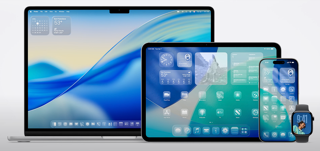
With iOS 26, Apple is starting a shiny new chapter in its design story. Its core design element — Liquid Glass — is glossy, fluid, and clearly pushing the boundaries of what software UI can do — and how it can feel. From a technical and visual standpoint, it’s undeniably impressive. The reflections, depth, and dynamic movement showcase just how far real-time rendering and Apple Silicon have come.
As exciting as this new direction is, it seems to me that this redesign shifts away from the very foundations that once made iOS feel so refined and user-friendly. Here are three areas that I believe need attention before the new system rolls out in autumn 2025.
1/ Change for the Sake of Change
More than anything, iOS 26 seems like a change that’s driven by the need to appear innovative, not by real user needs.
We’ve seen this pattern before. In past iOS updates, apps like Safari, Photos and Mail were suddenly overhauled in ways that confused users. Navigation was changed without clear benefits, and Apple eventually added the option to revert back to the old design.
As Alan Cooper, a pioneer in user-centered design, famously warned against “thrashing” — the tendency of design teams to change things to signal progress rather than respond to real user problems.
Of course, reinvention is necessary in technology — it drives progress and keeps platforms evolving. But when change lacks purpose, it starts to hurt usability. It disrupts habits, breaks consistency, and creates friction where there was none.
When I saw the introduction video of Liquid Glass, I immediately recalled Jakob Nielsen’s Heuristic about Consistency and Standards. It emphasizes that effective patterns should be preserved unless there’s a strong reason to change them. Good design builds on what works — it doesn’t throw it out for visual novelty.
And that’s the issue here: there’s no clear goal behind this redesign. It doesn’t make the experience better for users. It doesn’t improve usability. It doesn’t simplify development. It just looks different — and that’s not enough.
https://medium.com/media/fd74196f0043988ca370d6174a2d86ed/href
2/ UI Should Support, Not Steal Attention
The core principle behind a great user interface is that it should help you — not distract you. As Don Norman said, the best design is almost invisible. It supports your task without drawing attention to itself. And Apple used to follow this principle closely. In fact, it was one of key emphasized principles behind the iOS 7 redesign led by Jony Ive.
With Liquid Glass, that balance is gone. The interface is no longer a quiet helper — it’s the main character. Reflections, animations, depth effects… it all looks great, but it also distracts users and pulls their focus away from what they’re actually trying to do.
https://medium.com/media/17c282d14267737f7ca4523f816dbcdf/href
“Perfection is achieved, not when there is nothing more to add, but when there is nothing left to take away.” — Antoine de Saint-Exupéry
This shift goes against Apple’s own Human Interface Guidelines (emphasizing clarity over decoration) and Nielsen’s heuristic about Aesthetic and Minimalist Design which reminds us to reduce anything that doesn’t serve a purpose. Research into how people process information (like cognitive load theory) shows that too many visual effects can make it harder to think clearly and complete tasks.
https://medium.com/media/4977b8814e6d5743d53ca83e2c9df154/href
Liquid Glass makes iOS feel more like a visual showcase than something you simply use. The interface is constantly screaming and trying to get your attention, instead of quietly helping the user’s goal. In many cases, the design feels like an obstacle rather than a helpful guide.
3/ Regressions in Usability and Accessibility
One of Apple’s historical strengths was intuitive interaction. iOS used to make things obvious. Buttons looked tappable. Labels were clear. You didn’t need a manual — the interface guided you through it. It was built on the idea that users shouldn’t have to guess. In past years, the clarity started to fade…
Hidden Interactions
In order to make the interface look cleaner, Apple is increasingly relying on gestures and invisible interactions with no visual hint.
For example, the redesigned Camera app has now moved core settings behind swipe gestures that’s literally impossible to find unless you already know about it.
This directly violates Nielsen’s heuristic about Recognition over Recall — users should be able to recognize actions, not have to experiment or memorize how to use the app.
Lack of Clarity
Similarly, Apple decided to start removing labels from icons. It for sure looks cleaner but it also turns everyday navigation into trial and error.
Without text, even familiar actions can become unrecognizable. Especially for less tech savvy or new users this creates an unnecessary learning curve. Guessing is simply not good UX.

Accessibility Issue
Liquid Glass’s transparency, depth, and real-time effects look cool — but they also hurt accessibility.
Text contrast often suffers over blurred or moving backgrounds, making it harder to read, locate active UI elements, or even understand where to tap — especially in bright environments.
This goes directly against both Apple’s own Human Interface Guidelines and WCAG 2.1 standards, which emphasize strong contrast and legibility. Users are already reporting readability issues and layout inconsistencies in early betas.
When the system becomes harder to see, navigate, or understand — it stops being inclusive.

Conclusion
In past years, it feels like Apple has reached a plateau — refining their software until there’s almost nothing left to improve in terms of features or functionality. Now, instead of moving forward with purpose, it seems like they’ve lost direction. They’re no longer setting the pace — they’re chasing trends and reacting to the market.
What’s missing is the north star that used to guide their design: a clear, user-centered vision built on simplicity, usability, and restraint. The same principles that once made their products feel so refined — and simply a joy to use. Thoughtful, focused design that puts the user first.
That’s what I believe we’re all still hoping for.
Did Apple abandon its own design heuristics & accessibility principles? was originally published in UX Collective on Medium, where people are continuing the conversation by highlighting and responding to this story.