
Apple’s “liquid glass” isn’t just an accessibility blunder — it’s an environmental one too
This flashy design language sacrifices performance and longevity for visual flair — and sets a troubling precedent for the industry.
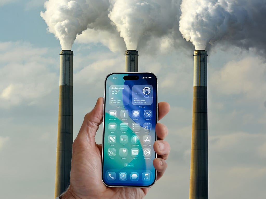
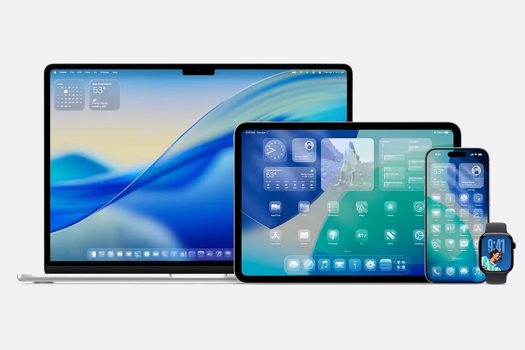
With all the hype surrounding Apple’s latest design language — “liquid glass” — which, as far as I can tell, is just glassmorphism dressed up with animation, I thought I’d throw in my two cents. While the accessibility issues have already been thoroughly dissected — yes, it’s a nightmare for contrast, readability, and motion sensitivity — there’s another concern people aren’t really talking about. The environmental impact.
Creating these sleek effects requires heavy Graphics Processing Unit (GPU) processing, which drains battery life and places unnecessary strain on devices. Research shows that GPU-intensive visuals can significantly increase energy consumption, especially on high-use devices like smartphones and laptops. In other words, we’re burning more power and resources to render something that offers no functional benefit — just aesthetic vanity.
Apple’s liquid glass design in iOS relies on live blur and motion effects throughout the UI — visuals that, generally speaking, place a heavier demand on the GPU.
This concept applies to webpages as well. Since I’m not a software engineer, I’ll explain it through a webpage example to show how the same principle works outside of operating systems. Applying a glassmorphism effect relies on the CSS backdrop-filter property, which adds blur or other visual treatments to the content behind an element.

Because backdrop-filter is GPU-accelerated, it can increase rendering workload—especially when the content behind the element changes, such as during scrolling or animation. In those cases, the browser must recompute the visual effect in real time.
While modern GPUs handle this fairly efficiently, the cumulative impact of multiple blurred elements or continuous updates and animations can lead to higher energy consumption.
Multiply that across millions of users and billions of page views, and you’re looking at a measurable increase in global energy consumption… all for a trendy visual effect.
Apple has always done things its own way, often ignoring standards in the name of “design purity.” They’ve overlooked accessibility rules before, and their environmental promises don’t always match their actions.
The company has pushed back against repair laws that could reduce carbon emissions. And evened removed chargers from iPhone boxes — something they claimed was eco-friendly — which ended up shifting the packaging and shipping burden to consumers, contributing to more waste and emissions.
But the bigger issue isn’t Apple itself — it’s the cult of design that surrounds it. Designers idolize Apple, many dreaming of becoming the next Jony Ive. That means Apple’s aesthetic choices don’t just stay in Cupertino — they ripple outward, shaping design trends across the industry. I know this firsthand. I lived through the skeuomorphism era, and yes, I used the style regularly myself.
So this isn’t just one company pushing bloated visuals. It’s the likely beginning of a trend — less accessible, more resource-hungry interfaces that trickle down across products, platforms, and industries.
The result? A design culture that prioritizes visual flair over functional integrity — at the cost of usability, inclusivity, and sustainability.
Apple won’t mention this in a keynote. They’ll say “it feels alive,” or that it “elevates the digital experience.” And sure, maybe it does. But only for the abled, affluent, and aesthetically aligned. For everyone else, it’s a heat tax on hardware, a battery tax on users, and a visual tax on clarity.
We’ve been here before. Flash websites in the 2000s. Parallax scrolling in the 2010s. Every era of digital design has had its aesthetic fad, and almost all of them eventually collapsed under their own weight — either because they broke too easily, loaded too slowly, or alienated too many users.
But the stakes are higher now. We’re not just talking about broken layouts or slow load times. We’re talking about planetary scale usage and energy draw.
In a critical time where entire industries are being asked to decarbonize, maybe it’s time digital design does too.
Imagine if interface design followed similar sustainability guidelines as physical product design or architecture. Would we still be encouraged to blur everything, animate every transition, and chase photorealism on five-inch screens? Probably not. We’d likely value clarity, legibility, and performance — not just because they’re better for users, but because they’re better for the planet.
Personally, I get the appeal. Apple’s trying to break the monotony of flat, lifeless interfaces — and that ambition is refreshing. But the solution shouldn’t be an aesthetic that drains batteries, blurs clarity, and sidelines accessibility. Adding personality to design is welcome. Sacrificing usability and sustainability for a fleeting visual trend isn’t.
This isn’t an argument against beauty. It’s a call to redefine it. Beauty that burns extra watts to exist isn’t timeless. It’s wasteful. And in an age of climate anxiety, that matters more than ever.
So maybe the next time you’re about to implement a shimmering UI layer because Apple does it, ask yourself — is it worth the energy?
Because resistance to visual trends isn’t just a design choice — it might be an ethical one too.
Don’t miss out! Join my email list and receive the latest content.
Apple’s “liquid glass” isn’t just an accessibility blunder — it’s an environmental one too was originally published in UX Collective on Medium, where people are continuing the conversation by highlighting and responding to this story.