Computer-use agents can’t guess, improvise, or ask a coworker. That makes them the most honest usability testers we’ve ever had.

The first time I watched an agent fail on a vendor portal, I recognized the failure immediately. Not because I understood the model. Because I’d failed in exactly the same place myself.
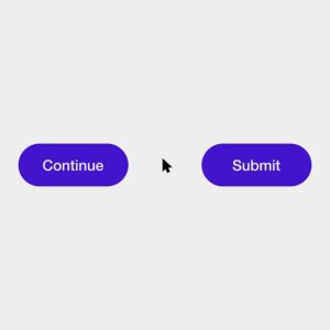
For example, I watched a run where an agent reached a form that had two buttons labeled “Continue” and “Submit”, chose the wrong one, and the run stalled. This wasn’t the agent’s fault, it was bad UX.
I design products at Deck, where we build infrastructure for computer-use agents: software that logs into websites and operates them the way a person would, clicking, typing, and navigating. Most of the portals our agents work in were never designed to be automated. They’re utility accounts, vendor payment pages, and back-office tools with no API, built for humans and often barely built for those.
Watching thousands of agent runs across these portals has taught me something I didn’t expect. The places agents get stuck are almost never exotic. They’re the same places people get stuck. The difference is that people hide it.
Humans glance over bad design. Agents can’t.
Steve Krug observed years ago in Don’t Make Me Think that people rarely figure out how a website works. They muddle through: guessing, backtracking, and moving on once something seems to work. That muddling is a kind of invisible labor, and it hides an enormous amount of design debt.
When a button label is ambiguous, a person tries one and sees what happens. When a menu only appears on hover, a person waves the mouse around until it shows up. When a session expires halfway through a form, a person sighs, logs back in, and starts again. When they truly can’t work something out, they ask a coworker who learned the trick last month. None of this shows up in analytics as failure. It shows up as “time on task,” or not at all.
An agent can’t do most of that. It doesn’t remember the trick from last month. It can’t lean over and ask someone. It can retry, but it can’t intuit which of two identically labeled buttons the designer meant. So the debt that humans quietly absorb becomes visible, run after run, as a step that broke.
That’s what makes agents unusually honest testers. They don’t experience frustration, but they surface every place where a design depends on someone guessing right.
Where agents get stuck
The failures cluster into a handful of patterns. None of them will surprise a designer. That’s the point.

1. Labels that only make sense if you already know. “Manage,” “Edit,” and “Settings” all on one page. Icon-only buttons with no text. Two buttons that both say “Continue.” Don Norman’s idea of signifiers, the cues that tell you what an action will do, is the whole game here. When the signifier is missing, a person relies on memory or experimentation. An agent has neither.

2. State that hides. Menus that exist only on hover. Buttons that are disabled with no explanation of why. Status communicated purely by color. Jakob Nielsen’s first usability heuristic, visibility of system status, was written for people. It turns out to be the first requirement for agents too. If the interface doesn’t say what state it’s in, nothing operating it can know.

3. Interruptions. The cookie banner, the “rate your experience” modal, the promotional interstitial that appears on the third visit, the chat widget that slides over the submit button. Every one of these is a small tax on human attention. For an agent, an unexpected overlay can be the end of the run. It’s a useful mirror: if an interruption is disruptive enough to stop a machine cold, it’s worth asking what it costs your users.

4. Time. Sessions that expire mid-task. One-time codes that time out before they arrive. Pages that log you out “for your security” during a multi-step process. People tolerate these grudgingly. For any automated or delegated work, they’re often the single largest source of failure, and they’re a sign that the system was designed around a single short visit, not around real work.

5. Success that doesn’t announce itself. This is the one I care about most, because it’s the one I spent years on in payments. You submit a payment and land back on the dashboard with no confirmation. Did it go through? A person checks their email, or refreshes, or calls someone. An agent has to decide whether the task is done, and if the interface doesn’t say so clearly, it can’t. In my last piece for UX Collective I argued that trust in financial products lives in moments like this. Agents make the same argument from the other side: a task isn’t complete until the interface tells you it is.
We’ve seen this before: the curb-cut effect
None of this is new territory. It’s accessibility.
Many of the fixes that help agents are the same ones that help people using screen readers, keyboard navigation, or magnification: real text labels instead of icon-only buttons, states that are announced instead of implied, predictable structure, no content that only exists on hover. The WebAIM Million report has documented year after year how common these basic gaps are across the web’s most visited homepages.
Angela Glover Blackwell called this pattern the curb-cut effect: design for people with specific constraints, and you end up improving things for everyone. Curb cuts were built for wheelchairs and are used by every parent with a stroller. Clear labels and visible state were required for assistive technology, and they help every user who’s tired, rushed, or new.
Agents are, in a sense, the newest constrained user. They push in the same direction accessibility advocates have been pushing for decades, which is a welcome thing. The work that makes a portal legible to an agent is largely the work we should have done for people already.
Where the analogy breaks
It would be too clean to say “design for agents and humans benefit.” Three places it gets complicated:
Some friction is supposed to be there. I’ve written before about graduated ceremony: matching the weight of a confirmation to the consequence of the action. Some steps exist precisely to slow things down. A confirmation before moving money, a second check before deleting an account. Making those steps “agent-friendly” by removing them would be a mistake. The better answer is to design for delegation explicitly: let a person grant an agent specific, limited authority up front, so the ceremony happens at the moment of handoff rather than disappearing altogether.
Not every site wants agents. CAPTCHAs and bot detection exist for real reasons: fraud, scraping, abuse. Some services have a legitimate interest in knowing whether a human is present. “Agent-legible” and “agent-permitted” are different questions, and designers will increasingly have to answer the second one deliberately rather than by accident.
Agents also fail where people don’t. They can misread a visually dense layout a person would parse instantly, or miss context a human gets from the surrounding page. So agent failures aren’t a perfect proxy for human failures. They’re a strong signal, not a verdict. When an agent and a person both struggle in the same place, that overlap is where I’d look first.
Using agents as a usability lens
You don’t need to build for agents to learn from them. A few questions I now ask in every design review, whether or not an agent will ever touch the screen:
- Could someone who can’t guess complete this? If the path depends on trying both buttons, it’s a labeling problem.
- Is every state visible without hovering, remembering, or color alone?
- Does success announce itself? If the only proof a task finished is that nothing went wrong, it hasn’t been designed yet.
- Does each interruption earn its place? If it would stop a machine, it’s costing your users more than you think.
- Does this flow survive a real task’s length? Timeouts designed for a single quick visit break every longer process, human or not.
For years, usability testing meant recruiting people and watching them muddle through. That’s still irreplaceable. But there’s now a second kind of tester showing up on our interfaces, one that never muddles, never guesses, and never quietly absorbs our mistakes. The places it gets stuck are a map of the design debt we’ve been asking people to carry.
Trust has always lived in the details. Agents just stopped letting us get away with skipping them.
References and further reading
- Steve Krug, Don’t Make Me Think
- Don Norman on signifiers, The Design of Everyday Things
- Jakob Nielsen, “10 Usability Heuristics for User Interface Design”
- WebAIM Million annual accessibility report
- Angela Glover Blackwell, “The Curb-Cut Effect,” Stanford Social Innovation Review
- “The hidden UX of payments” in the UX Collective
Agents struggle with the same bad UX we do was originally published in UX Collective on Medium, where people are continuing the conversation by highlighting and responding to this story.