

An idea kept coming back in most branding projects I worked on in the past years: what if we embedded data in the logo? Real data, not symbols of information but information itself. Data that meant something for the client, that would shape the logo and create something unique. This idea came back again earlier this year and I knew I had to look deeper. So I spent time this summer searching for examples of logos embedding data: I went through graphic design books, online first (thanks to the amazing Internet Archive digital library) and in person in the beautiful reading rooms of the New York Public Library. Here is what I found.
First, there are a lot of logos out there, so let’s define what we’re looking for. Logo is simple: it’s the main mark for a brand. So no illustration, branded visuals or patterns. No data visualization that is not a logo, as iconic as it could be. Data is a bit harder: most logos carry meaning but very few carry data. So I found two questions that helped me make the distinction. First: does the data exist outside of the logo? Mercedes’ three-pointed stars symbolizes motorization on land, on water, and in the air. This is purely symbolic, not information. The second question: if the information changes, does the logo change? Here we can look at the Mexico City Metro logo by Lance Wyman: Wyman explains that his M logo is heavily inspired by the path of the first metro lines. One could almost use the logo to navigate the early metro system, but while that might have been true at some point, the system expanded a lot and the logo never changed. A great logo inspired by data but not a logo embedding data. So with these two questions in mind let’s start from the beginning.
Network
The oldest logo embedding data I could find dates from 1903. And while the word data itself might not be appropriate for its time, it definitely fits our definition. In the Bay Area in the early 1900s, while consolidating local streetcar lines under one company, the general manager realized that the overall shape of the network resembled “an old-fashioned key — three “handle loops” covering Berkeley, Piedmont and Oakland, a “shaft” formed by the ferry pier, and “teeth” representing the ferry berths at the end of the pier.” This simple shape, a stylized map, became their logo and their name: the Key Route. As the service expanded, the logo was redesigned as a flying key, and while the name and the key symbol remained, the ability to read the routes was lost. We went from a logo embedding data (the different streetcar routes) to a symbolic logo where the key was just an abstract reference to the past. In 1946 when the network was sold and buses were added the key entirely disappeared, remaining only in the company name.

I couldn’t find other examples from this time, but I have the intuition that this wasn’t the only company showing their network as part of their logo. I can imagine railroads or utilities using schematics of their early networks (not symbols of it, but the real schematics) as the most concrete sign of the company. Both helping their customers navigate the network and showcasing their imprint on the world.
Scientific Representation
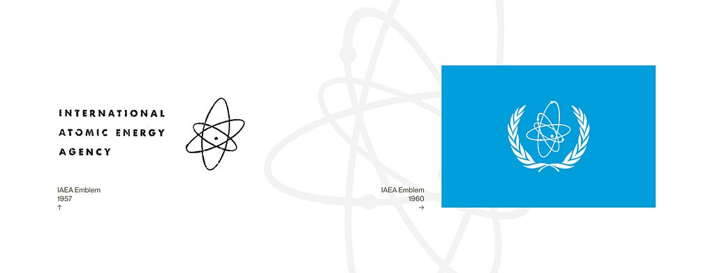
The history of logos carrying data seems to follow the history of information design. While the development of railroad and utilities made network diagrams common, the 20th century brought to the general public the visual language of physics and chemistry. One notable logo from this time is the International Atomic Energy Agency (IAEA) emblem. Designed in 1957 during the atomic age, it is a rare example of a logo evolving from symbolic to specific scientific representation.
Its first iteration displayed three orbits (representing electrons) orbiting a dot (representing a nucleus): the symbol of the atom. Not a specific atom, but the idea of an atom. A year later, someone at the agency noticed that it might not be the right logo for the IAEA: indeed the atom with three electrons is lithium, commonly associated with hydrogen bombs. Not ideal for the world’s “Atoms for Peace” agency reporting to the United Nations. A quick fix was proposed: adding an electron to turn it into beryllium. But in the process they also added dots for each electron and varied the orbit thicknesses. They turned a symbolic representation of the atom into an specific scientific visualization of beryllium. The final emblem was adopted in 1960, adding the blue color and olive branches from the United Nations.
In 2025, inspired by Mark Howarth’s protein alphabet, Leonora Martínez-Núñez created the logo for the Visualizing Biological Data international conference (VIZBI). The scientist turned professional scientific illustrator designed and animated each letter of the logo to represent the diverse topics discussed a the conference. My chemistry knowledge is extremely limited so take it with a grain of salt, but as the letters move away from the protein alphabet visualization they appear more abstract and symbolic, as if the logo was caught in the middle of a transition from specific protein visualization to a more abstract and general representation of chemistry.
From IAEA to VIZBI there is a tension between the symbolic representation and the scientific visualization. Fundamentally logos are signs, we don’t expect them to be accurate scientifically, but we expect them to be accurate symbolically. This can be resolved either by moving toward more symbolic and abstract representations, like the VIZBI logo, or by letting the specific representation function as a symbol, as shown by the history of the IAEA logo.

Charts & Graphs
With the advent of the personal computer, and later the internet, data took a more important place in our lives. Manipulating data became common in most office jobs, from very simple Excel spreadsheets to more complex analytics and visualizations tools. Data quickly became synonymous with information and control, a symbol of the computing era. It’s not surprising that in the early 2010s we see a series of logos showcasing data in its natural habitat: charts and graphs. A notable example is the 2013 logo for the Council on Australia Latin America Relations (Coalar) by the Australian agency Churchward/Melhuish. The logo combines the C from Coalar with a donut chart representing the land mass of Australia and Latin American countries. The largest ones like Brazil (green), Australia (yellow), or Argentina (blue) stand out while the smallest countries are shown at 1% of the land mass each. In a similar vein Open Knowledge logo, designed by Johnson Banks in 2014, combines two radial histograms showing how open data is in 72 countries. Both graphs (open in green, closed in red) form an O for Open.
But why stop at one dataset when the logo could evolve to show multiple? The 2015 APEC CEO Summit Philippines identity by Havas h2 encodes several datasets in different variations of the logos through radial bar charts. While it could be read as an abstract series of circular lines around its wordmark, everything is actually measured and plotted. The length of each line represents the main information: the default logo showcases GDP per capita, but other versions show population, land area (again), broadband or foreign investments among others. And their starting angle is plotted against the geographical location of each country, creating a series of unique charts.

Some logos push the abstraction further, bridging the gap between charts and data visualizations. Brand Bar (formerly Café Design) logo for Oppenheim law firm in Hungary is a good example: it takes the partners’ names, counts the frequency of each letter, and visualizes it in a unique radial shape. The result, one main logo for the firm and a series of unique ones for each partner, is quite beautiful and fully abstract: no legend, no explanation next to it, just a series of dots.
But all of these charts as logos are quite mysterious. They look like charts without legends, data without labels. One could say that unlike real charts these logos aren’t here to carry information but to convey the idea of information. And I would agree but I also think that what these logos truly want is to be deciphered. That creates an interesting tension: the data, while shaping the logo, only appears as a second layer that very few people will understand. “There is always that aha moment! ‘Oh so this is what this is telling us.’” comments the Chief Operating Officer of the APEC CEO Summit about the logo. To truly carry data, to fully serve their function, these logos need to be explained.
Dynamic
Around the same time, companies realized that data isn’t static numbers but rather massive information flows. One logo from the era stands out: the 2015 logo for Seagate by Goodby Silverstein & Partners. The data storage company’s rebrand was based on the idea of a “Living Logo”, showcasing “data as a living, vibrant thing that powers human invention, culture and advances”. Representing data storage isn’t easy and obviously Seagate doesn’t own the data it’s storing, so they partnered with Getty Images to turn its S monogram into an infinite flow of tiny images. The press release proudly explains that the logo can tell “an infinite number of visual stories about topics such as technology pioneers and breakthroughs in human history”. But the images are so small and there are so many of them, that their content (the data itself) doesn’t really matter. It’s impossible to tell what is shown here without zooming in (which an older version of the site apparently allowed). Again, this logo is about the idea of data rather than the specific data displayed. It’s about the quantity and the movement of data. There is something very 2010s in this logo, an optimism in technology and in infinite data feeds.
Designers realized that this logic can also be applied to design itself: a few parameters are enough to generate an infinite number of logos. They saw there an opportunity to explore new types of identities. As Irene Van Nes explains: a generative “identity can reflect the world it is living in, and adapt in response to its input.” But most generative identities don’t actually embed real data, they play with parameters without carrying information. One of the earliest generative identity based on real data I could find is the Visit Nordkyn logo by Neue Design Studio from 2010. The logo system is entirely driven by wind direction, wind speed and temperature from the Norwegian Meteorological Institute, updated in real time. The logo reflects how the weather influences life on Nordkyn, located in Norway’s northernmost county. 16 years later, it still lives on today, evolving every few minutes with the climate on Nordkyn.

Earlier this year, Base Design produced the visual identity for the 2026 Adelaide Biennial of Australian Art around a central element: Protocol, a programmatic typeface developed in collaboration with the foundry Counter Forms. The typeface mutates every 6 hours during the biennial, “driven by live environmental data: temperature, wind speed, surface pressure in Adelaide, and the S&P 500, a global barometer of financial markets.“ And “on the final day of the exhibition, the system reaches its programmed demise: bent, fragmented and exhausted.” The 109 iterations of the font are available for download here with the data source for each. Evolving following the font, the logo changed 109 times throughout the biennial. A fixed layout and yellow color made it recognizable, regardless of the typeface changes. In both logos, the data creates small variations around a main theme. Compared to Seagate, these logos are in a slow motion, one evolving every few minutes, the other every couple hours. They carry data at a slow pace, reflecting on time and their environment rather than on the speed of technology.
Beyond meaning and symbolism, dynamic logos are very hard to use as logos. Their dynamic nature is in direct contradiction with the reality of how logos are displayed: from physical such as engraved on hard drives for Seagate or printed on large exhibition posters for the biennial, to digital where social media platforms don’t allow profile pictures to be animated. So they need to be stabilized, frozen in their motion, stopped in a static state to truly exist. Ironically, I can’t show them animated in this article either. Most people will never experience their data flowing.
Cartographic
120 years after Key Route, cartographic logos are more common. And since I started researching for this piece a question stuck with me: are map based logos embedding data? Maps are a series of data points (coordinates) represented in a 2D space, so any logo including a map is by definition embedding data. But looking at probably the most famous map logo — the United Nations Emblem from 1946 — I’m having doubts. How far can you simplify a map before it’s not a map anymore? I’m not sure, but I know two logos that were recently released that might help us understand.
The first one is the Saaristo logo by Bond from 2025. Saaristo is an archipelago in Finland made out of 40,000 islands. The designers picked 8 whose shape resembles the letters of the word Saaristo. They printed and meticulously redrew the islands outlines creating a unique wordmark. Beyond the neat idea of a logo shaped by the place it represents, I think what makes it beautiful is that the rugged contours convey the scale of the islands and the natural elements shaping them such as wind, water and ice. Beyond data points, it makes us feel these islands.

Earlier this year, FutureBrand presented a new identity for The Brazilian Amazon with the goal of creating a unified destination brand for a very diverse region of 28 million inhabitants. At the core of the region, and its identity, is the Amazon river. Looking at the twists and turns of the river they got inspired and created a full alphabet. The Amazonia logo flows, from one part of Brazil to another. But unlike Saaristo, each shape has been freely redrawn, most probably to improve legibility and visual balance. This is a great logo, very clearly inspired by the shape of the river, but it’s a stretch to say that it carries data.
From Norway, to Finland, and Brazil, tourism logos are heavily represented here, as if embedding data grounded logos into the places they promote. As if embedding data allowed logos to carry a piece of these places with them.
To conclude let’s look at the ancestor of modern logos: heraldry. While coats of arms are neither logos nor what we’d call data, they are interesting to look at in this context. At a glance, heraldic signs feel very symbolic, built around specific rules and a limited number of patterns and colors, akin to today’s generative logos. But looking at it a bit longer reveals that it’s more complicated. Today’s historians agree that most of the symbols used are actually arbitrary identifiers. And some actually encode data. For example cadency is a system identifying descendants in a family. In England the first son is represented by a label of three points, the second by a crescent and so on, one symbol for each son. And the heir drops the label when the father dies. The mark literally updates when the information changes. For those who can decode them, coats of arms truly embed real world information. Data is encoded into some of oldest signs we have around us.
I wanted to write this short history because in all the books cataloging logos I could find, data didn’t seem to be a category. For example Yasaburo Kuwayama’s Trademarks and Symbols from 1973 sorts more than 3000 logos into visual subjects — what the logo depicts. And more recently plenty has been written on generative logos — how the logo is created. But nothing on what the logo encodes. For more than a hundred years, beyond meaning, logos have embedded information and I think it’s time to look at it as a proper category.
Sources
- Per Mollerup, Marks of Excellence
- Irene Van Nes, Dynamic identities : how to create a living brand
- Yasaburō Kuwayama, International Logotype
- Yasaburō Kuwayama, Trademarks & symbols
- Jens Müller & Julius Wiedermann, Logo Beginnings Logo Modernism
A short history of logos made of data was originally published in UX Collective on Medium, where people are continuing the conversation by highlighting and responding to this story.