Designers, leave your intimidation at the door.
Nobody becomes a designer because they’re excited about compliance. It sounds boring and it sounds like someone else’s job. Most of us are glad it is.
But what if we’re wrong? What if no one else is doing it? What if no one else cares?

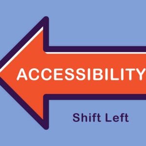
Picture a project as a timeline, with design on the far left and launch on the right. Accessibility problems are cheapest to fix on the left, before anything is built. Software teams call this ‘shifting left,’ which just means catching problems earlier, closer to the design, so developers and testers aren’t cleaning up later. We’re already standing on the left. If we care about our users and their experience, doesn’t that make our part of it our job?
That sounds like a big ask, so here’s the reassuring part: nobody starts as an accessibility expert. The people you picture as experts began just as unsure as you are, and they got there one small thing at a time. I still struggle with imposter syndrome on occasion.
Recently I listed everything I’d done around accessibility over the past year. I expected a short list. I was shocked to see how long it ran: writing design system component guidance, identifying rendering issues in a mobile view, posting article links and accessibility presentation invites in a shared channel, a change to who gets invited to which meeting, a note to a colleague about a gap in their training plan. None of it felt big when I did it.
These small actions add up over time. I never set out to build a body of work. I’d have been too intimidated. If someone had shown me everything I’d end up doing, I would have said no, because I didn’t trust that I had the skills or that it fit nicely in my job description.
Accessibility feels overwhelming when you look at the whole thing. It’s manageable when you only have to finish the one thing in front of you, and your skills grow as you go.

Getting started seems hard and complicated
Let’s be honest about how accessibility usually reaches us. It arrives as a mandatory standards document full of acronyms, success criteria, and conformance levels, written in the formal register of people who write standards. It’s dense, it’s prescriptive, and just when you’ve got a handle on it, a new version appears. It’s not designer-friendly language, and I don’t blame you if you cringe when you first see it.
It’s natural to feel that you are already behind and completely overwhelmed, wondering where to even start.
There’s a reason it feels this way. In my experience, most designers were never taught accessibility. Design programs often treat it as an afterthought, and that carries into the field, where it’s rarely prioritized. It isn’t intuitive either. Unless someone deliberately puts it in front of you, there’s no reason you’d know where to start. So if you feel behind, that isn’t a personal failing. Nobody handed you the map.
The good news is that you don’t need to understand all of it to do your first useful thing.
And you’re not starting from zero. In my earlier article, You already know how to make it accessible, I mapped design to the accessibility standards behind them. Most of it turns out to be good design with a legal name attached. You probably have more skills and knowledge than you think, and just didn’t know what it was called.
Baby steps, start small
One of the most useful things you can do is take your first step.
Take the part of the requirements we designers actually control, like readable text, buttons that are easy to hit, clear labels, and helpful error messages, and start there. That’s shifting left in practice.
https://medium.com/media/27e349f0d9b24fc055f1d9549ba3c3a5/href
Experience it for yourself
Nothing converts a skeptic like experiencing your own design the way some users do.
Put the mouse away and finish a task with the keyboard.
Turn on a screen reader for ten minutes.
You’ll see focus jump somewhere nonsensical, a button that announces itself as just “button,” a popup you can’t escape. Worst of all, you’ll hit a dead end where your task cannot be completed.
That’s hard to argue with. It turns a requirement into “my design is broken for some people.”
Ever see someone use a screen reader?
I’ll never forget the first time I experienced it. It was mind-blowing how quickly someone can navigate through content and hear it read rapid-fire. In that moment, my empathy grew by leaps and bounds. I heard what a screen reader does with a page that’s technically compliant. The images all had alt text, so on paper everything passed. In reality, the descriptions repeated what the page already said in words, so the same information got read out again and again. Supremely annoying.
Nothing on the checklist was failing, and the experience was still awful.
That’s the part a checklist can’t teach you. Passing isn’t the same as working, and the only way to know the difference is to experience it.
One caution: ten minutes with a screen reader shows you what your design is doing. It won’t teach you what it’s like to rely on one every day. When you can, learn from the people who do.
I haven’t seen AI fix this, and I think we’ll need people testing manually for a long time to make sure the experience works for the people using it.

Small things to try
Pick any one. Any one. There’s no right way to get started, just get started!
Squint at it.
Step back from your screen, or literally squint. What disappears? Light gray text, pale buttons, and faint borders go first. If you have to strain, someone else does too. A free contrast plugin in your design tool will give you a pass or fail if you want a second opinion, and you don’t need to understand the math.
Turn your screen to grayscale.
Can you still tell which field has an error, which chart line is which, which tab is selected? If color was doing all the work, add a second signal, like an icon, a label, or a pattern.
Dim your brightness and take it outside.
Open your design on your phone in the sun, or drop the brightness way down. This is how a lot of people use your product every day.
Put the mouse away and tab through one flow.
Can you always see where you are? Does it move in an order that makes sense? Can you get out of every popup? You’re feeling your design without a mouse, so there’s nothing technical to learn.
Rewrite one error message.
Say what went wrong and how to fix it, in words a person would use. “Invalid input” becomes “Enter a date like 04/15/2026.” Then check that the message doesn’t rely on red alone.
Try it with one thumb.
Hold your phone in one hand and try to reach and tap everything. Tiny icons, crowded links, and buttons in the far corner become obvious fast.
Zoom way in.
Make your text much larger, or zoom the page in. Does anything overlap, get cut off, or become unusable? This catches a surprising number of mobile problems.
Turn on a screen reader for ten minutes.
VoiceOver on Apple devices and TalkBack on Android are already built in. On a Mac, Command+F5 turns VoiceOver on. For TalkBack on Android phones, look under ‘Accessibility’ in Settings.
You don’t need to be good at it. You just need to hear your design once. Listen for anything it says twice or notice what it skips.

Take it to the next level
Once you’ve tried a few small things, here are two ways to go further:
Turn understanding into advocacy. The next skill is advocacy, and it works better with evidence than with principle. Bring concrete examples of what real users hit. A passing report doesn’t tell you what it sounds like. Check your analytics, because if most of your traffic is on mobile, mobile is your main experience and not an edge case. Point out that shifting left saves time and money: problems found early are cheaper than problems found after launch. Then bring your developers in early, before anything is built. Show them what you found and what a person would experience, and work out the fix together. Designers set the direction, but it takes the whole team to deliver it. And invite other disciplines to add their own expertise and finishing touches.
Learn by volunteering. You don’t have to wait for a project at work. Since accessibility is rarely taught, the best way in is to be around people who do it. Some of the fastest learning happens outside your job, where the stakes are lower and everyone around you is there to learn too. And if it doesn’t fit in your job description, it doesn’t have to.
- Accessibility Internet Rally (AIR). Knowbility’s AIR is an accessibility hackathon, and it needs designers. Teams are paired with a nonprofit, artist, or community group and spend about ten weeks building an accessible website for them, with a mentor’s guidance and training along the way. Registration for the next rally opens the week of September 28 and runs through December 21, and the work itself runs from January through May.
- WordPress Accessibility Day. A free, 24-hour virtual event run by volunteers. You can just attend and soak up the sessions, or you can volunteer. Past volunteer roles, like session moderator and emcee, don’t require any coding.
- Global Accessibility Awareness Day. It falls on the third Thursday in May, with community events all over the world. It’s a good nudge to spend a day trying something.
I’ve volunteered at Knowbility’s AccessU conference, and I learned in two ways. I picked up a lot from the lectures and workshops. But some of the best learning happened in conversation with the people who attend. The accessibility community is open and generous with its time. They welcome newcomers, and they want more people involved, so the barrier to entry is low. Volunteering also gives you plenty to add to your list.

Keep a list
This kind of work is nearly invisible while you’re doing it. Nudging a process, fixing an accordion component’s interaction, asking for accessibility tools, sharing an article, engaging with your accessibility or QA folks — none of it feels like an accomplishment at the moment. I only saw how much I’d done because I happened to look back to see what wins I have for this past year and saw that I had more accessibility points than I realized.
So keep a running list, and add a line whenever you change something, share something, or unblock someone’s work. (This is good practice for all your work — tracking your accomplishments).
Start with one small thing
Nobody starts as an accessibility expert. You become one by finishing small things, one after another, until one day you’re the person people ask. You never decided to be. It just happened. Our part of this is our job, and it turns out to be one you can learn a small thing at a time.
Don’t try to take on the whole thing at once. Pick one thing from the lists above and do it this week. Finish it, then pick the next. The more you do, the easier it gets.
So what are you waiting for? This is your personal invitation! Come join us in making digital products work better for everyone.
Nobody starts as an accessibility expert was originally published in UX Collective on Medium, where people are continuing the conversation by highlighting and responding to this story.