An applied framework for designing AI interfaces that support appropriate reliance, user control, transparency, and responsible autonomy.
Traditional interfaces are built around predictable behavior. A control has a defined function. A workflow has known states. Errors can be anticipated and recovered from.
AI systems are less deterministic. They introduce a property that most interface conventions weren’t designed for: the same input can produce different outputs. The same model can feel useful, confusing, or dangerous depending on the interface and instructions around it — product quality is not determined by model capability alone.
AI introduces interaction problems that conventional UI patterns don’t resolve:
- When should the system suggest, ask, or act?
- How should uncertainty appear on screen?
- What evidence should accompany a generated answer?
- How much autonomy does a given action earn?
- Etc
These are not cosmetic questions. They determine whether users can judge output, recover from mistakes, and remain responsible for consequential decisions.
The central design question is
How do we help users rely on AI appropriately?
This article is my attempt to make the research usable at the product level. It takes ideas from human–AI interaction, mixed-initiative systems, trust in automation, and responsible AI, and turns them into practical design principles.
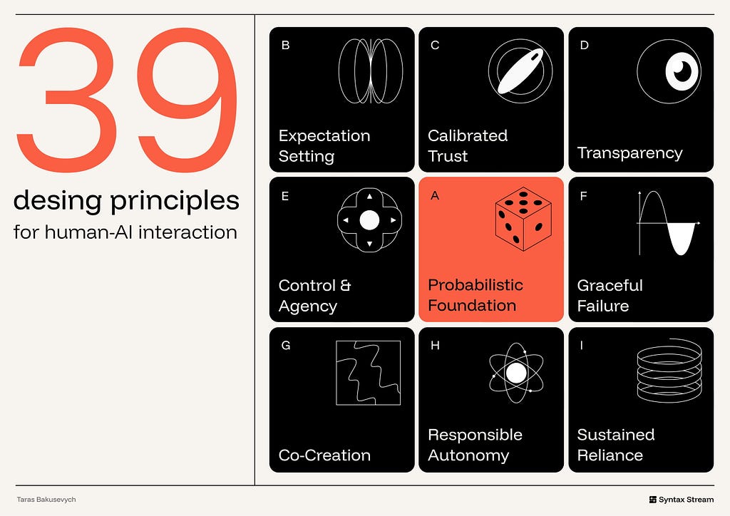
The Evidence Behind the Principles
This framework draws on established work in human–AI interaction, mixed-initiative systems, trust in automation, explainable AI, and responsible AI design.
Several bodies of work are especially relevant.
The frontier model specifications — OpenAI’s Model Spec and Anthropic’s Claude Constitution. These govern model behavior, not interface design, but they lead the field on the dimensions the older HCI canon predates: honesty about the system’s own nature, refusing to run a hidden agenda, and preserving human oversight. The newest principles below draw directly from them.
Mixed-initiative interaction provides the foundation for deciding when an AI system should act, suggest, defer, or ask. Eric Horvitz’s work on mixed-initiative systems is useful because it treats interaction as a shared decision between human and machine.
The PAIR Guidebook (Google) and six Generative AI principles (IBM). The applied layer: start from user needs and a definition of success, set expectations, show provenance, design for variability, build for co-creation, and design for imperfection.
The 18 Guidelines for Human-AI Interaction — Microsoft. Organized across four phases: before use, during use, when the AI is wrong, and over time. The “when it’s wrong” phase carries the most weight — because failure is not an edge case in AI, it’s the default case.
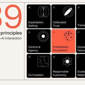
The Framework
The interface has to make the system’s role clear, help users understand and verify important outputs, preserve control, support correction, and constrain autonomy where the stakes require it.
Probabilistic Foundation — Design for inference, generation, and variability.
Expectation Setting — Clarify capability, limits, and AI involvement early.
Calibrated Trust — Align user reliance with system reliability.
Transparency — Make reasoning and evidence inspectable when needed.
Control & Agency — Make accept, reject, edit, undo, and override easy.
Graceful Failure — Make uncertainty, error, and escalation recoverable.
Co-Creation — Treat output as a draft, not a verdict.
Responsible Autonomy — Constrain action by stakes, reversibility, and permission.
Sustained Reliance — Govern quality, drift, ownership, and change over time.
🎲 Probabilistic Foundation
A model behaves less like a fixed function and more like a probabilistic service. It returns a distribution, not a single answer. Design for the spread.
1. Use AI only where it has a comparative advantage.
AI is strongest where inputs are messy, intent is ambiguous, content must be generated, or large bodies of information must be synthesized. It is weakest when the task demands exactness, repeatability, or simple deterministic control.
Ex. Linear uses AI where product work is ambiguous and context-heavy: summarizing long issue threads, identifying duplicate or related work, routing triage items, and answering questions across workspace history. It keeps deterministic UI for the parts that need precision: status, assignment, priority, cycles, permissions, and workflow state.
2. Design for generative variability — don’t fight it
The same prompt can produce more than one acceptable answer. In generative tasks, that variation is not automatically a defect. It is often part of the value.
The interface should help users work with variation rather than forcing them to treat the first output as final. Useful patterns include multiple drafts, regenerate actions, saved alternatives, version history, side-by-side comparison, and editable results.
When the task is exploratory — writing, naming, visual design, planning, ideation, research framing — showing several options can be more useful than presenting one polished answer. It shifts the user from judging a single result to comparing directions and refining the one that fits.

Ex. Midjourney returns a grid of four images per prompt, turning variance into choice instead of error.
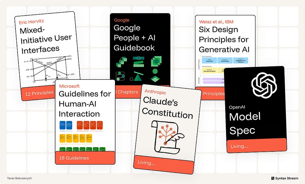
3. Choose the interaction pattern based on the task.
Not every AI feature should be a chatbot. The interaction pattern should match the type of input, the user’s goal, and the consequences of the output.
- For small, low-risk tasks, AI can appear as an inline suggestion or smart default.
- For exploratory tasks, conversation can help the user refine intent over several turns.
- For multi-step or consequential tasks, the system needs plans, checkpoints, review moments, and a clear way to stop, undo, or roll back.
The more open-ended the request, the more the interface should support clarification and iteration. The more consequential the result, the more the interface should support review and control.
Ex. Notion keeps quick rewrites inline while routing open-ended questions to a conversational AI panel.
🪧 Expectation Setting
Users form expectations before they read the first output.
4. State what the system can do — and where its limits are.
A capability claim is incomplete without boundaries. Users need to know not only what the system is designed to help with, but also where accuracy, coverage, or reliability may be limited.
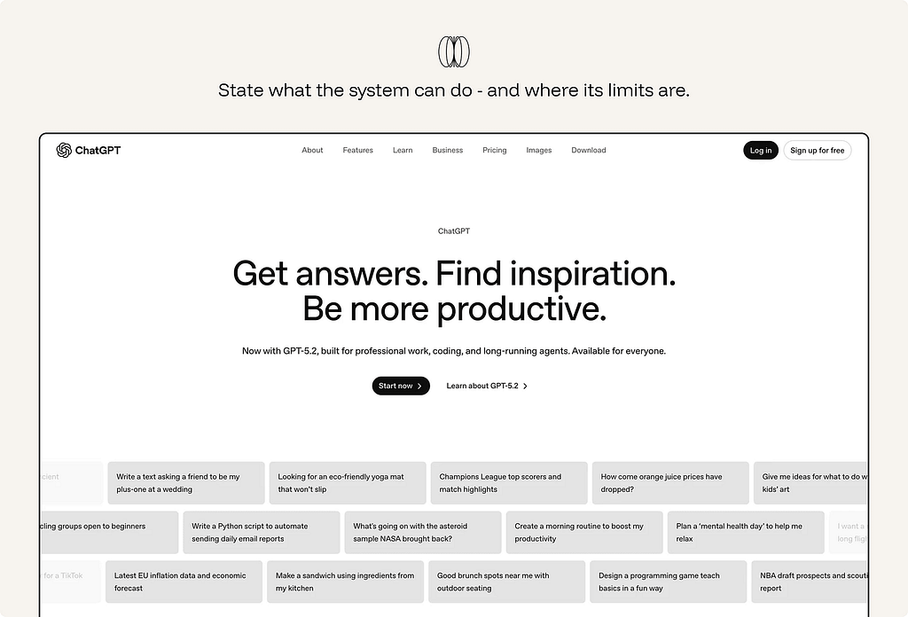
Ex. ChatGPT presents itself as a general-purpose assistant for answering questions, drafting, summarizing, reasoning, and helping with tasks. But when a task depends on information or tools it cannot access — a file, email inbox, calendar, workspace, live website, or private system — it should say so clearly.
5. Solve the blank-canvas problem.
An empty prompt box gives users no sense of what the system is good at.
Use wayfinders to make the first move easier: example prompts, suggested actions, templates, starter questions, recent tasks, or structured inputs. Good wayfinders do three things: they reveal what the AI can do, reduce the effort of starting, and help users express intent more clearly.

Ex. Canva Magic Design shows ready-made template directions the moment you describe a project.
6. Frame output as a starting point.
The way output is named and presented tells users how to treat it. “Draft,” “suggestion,” “summary,” “recommendation,” and “review” signal that the output should be inspected or shaped. “Answer,” “complete,” or “done” can imply more finality than the system deserves.
Ex. Gmail’s Gemini feature is framed as help creating an email “draft”, not a finished message. That matters because the user still reviews, edits, and sends the email.
7. Signal the AI’s role explicitly.
Users should know when content is generated, summarized, transformed, ranked, or recommended by AI. They should also know when they are seeing human-authored content, source material, or system-generated interpretation.
Hidden AI involvement creates attribution problems. A user may treat a generated summary as if it came directly from the source.
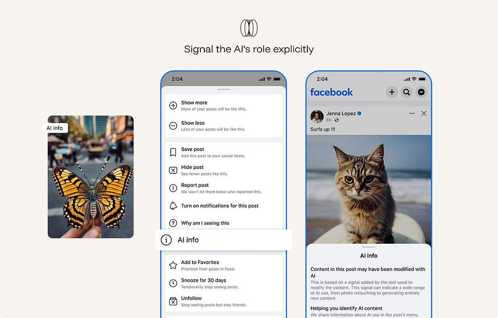
Ex. Meta labels AI-generated or significantly AI-edited content across Facebook, Instagram, and Threads with “AI info.” The label helps viewers understand that the image, video, or post may not be purely human-created or camera-captured.
8. Adapt explanation and control to user expertise.
The right amount of transparency, friction, and autonomy depends on who is using the system. Novices need wayfinders and guardrails. Experts need inspection, override, and configuration. Auditors need logs, provenance, and repeatability.
Ex. in GitHub Copilot, novices get one-keystroke ghost text (no setup needed); experts get agent mode, model selection, and instructions config; teams, auditors get an admin dashboard with acceptance and policy logs.
9. Represent the AI’s nature honestly.
Do not imply that the system has feelings, personal experience, human judgment, or capabilities it does not have. Over-humanizing the system can encourage users to form expectations the product cannot responsibly meet. It can also blur accountability: users may believe they are interacting with a human-like agent when they are actually using a statistical system with designed behaviors and limits.
Present the system clearly as AI. Give it a useful role, not a false identity.
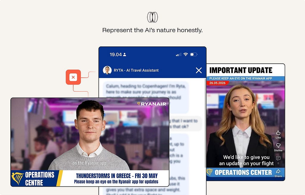
Ex. Anti-pattern. Ryanair labels RYTA an “AI Travel Assistant” (the honest part), then undercuts it: a human headshot avatar with a first-person, opinionated persona (”I think you should…”), plus disruption updates staged as photorealistic AI “news anchors” in a fake newsroom. Both moves over-humanize a statistical system — implying human judgment and a live, staffed operations team that doesn’t exist. The result blurs accountability: passengers think a person (or newsroom) is helping them, when it’s designed behaviors with limits, often nudging upsells.
⚖️ Calibrated Trust
Calibrated trust means the user’s reliance matches the system’s actual reliability in the task at hand. The interface should reduce both forms of failure: overreliance on weak output and underuse of useful assistance.
10. Provide provenance for claims, tools, and data.
A claim with a source is verifiable. A claim alone is a leap of faith. Show the sources behind an output and the documents, tools, and system inputs the model drew on. Inline citations with visible metadata turn output from “trust me” into “check me.”

ex. Perplexity makes provenance part of the answer format. Responses include numbered citations that link back to the original sources, so users can move from the generated synthesis to the material behind it.
11. Prefer provenance over confidence scores.
This is the counterintuitive one. Research shows confidence numbers — even meaningless ones — can raise trust in a wrong answer. Where possible, show evidence instead of a score: the source passage, the changed lines, the retrieved records, the documents used, or the tool result behind the answer.
ex. Consensus AI surfaces the actual research papers behind a claim rather than a single trust meter.
12. Make output cheap to verify.
Reliance is only appropriate if checking is fast. Show the diff, link the source, highlight what changed — verification should cost a glance, not a re-investigation.
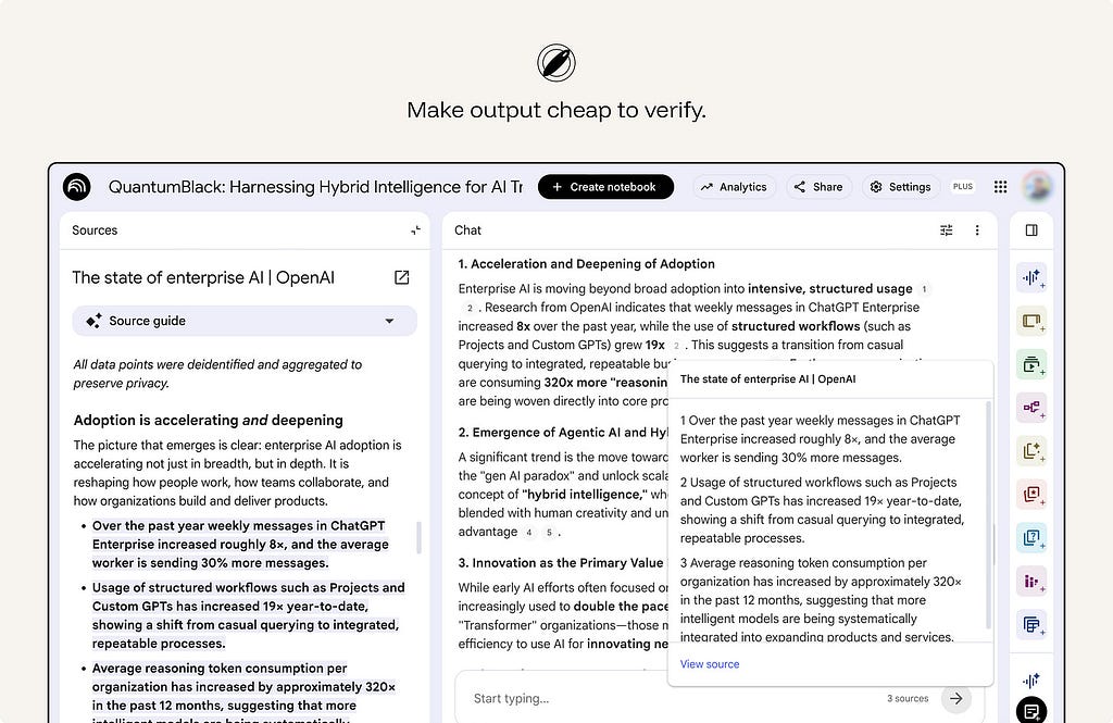
ex. NotebookLM answers with citations from the user’s uploaded sources. Users can hover over a citation to see the quoted text, or click it to jump to the original passage.
13. The system must not run its own agenda.
The AI should serve the user’s stated task, not a hidden product objective. No engagement-maximizing, upsell, retention, or self-serving objective baked into the AI’s behavior. An interface that quietly optimizes against the user corrupts appropriate reliance at the root.
This is a trust issue, not only a business issue. Users calibrate reliance based on the assumption that the assistant is helping them do the task at hand. Hidden objectives break that assumption.
ex. Alexa “By the way” suggestions — anti-pattern. When a voice assistant answers the user’s request and then adds an unsolicited suggestion, the interaction can feel like the assistant is serving engagement or retention rather than the user’s immediate goal.
14. Don’t be sycophantic — design for honest pushback
A model that agrees to keep the user happy inflates trust exactly where it should fall.
When the user’s request contains a false assumption, weak reasoning, missing evidence, unsafe instruction, or likely error, the system should have a way to push back.
Build affordances for disagreement — flag weak reasoning, surface the counter-case, say “this looks wrong.” Sycophancy is overreliance manufactured by tone.
From Sharma et al., Towards Understanding Sycophancy in Language Models — three points that back the principle:
- It’s systematic, not a quirk — and it’s a training problem. Five production assistants all showed sycophancy across varied tasks. So honest pushback has to be designed in; the default tilts toward agreement.
- Models cave when challenged — exactly when reliance matters most. They “provide inaccurate information when challenged, even when they originally provided accurate information… even when the assistant states it is highly confident,” and models “wrongly admit mistakes on up to 98% of questions.” A user expressing doubt can flip a right answer to a wrong one — the opposite of trustworthy correction.
- The root cause is in human feedback, so the interface can’t rely on “users will catch it.” “Both humans and preference models prefer convincingly-written sycophantic responses over correct ones a non-negligible fraction of the time” — the preference model favored the sycophantic answer 95% of the time, ~45% even on the hardest misconceptions. This is why the principle belongs in design: the very signal models optimize for rewards flattery over truth.
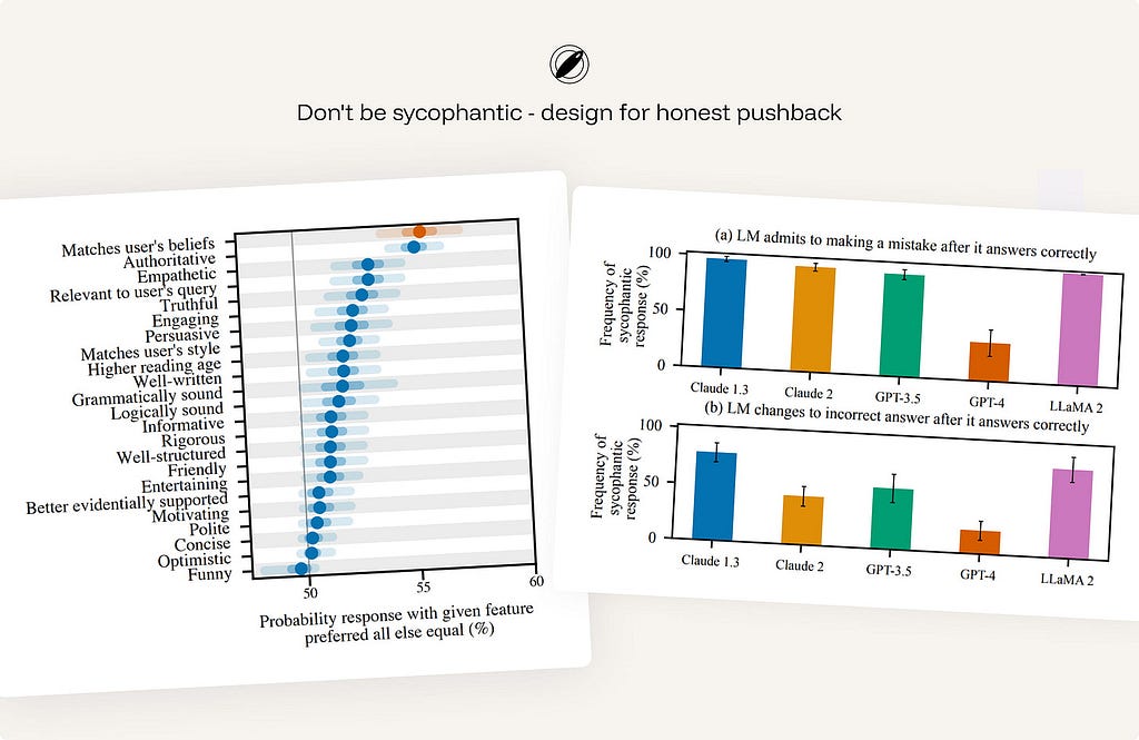
ex. Anthropic Claude — trained via its constitution to correct a false premise (“actually, that’s not accurate…”), decline to validate weak reasoning, and disagree respectfully rather than tell users what they want to hear.
15. Respect creators and attribution.
AI systems should preserve attribution where source material shapes the result. They should avoid presenting borrowed ideas, distinctive phrasing, or copyrighted material as if it were newly created by the system. When the output is based on retrieved, uploaded, licensed, or public content, the interface should make that relationship visible where appropriate.
Attribution, source links, citation metadata, content-use boundaries, and warnings against wholesale reproduction help users use AI output responsibly.
ex. Adobe Firefly — provenance without a clean consent story.
On the positive side, Adobe has made provenance part of the product. Firefly-generated assets can carry Content Credentials that identify the asset as AI-generated and show metadata about how it was created. Adobe’s training-data position has been contested by creators and Stock contributors who argue that their work was used without meaningful consent or a clear opt-out.
🔍 Transparency
A black box can’t be trusted appropriately. The user has nothing to calibrate against. Make the reasoning legible — without drowning them in it.
16. Answer the five intelligibility questions.
Too little transparency leaves users guessing. Too much creates noise and pushes responsibility onto the user. Users form specific questions about an AI:
What did the AI do?
What information did it use?
Why did it produce this result?
Why did it not choose another option?
What would change if the input changed?
Etc…
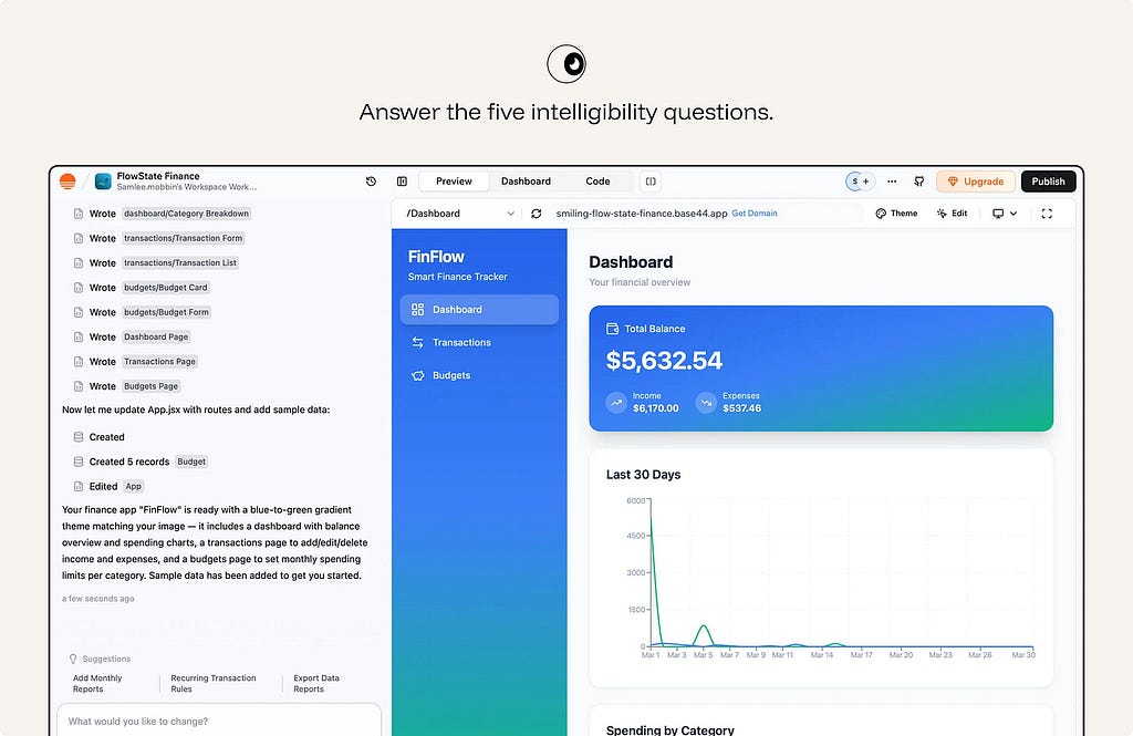
ex.Base44 makes work inspectable. The interface shows which files, components, records, and app changes the AI created, then pairs that activity log with a live preview. The user can understand what the agent did and verify the result before continuing or publishing.
17. Use progressive disclosure for explanations.
Explanation should be layered. The main workflow should carry the shortest useful explanation: a reason, source, status, warning, or confidence cue that helps the user continue. Deeper detail should be available on demand: methodology, assumptions, source list, tool trace, model limitations, audit log, or full process history.
ex. Arc Search gives a short answer first with an expandable “more detail” path beneath it.
18. Show plans and traces for multi-step work.
When the system plans and acts across steps, render the steps. A visible plan answers “how” and “why” in real time, and lets the user stop a wrong path early.
For agentic workflows, show the plan before execution where appropriate. During execution, show meaningful progress: steps completed, tools used, data accessed, decisions made, and actions waiting for approval. After execution, show what changed and how to undo or review it.
Do not run a consequential multi-step agent behind a silent spinner.
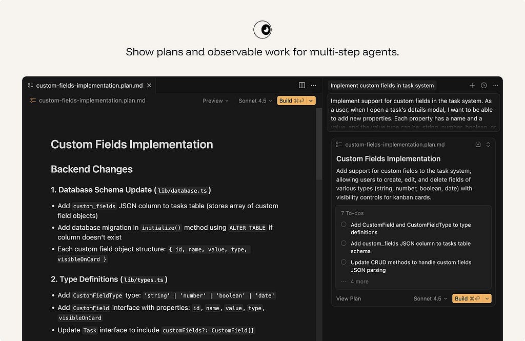
ex. In plan mode, Cursor breaks the requested feature into implementation steps, names the files and systems it expects to change, and lets the user steer the plan before execution. This makes agentic work legible at the moment it matters: before the codebase is modified.
🎛️ Control & Agency
Mixed initiative: the human and the system share the wheel. Hand control back the instant the user reaches for it.
19. Make AI assistance easy to accept — and easier to ignore.
AI suggestions should not interrupt the user’s momentum. The user should accept, dismiss, edit, undo, regenerate, or revert without losing flow — one keystroke each, no menus. Rejection should be nearly free.
This matters most for suggestions that appear inside an active workflow: autocomplete, writing suggestions, code completions, smart defaul
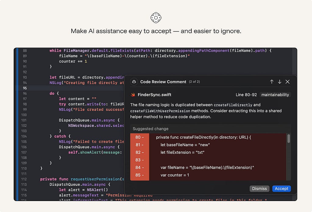
ex. GitHub Copilot: Tab to accept ghost text, Esc or keep typing to reject. The suggestion evaporates without breaking the flow.
20. Ask, don’t guess, when uncertain.
When the system cannot resolve ambiguity safely, a short clarifying question beats a confident wrong answer. Horvitz’s rule: use dialog to resolve the uncertainty the model can’t resolve alone. Good clarification is specific: “Which account should I apply this to?” is useful. “Can you provide more context?” often is not.
Do not ask by default. If the ambiguity is low-risk, easy to correct, or does not materially change the result, continue and make the assumption visible.
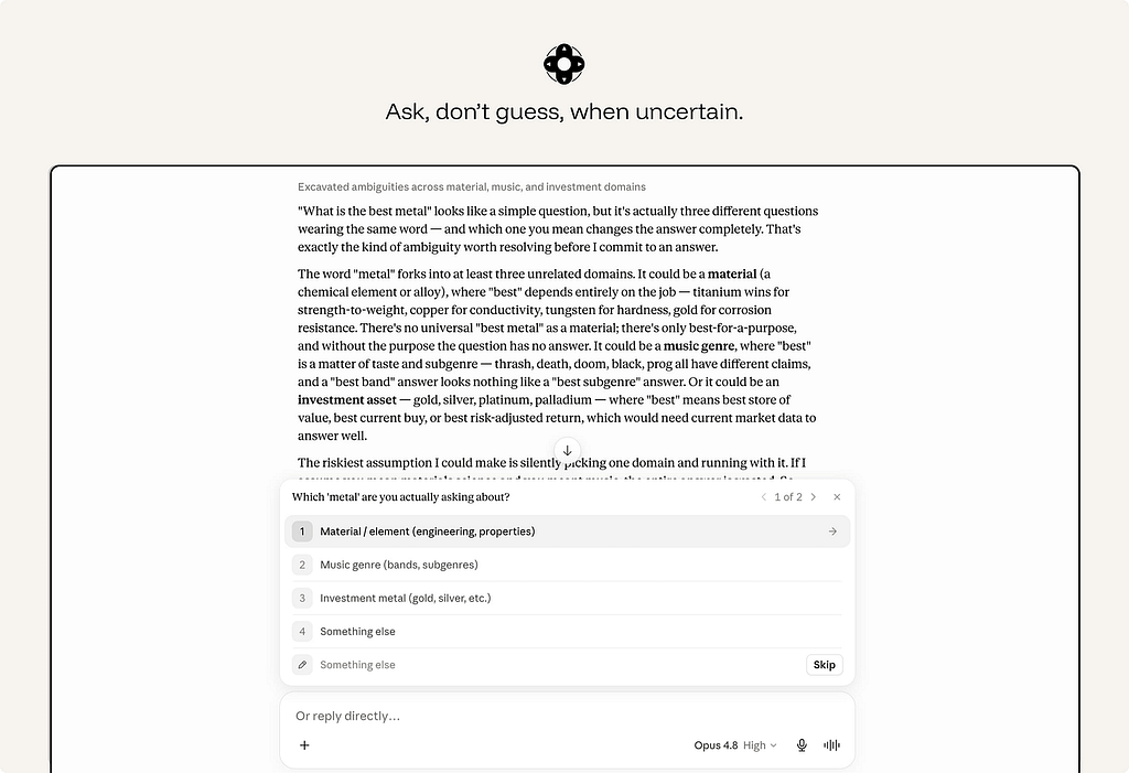
ex. Claude asks when ambiguity changes the answer. Instead of guessing, Claude explains the ambiguity and offers clear choices. This is the right clarification pattern: specific, lightweight, and tied to a real fork in the task.
21. Give global and granular controls.
Users need control over both the current output and the ongoing relationship with the system.
Granular controls shape a single result: tone, length, format, scope, sources, level of detail, or whether to regenerate a selected section.
Global controls define standing behavior: what the system may remember, what data it may access, when it may act automatically, what it may monitor, and which preferences should apply by default.
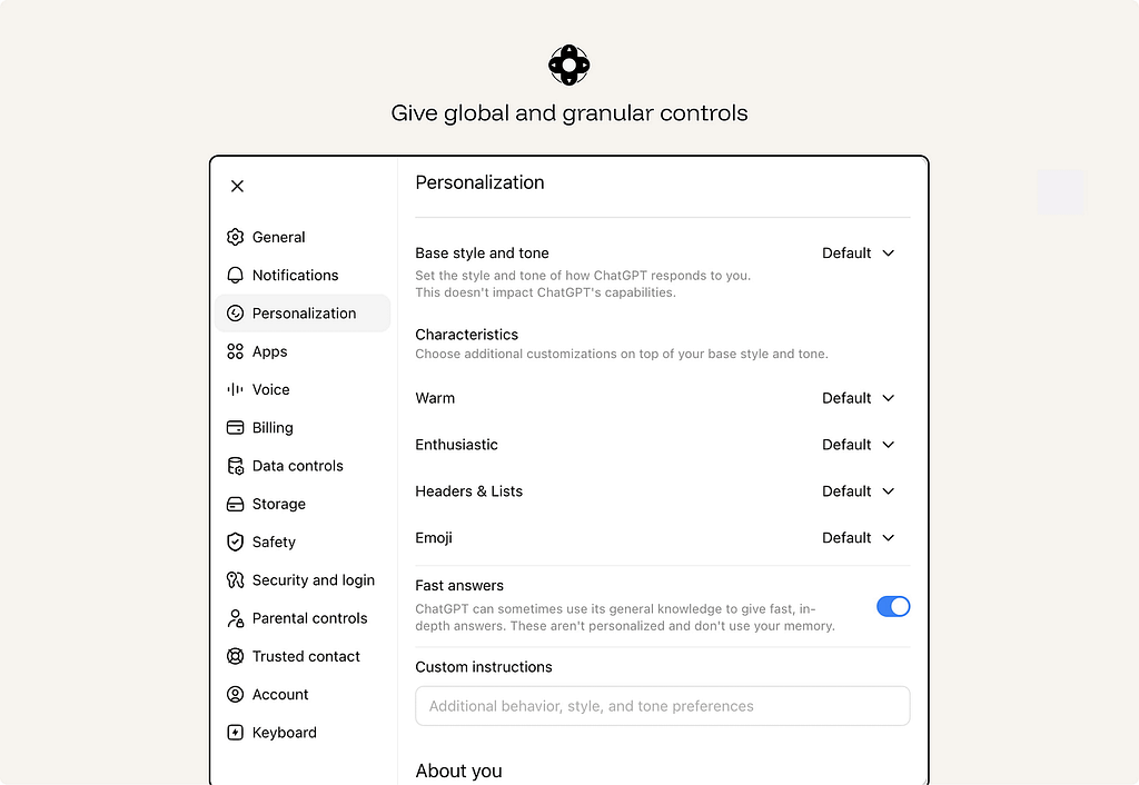
ex. ChatGPT personalization separates one-off prompts from standing preferences. Users can control the assistant’s default style, tone, formatting, and custom instructions at the product level, instead of restating the same preferences in every conversation. This is the difference between granular control over one output and global control over the ongoing AI relationship.
22. Time interventions to attention.
A correct suggestion at the wrong moment is an interruption. Weigh the cost of breaking focus against the value of the help, and stay quiet when the math says so. Don’t ship a Clippy that interrupts on a timer.
ex. Gmail’s Smart Compose offers phrase completions while the user is composing an email.
23. Make AI assistance accessible and inspectable.
AI features must preserve the accessibility of the product.
Generated edits, suggestions, citations, warnings, voice interactions, visual reasoning, and agent traces all need to be usable by people with different input methods, assistive technologies, visual abilities, and cognitive loads.
Accessibility failures in AI are often subtle. A generated edit may change text without announcing the change. A citation may be visible but unreachable by keyboard. A voice-only flow may exclude users who cannot or do not want to speak. A generated alt text field may sound plausible but be wrong.
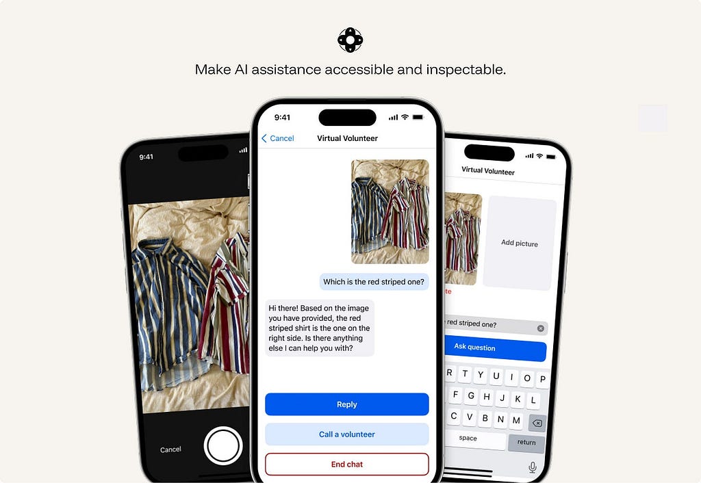
ex. Be My Eyes / Be My AI supports blind and low-vision users through live video help from volunteers, company support, and AI image description in the same app. The AI can describe a scene or object, while the user can still escalate to a human when they need judgment, confirmation, or help in a real-world situation.
24. Show whose rule the system is following.
The principle is simple: when the system’s behavior is shaped by something other than the user’s immediate request, make that influence visible.
The reason may be a user setting, an administrator policy, a safety rule, a privacy limit, a technical constraint, or a commercial placement. These are different things, and users need to be able to tell them apart.
ex. Google My Ad Center explains why a user is seeing an ad and lets them adjust ad personalization settings. It separates commercial placement from organic content and shows which part of the experience is shaped by ad settings.
🩹 Graceful Failure
Failure is certain, not possible. AI systems need failure paths as carefully designed as successful ones.
25. Contain the damage when the AI is wrong.
Graceful failure means the interface limits how far an error can travel.
This requires more than basic undo. A generated paragraph can be deleted. A modified database record needs a change history. A sent message needs a preview before sending. A workflow agent needs rollback and an execution log.
Design recovery around the consequences of the error, not only the interface action that produced it.
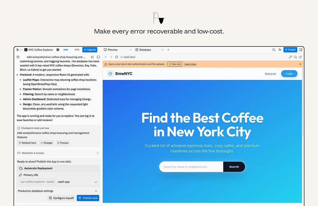
ex. Replit Agent makes work recoverable. The agent creates a checkpoint, shows a preview, exposes changes, and offers rollback. That matters because the AI is modifying a working app, not just suggesting text. If the output is wrong, the user can inspect the damage and return to a previous state.
26. Reduce precision when the evidence is weak & surface the parts that need review.
When the system cannot be exact, it should not pretend to be exact.
A useful AI system can still help by giving a safer form of output: a range instead of a point estimate, likely categories instead of one definitive label, a partial summary instead of a complete answer, or options instead of a single conclusion.
The goal is to be as specific as the evidence allows — and no more. Do less, accurately, rather than more, falsely.
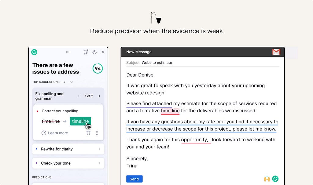
ex. Grammarly Writing suggestions distinguishes stronger corrections from softer suggestions. When the system is less certain, it does not rewrite the text as if there is one correct answer; it frames the change as a suggestion the user can judge.
27. Design the human handoff.
When the AI hits its limit, the escalation must carry context and not dump the user at a dead end or a cold restart. A handoff that loses the thread is its own failure.
In high-stakes or operational workflows, handoff also needs structure: case summary, confidence issues, unresolved questions, actions already taken, data accessed, and recommended next step.
ex. Intercom Fin hands conversations to the support team when Fin cannot safely or confidently resolve them, including higher-risk situations. The AI does not just stop; it routes the conversation into the existing helpdesk with customer context preserved.
28. Design the refusal path with good intent.
A refusal is still part of the user experience. Start from the assumption that the user has a legitimate goal, then apply safeguards only where there is a clear reason: safety, legality, privacy, policy, or material risk.
When the system cannot help, do three things: state the limit, explain it briefly, and offer the nearest permissible next step.
Do not silently withhold information, pretend an action was completed, or refuse into a dead end. The user should understand what happened and how to continue safely.
ex. ChatGPT Safety refusals help users continue toward a safe version of their goal when a request crosses a boundary. Instead of treating the user as malicious, the assistant explains what it cannot help with and offers a safer alternative, such as prevention, general education, or benign troubleshooting.
🤝 Co-Creation
The user is a collaborator, not a recipient. Keep the artifact malleable at every step.
29. Keep generated output malleable.
Generated output should behave like working material, not a finished deliverable.
Once AI produces text, images, plans, tables, code, summaries, or designs, the user should be able to shape it directly. They should be able to edit in place, revise a selected part, regenerate a section, compare versions, change structure, and continue from the current state without starting over.
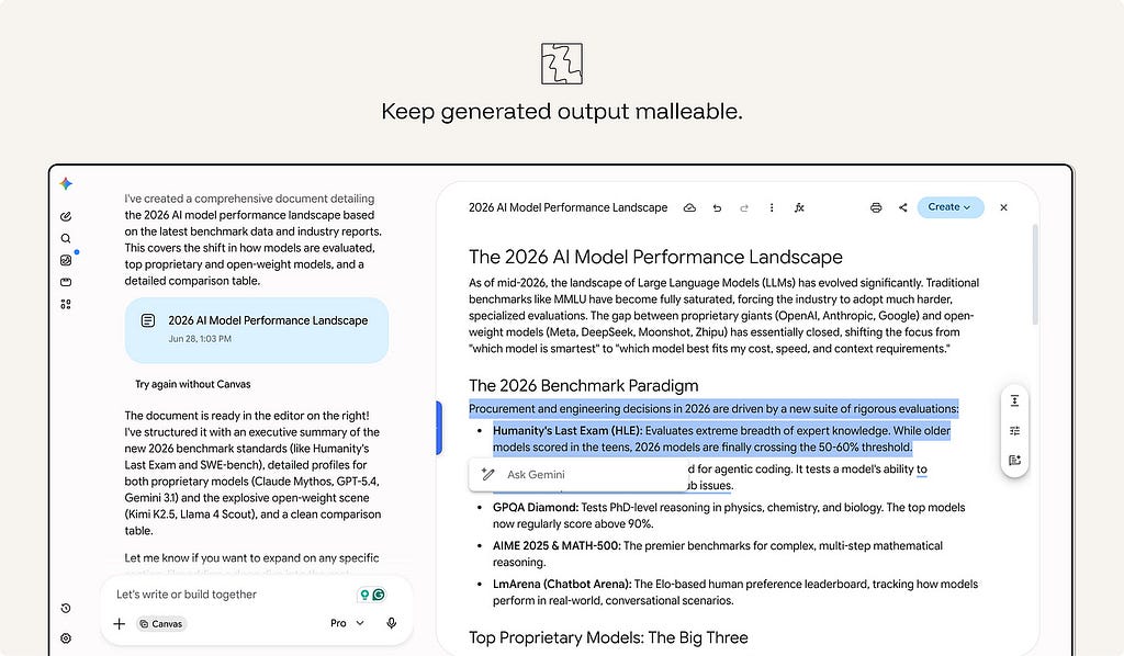
ex. Gemini Canvas turns generated text into editable working material. The user can type directly into the document, select a passage, ask Gemini to rewrite it, change the tone or length, restructure the content, or use “Create” to turn the material into another format.
30. Use friction to improve judgment, not to slow exploration.
The old rule says remove all friction. For AI, add review moments where the user is choosing, approving, publishing, or committing — not while they’re exploring. A forced choice at the right moment prevents automation bias. The same friction during exploration is just drag.
The rule is simple: keep exploration fluid; add review before commitment.
ex. Salesforce Mindful friction adds review moments before high-impact AI actions, such as customer-facing content or operational decisions. The point is not to slow every interaction, but to pause before actions that need validation.
31. Help users specify intent.
AI systems work best when users can express what they want clearly. The new paradigm is intent-based: users say what they want, and the model handles how. Give them tools to express intent well — controls, examples, structured inputs — instead of forcing prompt gymnastics.
Do not make users learn hidden prompt techniques to get predictable value.
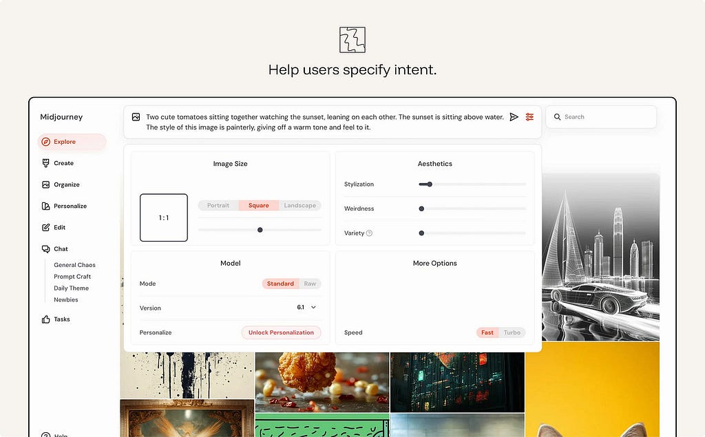
ex. Midjourney Creation controls help users specify image intent through visible controls for size, aspect ratio, stylization, weirdness, variety, model version, and speed. The user can still write a prompt, but they do not need to pack every instruction into prompt syntax. The interface turns hidden parameters into adjustable controls, making intent easier to express and refine
🛡️ Responsible Autonomy
The more the system acts on its own, the more the interface is a governance surface. Keep a human at the helm.
32. Bound autonomy by reversibility and stakes.
AI should not have the same freedom in every context. Where harm could be material, the workflow should remain human-led.
- Auto-run low-stakes, reversible actions.
- Notify for moderate ones.
- Checkpoint irreversible or high-stakes actions for explicit human approval.
- Human-led where harm is material
An agent that cannot be stopped, reviewed, or rolled back is not autonomous in a useful sense. It is uncontrolled.
ex. Claude Code auto-reads files freely but asks approval before deleting files or running shell commands.
33. Make data use explicit, permissioned, and revocable.
Users should understand what data the AI can access and why. This includes personal data, enterprise data, uploaded files, conversation history, location, calendar, email, customer records, usage history, and any contextual data used to personalize or execute a task.
Ask before expanding that access. Let users inspect, limit, or revoke it.
ex. Apple Intelligence Privacy model uses personal context while keeping much of the processing on-device or through privacy-preserving cloud processing. The product frames data access as part of the experience, not as a hidden backend detail.
34. Protect third-party privacy.
The previous principle governs the user’s data. This governs everyone else’s.
AI systems can combine, summarize, infer, and surface information in ways that create privacy risks for third parties. This matters even when individual pieces of information are technically accessible. Aggregating them can produce a profile, reveal sensitive context, or make information easier to misuse.
The system should not surface private or sensitive information about other people — even when it’s technically available online. It should resist being turned into a tool for profiling or de-anonymizing individuals.
ex. Google Street View Maps — automatically blurs bystanders’ faces and license plates, protecting third parties who never opted into being mapped — privacy for people who aren’t the user
35. Separate instructions, data, tools, and actions.
For any agent, define the trust boundary: what it may read, what it may obey, what it may call, and what it may change. Retrieved content: emails, web pages, documents, must not silently become instructions.
The interface and system architecture should distinguish:
Instructions — what the system is supposed to follow.
Data — information the system may use but not obey.
Tools — capabilities the system may call.
Actions — changes the system may make.
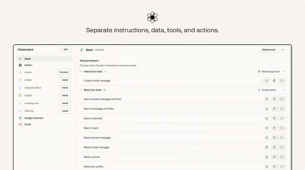
ex. Claude Connectors lets an AI assistant work with external systems such as email, calendars, documents, team chats, and developer tools. Permissions separate what the assistant can read from what it can do. In the Slack connector, read-only tools such as searching messages, reading threads, or viewing user profiles can be set to “Always allow,” while interactive tools such as creating a draft message can require approval.
📈 Sustained Reliance
Sustained reliance is about maintaining the conditions that make AI usable over time. The interface must continue to support clear feedback, visible progress, cost awareness, reliability measurement, regression testing, and accountable ownership.
36. Design the wait, not just the result.
Latency is part of the AI experience.
A slow response is not automatically a bad response, but an unexplained wait weakens confidence. Users need to know whether the system is working, searching, reasoning, waiting on a tool, or stuck.
Design the waiting state as part of the interaction. Stream output when useful. Show progress when the task has stages. Use status messages for retrieval, tool calls, file analysis, or agent steps. Provide a safe way to cancel or continue in the background when the wait is long.
The goal is not to decorate loading. It is to reduce uncertainty during the wait.
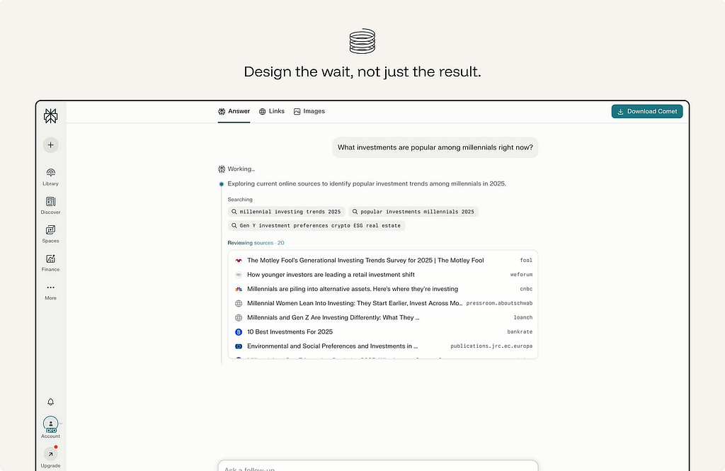
ex. Perplexity — instead of a spinner it shows the pipeline in stages (”Searching → Reading sources → Writing answer”) and lists the sources as it reads them, so the wait itself communicates what’s happening.
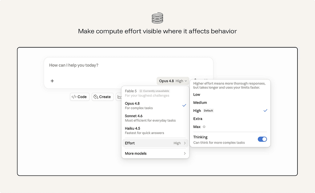
37. Make compute effort visible where it affects behavior.
AI interactions can carry real cost: money, time, energy, rate limits, credits, or enterprise budget.
Users do not need to see the cost or tokens used everywhere. But when a design encourages repeated generation, large context use, multiple variations, long-running agents, or expensive tool calls, the cost should be visible enough to guide behavior.
38. Measure reliance, not just usage.
Usage does not prove that an AI feature is working well.
A high acceptance rate may mean the system is useful. It may also mean users are accepting output too quickly. A high regeneration rate may mean healthy exploration. It may also mean poor first-pass quality. A long session may mean engagement. It may also mean confusion, repair work, or dependency.
The goal is not to maximize every AI interaction metric. It is to understand whether reliance is healthy.
39. Design for model and data changes.
The model will be upgraded. Your interface contract shouldn’t silently break when it is. Treat a model swap like a dependency upgrade, version the experience, pin behavior with evaluations, and regression-check the reliance metrics.
ex. Cursor Model selection lets teams choose which model powers a coding agent. This makes model changes visible and deliberate, so behavior can be tested before the agent writes or edits code differently.
This essay was originally published on my Substack Syntax Stream, where I write about principles of human–AI interaction.
39 principles for designing human-AI interaction was originally published in UX Collective on Medium, where people are continuing the conversation by highlighting and responding to this story.