Productive computing has had a number since 1982. Every AI product missed it, and agents missed it by minutes.
Editor’s note: I wrote this article from firsthand experience as a founder and engineer.
Disclosure: I co-found Chrome extensions that sit next to major AI chat products. Some of the user behaviors described below are behaviors I see across our install base, and I have a commercial interest in AI products having UX gaps that third-party tools can fill. I disclose this upfront so readers can factor that bias into the arguments.
Last week I was watching a session recording from one of our power users. She typed a question into an AI chat, hit enter, and the spinner appeared. She switched tabs. Forty-three seconds later she came back, scrolled up, scrolled down, and typed the same question again. She had no idea the first answer had already finished.
This is the waiting problem.
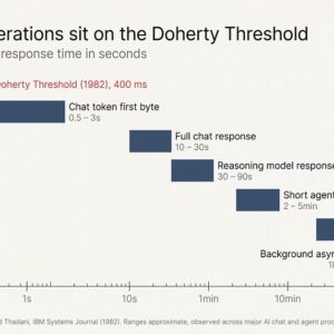
We have known the productive number for human-computer response time since 1982. Walter J. Doherty’s IBM Systems Journal paper, summarized in Laws of UX as the Doherty Threshold, put it at roughly 400 milliseconds. Below the threshold, users stay in a productive loop with the system. Above it, attention leaks. Above ten seconds, attention typically leaves the screen entirely.
Every major AI product launched in 2023 and 2024 missed that threshold. The agent generation that shipped in 2025 and 2026 missed it by minutes.
The number we already knew
The Doherty Threshold has been a published, citable, named number in HCI for over forty years. The original IBM paper measured user productivity at terminals and found that response times under approximately 400 milliseconds produced not an incremental gain but a different mode of work. Users stopped waiting for the machine and started thinking with it.
Brad Myers’s 1985 CHI paper, The Importance of Percent-Done Progress Indicators for Computer-Human Interfaces, extended the principle to longer operations. Myers showed that for any operation outside the immediate-response window, the appearance of progress was nearly as important as the progress itself. A percent-done indicator reduced perceived wait time, reduced anxiety, and increased completion rates. He did this work decades before “perceived performance” became a phrase product teams used in standups.
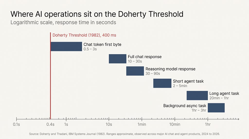
Jakob Nielsen condensed the lineage into three response time limits: 0.1 seconds (system feels instantaneous), 1 second (user’s flow of thought is preserved), and 10 seconds (user attention typically leaves the task). Bruce Tognazzini’s First Principles of Interaction Design restated the same envelope with one addition: when you cannot deliver the response, deliver the feeling of progress.
This is not obscure design history. Every undergraduate HCI syllabus covers it. Every modern operating system, every modern game engine, every modern web framework has internal teams reading these papers.
AI product teams launched without applying them.
What AI products actually do while you wait
Open any major AI chat product and watch what happens between the moment you hit enter and the moment the answer starts to arrive.
In the best case, you get token streaming. The first token shows up in a second or two and the rest stream in over the next ten to thirty seconds. This is the closest any AI product gets to Doherty’s threshold, and it works for the same reason Myers’s progress indicators worked. Streaming is the appearance of progress, delivered continuously.
In the median case, you get an ellipsis or a pulsing dot. No estimate. No percent complete. No indication of whether the model is still thinking, the API is overloaded, or the network has died. The ellipsis can last two seconds or two minutes. There is no way to tell from the affordance alone.

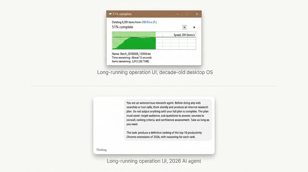
In the worst case, which is now the default for agentic mode, you get nothing usable at all. You hand the agent a multi-step task, it shows a status line that updates every twenty or thirty seconds with one fragment of internal monologue, then it goes silent for minutes while it does something in a sandboxed environment you cannot inspect.
Don Norman’s principle of feedback is one of the oldest in HCI. The system must tell the user what it is doing, continuously, in a form the user can understand. The agent generation of AI products has roughly two feedback states. Thinking, and done. There is no middle.
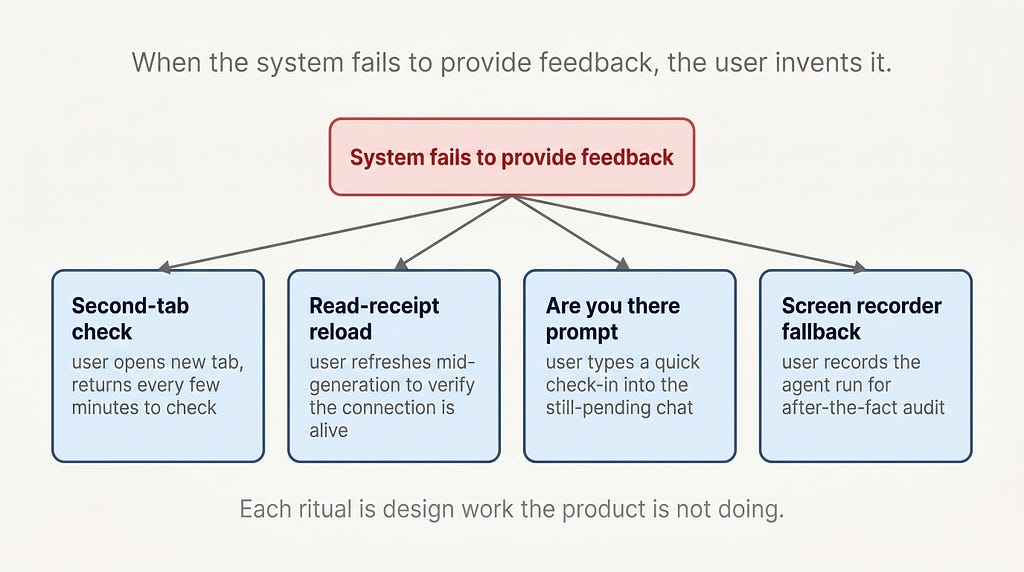
The rituals users invented to compensate
When a system fails to provide feedback, users invent feedback for themselves. This is one of the most reliable rules in interaction design, and the rituals AI users have built are now visible everywhere you look.
The most common is the second-tab check. The user submits a long-running prompt or an agent task, then opens a second tab to do something else. Every few minutes they tab back, check the result, then return to the second tab. The mental overhead of this loop is enormous, because the user cannot trust the AI product to tell them when the task is done.
A second is the read-receipt reload. The user refreshes the page in the middle of a long generation to verify that the connection is still alive. This sometimes destroys the in-flight response, which the user then has to reconstruct from memory.
A third is the “is it stuck or just slow” prompt. The user types a quick “are you there?” into a chat that already has a pending response, just to see the system respond and confirm it has not died. This is the AI equivalent of tapping a microphone before a speech.
A fourth, increasingly common among agent users, is the screen recorder. Power users running multi-hour agent operations now run a background screen recording so they can audit what the agent did after the fact, since the agent itself produced no log readable to them in real time.
Maggie Appleton, writing in her Language Model Sketchbook, made a related observation about AI interfaces broadly. When the interface fails to do design work, users do design work to compensate, and the work they do is invisible to the product team measuring engagement. The waiting rituals are the same shape. They are coping behaviors that look identical to product usage when summarized as time on screen.
Why the agent generation made it worse
The chat-shaped AI of 2023 and 2024 produced response times in the seconds to tens-of-seconds range. Annoying, but inside the upper envelope of Nielsen’s 10-second limit.
The agent generation of 2025 and 2026 produces response times in the minutes to hours range. A browser-controlling agent doing research can run for forty minutes. An asynchronous task queue can return three hours after submission. A multi-step coding agent can spend twenty minutes editing files in a sandbox.
These operations are not in the same response-time category as a chat reply. They are in the same category as a long compile, a video render, a large file copy, or a database migration. Software has had design conventions for these operations for forty years.
Long-running operations get:
- A persistent progress affordance, visible from outside the originating window
- A time-remaining estimate, updated continuously
- A completion notification, surfaced through the operating system notification model
- A log of what happened, accessible during and after the run
- A way to abort cleanly, with state preserved up to the point of abort
Mark Weiser, writing about the computer for the 21st century at Xerox PARC in 1991, described the goal of mature computing as calm interaction. The system in the periphery of attention when nothing is wrong, surfacing into the center of attention only when the user needs to act. Long-running operations are the canonical case for calm computing. They should fade into the periphery while running and surface a notification when complete.
The agent generation of AI products shipped with neither end of this loop. They neither fade calmly nor surface clearly. They sit in a foreground tab consuming the user’s attention while producing almost no signal, and they finish in a tab nobody is looking at.
The user is left holding the design work the product should have done. They build the rituals. They run the screen recorder. They check the second tab.
What a designed AI waiting UX would look like
A waiting UX that took forty years of HCI lineage seriously would have at least four properties.
Continuous progress, not a pulsing dot. Even for short operations, streaming tokens are not enough. The product should show what the model is doing right now in a form the user can parse. Which step of an agent run, which tool call is active, which file is being read. Brad Myers’s percent-done principle still applies. If you cannot show percent complete, show an ordinal step count or a live list of completed tool calls.
Time-remaining estimates that update. Long-running operations need an ETA, and the ETA should refresh as the model learns more about the task. A wrong ETA that updates is better than no ETA. Forty years of operating systems have shipped wrong-but-updating ETAs and users have learned to read them in context.
Completion notifications routed through the OS, not the tab. Long-running operations should fire desktop notifications through the system notification API. The user’s job is not to babysit a browser tab. Calm computing demands the system find the user, not the user find the system.
A persistent, readable log. Every long operation should leave a log the user can scroll through, with timestamps and tool-call summaries, accessible during the run and indefinitely after. A user should never have to run a screen recorder to audit their own AI session.
None of these are research projects. They are conventions that exist in every modern operating system, every CI/CD dashboard, every video render queue, every cloud function console.
The waiting problem is not a technology problem. The technology has existed for decades. It is a design problem, and the design lineage to solve it was on the shelf the entire time.
This is the fifth piece I have written about a specific HCI primitive that the AI industry shipped without. The earlier four covered the chat box as default paradigm, the forgotten conversation problem, the death of the empty state, and the undo problem. The pattern repeats because the cause is the same. The industry collapsed decades of interaction design lineage into the fastest thing it could ship.
What did your AI workflow learn to do to compensate for the waiting?
About the author: Adi Leviim is a full-stack engineer and product builder with 7+ years of experience shipping commercial software to global audiences. He writes about AI UX, the design reality of building for millions of users, and the gap between AI demos and production AI. Follow him on Medium for essays at the intersection of engineering and design.
The waiting problem in AI products was originally published in UX Collective on Medium, where people are continuing the conversation by highlighting and responding to this story.