
The Figma basics you were told to get right just became the foundation for something much bigger.
I watched a demo recently that I keep thinking about. Brad Frost, who wrote Atomic Design, joined Dominic Nguyen, co-founder of Chromatic, for a live session called Agentic Design Systems in 2026. Kyle, a developer experience engineer from the Storybook team, was running it, showcasing their MCP-in-the-making.
I will be honest with you, as a designer and educator, I watch those kinds of demos out of duty to stay up to date, with the quiet knowledge that I am a tourist in someone else’s world. But this one stopped me.
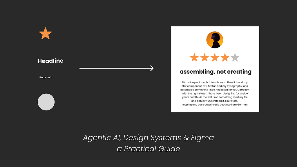
Kyle typed a prompt: “Add a customer reviews component.” No reviews component existed. No design file, no ticket, no Figma frame to point at. The agent found a Star component, Typography, and an Avatar. Read their props, understood their states, composed something new, wrote the code, wrote the tests. The whole thing took less time than it would have taken to write the Jira ticket. The demo was aimed at developers. Watching as a designer, I had a completely different reaction.
The design system is no longer just documentation for developers. It is instructions for a machine.
And the person who decides what components exist, what states they have, what they are called and why, is a designer.
That is not a threat. That is actually the most creative control designers have ever had over what gets built. What Storybook showed was not AI doing design. It was AI that finally knew to use what the designer already built. This is the opposite of vibe coding (no offence, but thanks god!). The agent is not inventing; it is following.
They had me at “assembling, not creating.”
Now, here is the thing: none of what makes this work is new. Semantic tokens, consistent naming, and complete component states.
Design systems people have been preaching this for years. Most of us listened politely and then got back to the actual work, simply because it felt like advice for enterprise giants and complete overengineering for an understaffed team of three trying to ship something by Friday.
The difference now is who is on the other end. Before, a poorly structured design meant a developer had to interpret your intentions. Annoying, but recoverable, and the back and forth occasionally produced something better than either of you planned.
Now the consumer is sometimes a machine and it reads exactly what is there. The design system basics we were always told to get right in Figma are now the foundation for an agentic setup where designers could have more power than ever over the creative outcome, if steered correctly.
Here is why, and what needs to change in your Figma file and process to get there.
Good News: Figma Is Not Dead. Bad News: Your Process will change (but in the best way)
In case someone on LinkedIn with a Lovable playbook written in Canva told you otherwise, you can verify here: isfigmadead.com. Still alive, amazing, let’s carry on.
What actually changes in an agentic setup is structure and where you put your energy. Less time on the full-page mockup that gets looked at once in a handoff meeting, more time on the building blocks. The components, the tokens, the states. Very much a return to Brad Frost’s atoms (who must have felt genuinely delighted watching his life’s work become the infrastructure for an AI workflow).
But here is the part I feel strongly about, and I do not think it gets said enough:
A) The deliverables
The agent builds from the building blocks: components, tokens, styles, and the descriptions you write for all of them. Nothing new, just the good old design system basics done properly.
B) The process to solid deliverables
Good building blocks do not come from a component library maintained in isolation. They come from a designer who saw the whole thing first. I cannot extract a good Star component without having designed a page where the Star had to work, where I saw how it related to the typography around it, how it felt in context, and what it communicated.
The design system is a distilled finding. Designing the whole page is where the finding happened and hence not redundant.
This is not a small distinction. If we treat the library as the starting point rather than the outcome of a creative process, we end up with something structurally correct and visually indistinct, optimised for assembly. This is what we’ve lately seen with Tailwind-based designs, and is the reason most vibe-coded interfaces look so generic. Fast to build, consistent, entirely interchangeable. Perfectly fine for shipping quickly, I use Tailwind a lot for exploration. Not fine if you want a visual language that is actually yours. Different things entirely!

The agentic AI setup will pull towards efficiency.
Towards the library of things, we colour in quickly. That is the natural gravity of a system built for assembly. The designer’s job is to ensure there is something worth assembling in the first place, and to help stakeholders understand why that work is not a luxury.
The creative process is not overhead. It is messy, non-linear, and impossible to automate. The depth of that mess is exactly what makes the distillation we feed the machine worth anything.
Cut it, and you have a fast system producing forgettable output, which costs more in the long run than the time you thought you were saving.
The page serves as a designer’s proof of concept. The components you extract from it are the actual work. But you have to make the page first. Really make it. Not as a deliverable. As thinking.
Quick word on MCP.
MCP stands for Model Context Protocol. It’s a standardised way for an AI agent to connect to a tool and read information from it. Figma has one. Storybook has one. You don’t set this up as a designer. But the more you understand what it reads from your file, the more intentional you can be about how you structure it.
The File Setup Reminder
Right. Now that we have defended the creative soul of design, let us rain a bit on our own parade and talk about naming conventions.
Think of this as a checklist for your file. Not all of it needs to happen at once, and you will need to adjust to your own team’s situation and requirements. But each item is a gap the agent will fill with guesswork if you leave it so it is worth already preparing designs with this in mind, a little more carefully, for the future.
Before we get into the file, where do you even start if your current file is none of this?
Don’t panic, breathe and pick one component. Your most-used one, and make it right. Proper naming, all states, token-based spacing, and semantic layer names. Then do the next one. A system that improves gradually beats one that gets rebuilt from scratch and abandoned.
1. Your Variables need more than a colour palette.
Most designers who have set up Figma Variables have a flat list of named hex values. That is primitives only, and it is only the beginning.
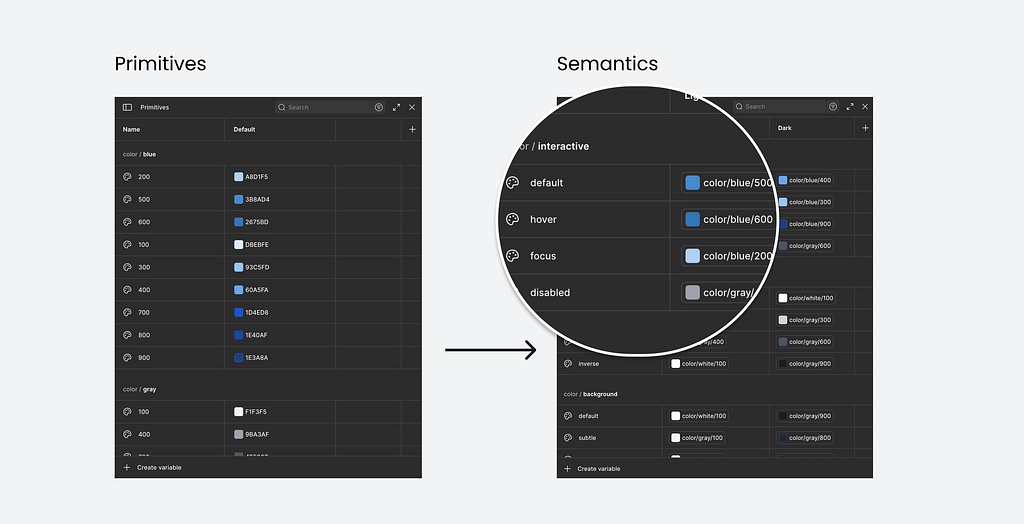
Primitives are your raw values.
blue/500 = #3B8BD4. Your colour palette, your spacing scale, your type sizes. Set these once and never apply them directly to a component. In Figma, hide them from the properties panel via the collection settings so nobody accidentally uses them. They remain available for your semantic tokens to reference. Technically, you can skip this layer if your system is very small and stable. What matters is what comes next.
Semantic tokens describe intent, not appearance. color/interactive/default. color/interactive/hover. color/interactive/disabled. This is the layer an agent reads to understand what a colour means rather than what it is. If your brand blue changes to teal tomorrow, the semantic token still says “interactive default” and nothing downstream breaks. This is the non-negotiable layer. Without it, the agent guesses, usually wrong in ways that are hard to spot until something ships.
Component tokens are optional.
button/background/default referencing color/interactive/default. Worth it for complex systems or multi-brand work. Skip them if you are just getting started.
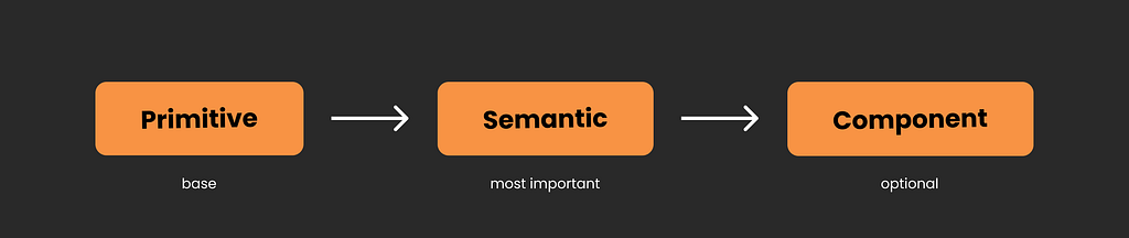
How many collections you have does not matter. What matters is that the semantic layer exists and carries clear intent.
One thing to know about naming. In Figma Variables, you use forward slashes: color/interactive/default. In code the convention is typically dots: color.interactive.default. Same intent, different syntax, and the names get transformed as tokens travel through a pipeline. Agree on the semantic structure with your developer before you build anything. Naming is genuinely one of the hardest problems in a design system, so do not expect this to be a quick coffee chat. Retrofitting it later is exactly as painful as it sounds.
2. Match your component properties to code props. Exactly.
In Figma, you have four types of component properties. Each one maps directly to a prop in code.
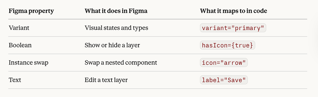
The problem is when the names do not match. If your Figma button has a property called “Style” with values “Filled” and “Outlined”, but the code component has a prop called variant with values primary and secondary, nothing maps cleanly. Code Connect cannot link them and the agent guesses.
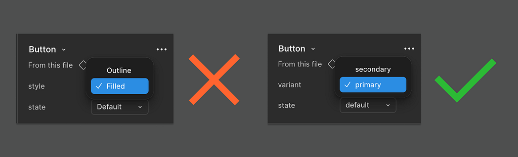
The fix is one conversation before you build anything. Agree on property names and values with your developer. Use them on both sides. Same capitalisation, same spelling. It sounds trivial. The rework it prevents is not.
Component names must be in PascalCase and match the code component name exactly. Not “Card — Product” or “product card (new)” or “Product Card v2 FINAL”. ProductCard. One character difference and the automated mapping fails.
Add descriptions to your components. Figma lets you add a description to every component and the Figma MCP reads them and passes them to the agent as context. “Five-point star used for ratings. Supports filled, empty, and half states. Interactive by default.” gives the agent vastly more to work with than a component with no description. This is a small thing that makes a significant difference.
A personal note from teaching this. Do not try to set up all four property types at once if this is new territory. I have watched teams freeze at this point and build nothing. Start with variants. They are visual, familiar, and cover most of what you need. The rest comes later, when you hit the specific problem it solves. A small system your team actually uses beats a complete one nobody touches. And for an agent, a clean, small system is far more readable than a large, messy one.
3. Design every state. Every single one.
Hover, focus, active, disabled, error, empty, loading, skeleton.
If you have not worked with Storybook, a story is the code equivalent of a variant on your Figma canvas. One state, rendered live in a browser, with its props defined. A Button might have a Primary story, a Disabled story, a Loading story. Exactly like your Figma variants, except alive and testable. That is what the Storybook MCP reads. Your Figma file gives the agent design context. The stories give it a behavioural context. Both matter.
If your Star component only has a default story, the agent thinks that is the only state it has. It will compose a rating box that cannot be interacted with, cannot show empty, cannot show an error. Not because the agent is bad at its job. Because you did not tell it those states exist.

Which property for which state:
Variants for states that change visual appearance. Default, hover, focus, disabled, error. Each variant becomes its own story. One variant, one story.
Booleans for things simply on or off. Has icon, show label. Booleans only control layer visibility in Figma. If the icon changes the button padding, that is a variant.
Instance swap for slotted elements. The icon inside a button, the avatar inside a card. Swap without detaching.
The multidimensional problem. Three sizes, three variants, three states, optional icon. That is 54 combinations as a full variant set. Nobody builds that. Use variants for the dimensions that change visually, booleans for the optional parts. Your developer is making the same compromise.
The gap Figma does not warn you about. Figma allows gaps in your variant matrix. Code does not. Agree on which combinations are real before you build and document the ones that are not.
A note for developers, from the bottom of my heart.
Sit down with the design team before anything is built. Props are the single most confusing thing for designers, right after auto layout. What is obvious to you is genuinely disorienting to us. The reverse is also true: ask a designer to cut their type scale and prepare to hear about visual hierarchy, reading rhythm, and at least one Swiss typographer. We are all experts in our own foreign language. Agree on prop names before anyone opens Figma or writes a line of code. Twenty uncomfortable minutes, weeks saved.
4. Slots. Brand new. Already essential.
Figma shipped slots in open beta on 5 March 2026.
A slot is a defined drop zone inside a component. A card where you can swap the image, the title, the footer button, without detaching. Detaching is what happens when a component does not do what you need so you break it open and edit it directly. It feels like a win in the moment. It is a maintenance disaster forever, because the component is now disconnected from the design system and nobody, including the agent, can reason about its structure.

Slots give you the flexibility without the chaos. In Figma, a slot appears as a pink-bordered area inside a component instance. General slots are open areas for any content. Named slots are specific drop zones: a header area, a footer area, a leading visual. You can have both in the same component.
In code this has always existed:
<ReviewCard>
  <Avatar />        // dropped into the leading slot
  <StarRating />    // dropped into the rating slot
  <ReviewText />    // dropped into the body slot
</ReviewCard>
The card holds the layout. What goes inside is whoever uses it’s responsibility. A component with named slots tells an agent exactly what goes where. A detached frame with “Frame 247” in the layers tells it nothing.
For a proper deep dive, Nathan Curtis wrote the definitive piece on slots in design systems. Worth bookmarking.
5. Use auto layout properly. Every component.
Auto layout is not just a layout convenience. The Figma MCP reads it and converts it directly to CSS. Horizontal and vertical auto layout maps to Flexbox (approximately). The newer Grid mode, introduced at Config 2025, maps to CSS Grid (also a bit more sort of). Understanding what those mean for you as a designer is worth your time, and if you are up for one more long articles, I wrote a guide on exactly that: Figma’s new grid, you must understand CSS Grid as a designer.
A frame with auto layout and token-based spacing is a description. A frame with manually placed elements and hardcoded values is a picture.
Spacing in variables. Every gap and padding should reference a spacing token and hence be stored in variables. For most systems, your primitive spacing scale is enough: space/4 = 16px applied directly to a gap is already meaningful and consistent. Semantic spacing layer names like space/component/padding-x are worth adding when your system is large enough to need that level of control.
Sizing should be intentional. fill, hug, or fixed. Never left on whatever Figma defaulted to when you dragged a frame onto the canvas.
Layer names matter too. The Figma MCP reads layer names to understand what it is working with. CardContainer, ProductImage, CTA_Button tell the agent something. Frame 247 and Rectangle 3 tell it nothing. Name every layer that corresponds to a structural element semantically. Figma has an AI rename feature in the actions panel worth trying. I have not tested it thoroughly enough to fully vouch for it, but worth a go, seemed pretty solid.

And your page structure matters. Name your Figma pages so the file is navigable by someone who has never opened it, because that someone is increasingly an agent. “Page 1”, “New Page”, and “Copy of Exploration” are not page names. They are evidence of a deadline.
6. Code Connect. You need it, but you don’t need to master it.
You do not set this up yourself but you need to know it exists because without it, everything in this file setup only goes halfway.
Code Connect is the explicit mapping between your Figma component and its code counterpart. It is not specific to Storybook. Any agent reading your design system through the Figma MCP needs it to understand which Figma component corresponds to which component in your codebase. Without it, the agent knows your Button exists in Figma but has no idea it is the same Button your developers already built. It generates a new one from scratch every single time. Figma’s own documentation puts it plainly: Code Connect is the number one way to get consistent component reuse in code. Without it, the model is guessing.
It only works cleanly if your Figma component names and property names match the code exactly. Which is why everything in sections 1 through 5 matters. The file setup is the foundation. Code Connect is what connects it to the machine.
Note: What the file setup doesn’t solve yet.
Variables travel cleanly to code, Styles don’t. Your typography style holds all the right values, bound to the right variables, but there is no automatic CSS class on the other side. That mapping is a naming convention between you and your developer, not a technical link. Code Connect does not cover it if you haven’t explicitly agreed that heading/xl in Figma equals .heading-xl in CSS. Same problem with gradients and effects. The variable layer is solid but the style itself has no automatic counterpart in code. Tools like Tokens Studio and Style Dictionary exist to help close that gap, transforming your tokens into CSS classes automatically, but the pipeline still needs setting up.
These are early days and the tooling will catch up for sure. A clean file means you are ready when it does. The naming, the states, the tokens, the auto layout, all of it still makes the agent dramatically more accurate.
Just don’t mistake a clean file for a complete pipeline yet.
A note for anyone who has ever had to justify design system investment.
For years, making the case for a well-structured design system was frustratingly hard. The value was real but diffuse. That is changing now for sure, as agent performance is a measurable signal. A well-structured system produces faster, cheaper, more accurate output. A poorly structured one produces guesswork that costs more to fix than it saved to generate. . The session covers this directly around the 1:01 mark: Storybook is already benchmarking with real metrics, speed, token cost, and code conformity.
For the first time, design system quality will have a number attached to it.
But the metrics only remain strong if the upstream creative work is protected. The agent works from a vocabulary a designer built. The richer the vocabulary, the better everything the agent touches. This is not an argument against efficiency. It is an argument for investing in what makes efficiency worth having.
Where we actually are.
The full loop is real and it works. Uber published a detailed account this month of using AI agents and the open source Figma Console MCP (if you don’t know it, check it out, such good work!) by TJ Pitre from Southleft to generate complete component specs in minutes instead of weeks. Different angle to the Storybook demo, same underlying argument: the better your design system is structured, the more an agent can do with it. At that scale, it makes total sense. For most teams? There is still a long way to go.
The open questions.
Where does visual truth live? Once an agent composes a new component, where does it go? Who sees it before it ships? Tests tell you if it works. They do not tell you if it looks right, feels like the brand, or holds up next to everything else on the page. The loop closes for developers when tests pass. It does not close for designers at all. That workflow gap is real and unresolved.
How does a designer communicate visual intent to a machine? Component descriptions help. Naming conventions help. But a brand’s visual language, the specific weight of a shadow, the rhythm of a type scale, the feeling of breathing room in a layout, none of that lives cleanly in a token file. We are still figuring out how much of that can be encoded and how much will always require a human in the room.
Who governs what the agent generates?
Design systems drift even when humans are maintaining them carefully. Agents accelerate that drift. They generate new things faster than teams can review them. Someone has to own the quality of what ships, and right now that responsibility is genuinely unclear.
Who is this actually for right now? Every working implementation I have seen is enterprise: enterprise demos, enterprise teams, enterprise pricing. My heart is with the two-person startup, the solo founder (like myself), the team in an emerging market, with the vision but not the infrastructure budget. The moment this tooling simplifies enough, the advantage shifts dramatically for exactly those people. Nobody seems to be designing towards that yet. That feels like a missed opportunity worth naming.
Who unlocks the tooling and wins the race? Will agentic tooling meet designers where they think, or will designers have to migrate to code environments (again)?
The tool managing to bring design, code, and agentic AI into the same space does not just win a category. It defines how the next generation of products gets made.
Nobody seems to be building toward it yet. That feels like the biggest opportunity on the table.
Point carefully
The agent assembles. It does not wonder.
It does not ask whether this component should exist, whether the shadow feels too heavy, whether the space between elements communicates ease or anxiety. It takes what it is given and builds from it, faithfully and fast.
That is not a limitation. That is the deal. And it is a good deal, if the person doing the giving has actually thought.
The risk is not that AI replaces designers. The risk is subtler: that the pull toward assembly gradually replaces the conditions that make assembly worth anything.
That we get very good at efficiently naming things and end up with nothing to say.
The designer’s job has always been to hold the whole thing in mind before any of it exists. That has not changed. If anything, the stakes just got higher.
The machine is fast. It will go exactly where you point it. Point carefully.
Who is Christine Vallaure, the author
Christine Vallaure. UI designer, speaker, founder of the learning platform moonlearning.io and author of theSolo, a book about independent product building. I teach UI design, Figma, and product to the people who want to understand what is actually going on under the hood.
Online courses, team training, conference talks. If any of that is useful to you, come find me.
Currently building a course on agentic AI for designers. Sign to my newsletter if you want to know when it lands.
Constitutionally incapable of writing a short article.
Agentic AI, design systems & Figma: a practical guide was originally published in UX Collective on Medium, where people are continuing the conversation by highlighting and responding to this story.