An accessibility-focused evolution of Inter that blends modern geometry with hyperlegible design principles.

I’ve used Inter for years. It’s been my default across dozens of projects and, in my opinion, represents the best of open-source typography. Its clean geometry, strong engineering, and consistent rhythm have made it a staple of modern design systems. Over time, especially while working on accessibility-focused products, I began noticing small limitations. Certain glyphs blurred together at smaller sizes, some bowls felt tight in low-vision contexts, and characters like I, l, and 1 weren’t distinct enough for readers who rely on extra clarity. None of this diminished my respect for Inter, it simply highlighted areas where accessibility could be improved.
Because of these legibility challenges, when I started doing product work for Loud + Clear, an app designed for people with Parkinson’s, I turned to Atkinson Hyperlegible. It’s one of the most thoughtfully designed accessibility fonts available, with radically open forms and unmistakable glyph shapes that prioritize clarity. For low-vision users, it excels.
But I missed Inter’s visual aesthetic, its modern geometry, contemporary rhythm, and the familiarity designers expect in UI typography. I admired Atkinson’s readability and Inter’s overall look, and kept wishing there were a way to bring the strengths of both into a single design.
Hyperlegible Sans is the result. It’s an open-source fork of Inter that preserves its modern character while incorporating hyperlegible principles inspired by Atkinson. It isn’t meant to replace either font, just to offer another option, one that didn’t exist before.
What I changed (and why)
The philosophy behind Hyperlegible Sans is simple: keep the visual identity of Inter intact, but reduce ambiguity wherever it appears. That meant making targeted, deliberate adjustments rather than redrawing the font from scratch.
Here are the most impactful changes:

Capital I
I added subtle top and bottom bars. This keeps it visually aligned with Inter’s geometry while removing its similarity to lowercase l and numeral 1. Low-vision readers rely on disambiguation, and this single change dramatically improves clarity without altering the overall feel.

Lowercase l
I added a small baseline spur. This makes it unmistakable as a lowercase letter and prevents confusion with 1. It also provides more visual stability inside dense UI strings.

Zero
I added a slash. A slashed zero is simply more readable for everyone. It avoids the O/0 problem entirely, especially in interfaces that rely heavily on numeric input or one-time codes.

Capital O
I widened it slightly. Inter’s O is balanced and elegant, but too close to the zero for accessibility-first interfaces. A slightly wider form keeps its beauty while improving distinction.

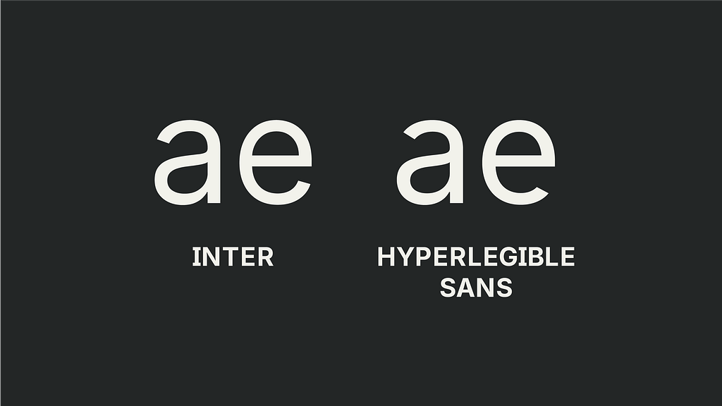
a and e
I opened both apertures. The two-storey a and the e’s crossbar were always a bit tight for low-vision readers. Opening these shapes makes them more readable at small sizes and more resistant to blur.
The Number 8
I adjusted the structure of the numeral 8 by reducing the symmetry and tightening the relationship between its upper and lower bowls. In Inter, the 8 is balanced and elegant, but at small sizes or under blur it can collapse into a dense, indistinct shape.

Rethinking spacing and kerning for accessibility
While Inter’s spacing and kerning are excellent for general-purpose design, accessibility requires a subtle shift in philosophy. Crowding can become a barrier. Certain letter combinations can merge when users read with low acuity.
I added additional kerning space to pairs that commonly collapse:
- rn, ri, rl
- fi, fl, ft, tt
- ii, ll, il, li
- la

These are small changes, but small changes can have large effects. Hyperlegibility is often achieved through a series of minor adjustments that build up to meaningful improvements in clarity.
The design belief behind this project
Accessibility shouldn’t require compromising aesthetics.
A font shouldn’t look “special” or “different” to be inclusive. Good typography should simply work for everyone.
Hyperlegible Sans reflects a belief I carry into every project: design can be both beautiful and accessible.
We don’t need to choose between modern geometry and clear letterforms. We can have both.
Design is full of these false choices, and part of the work is expanding the range of tools available so designers can choose what best fits their intentions.
What’s next for Hyperlegible Sans
This is only version 1. The roadmap includes:
- additional weights
- a full variable font
- expanded punctuation
- broader language support
- refinements for dark mode and low-contrast environments
And like Inter, this project is open-source. I’m uploading the complete files to GitHub, along with documentation on the changes and a roadmap for future versions.
My hope is simple: that this font becomes another tool in the accessibility toolkit. Something UI designers, developers, and product teams can reach for when they need both clarity and beauty, when they want typography that reflects how modern design should work.
Not less beautiful. Not more clinical. Just clearer, easier, more humane.
View “Hyperlegible Sans” on Github

Hyperlegible Sans: a free, open-source font for accessible design was originally published in UX Collective on Medium, where people are continuing the conversation by highlighting and responding to this story.