A practical way to evaluate what to fix next.

Disclaimer: Some visuals in this article are AI-generated. I’m using them only to help explain the ideas more clearly. These visuals are not intended for commercial use, and I’m not monetizing this article. If any visual resembles an existing work, it’s unintentional , please reach out and I will credit or remove it.
It’s Saturday afternoon.
The park is packed, but something feels… off.
The entrance queue is long and chaotic. Some visitors argue with staff because they “already bought tickets,” but the scan keeps failing. A few families give up and leave before they even step inside.
Inside the park, the crowd gathers in one area, one “ride” that everyone seems to know. Meanwhile, several other attractions sit quiet, almost empty. Not because they’re bad, but because visitors can’t find them. The signage is confusing, the map is overwhelming, and the routes don’t feel intuitive.
At the souvenir shop, sales are down. The operators swear the merchandise is fine. The finance team wonders if prices are wrong. The product team thinks maybe the park needs “a new ride.”
And then the feedback booth opens:
- “It’s too hard to get in.”
- “I didn’t know where to go.”
- “I got tired quickly.”
- “It wasn’t worth it today.”
Here’s the uncomfortable truth: the park isn’t failing because it lacks rides. It’s failing because the team doesn’t share a reliable way to evaluate what to fix next.
That’s why I love this metaphor: Your product is a theme park. And evaluation is renovation planning.
Not “shipping more features.”
Not “adding more content.”
Not “guessing based on the loudest voice in the room.”
Renovation planning.
The mapping: if the metaphor is true, what is what?
Once you accept the “theme park” frame, you stop seeing your product as a list of features, and start seeing it as a place people visit.
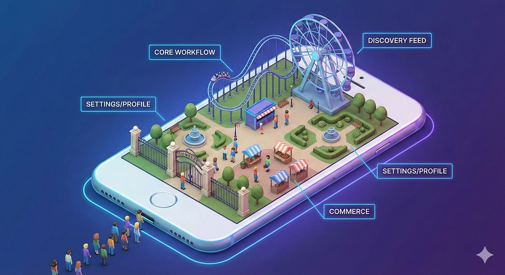
Here’s the simplest mapping:
- Visitor = your user / audience
They come with expectations, emotions, and limited time. - Access = your entry points
Landing pages, SEO/social entry, app open, onboarding, login, paywall moments, notifications — everything that determines whether they can enter smoothly. - Zones/Platforms = contexts
Home, feed, article page, video page, search, profile, commerce, chat — each is a “zone” with a promise. - Rides/Attractions = features
Recommendation modules, player, comment, follow, save, share, checkout, personalization, bundles — anything interactive that creates value. - Ticketing + footfall = growth and retention signals
Traffic, activation, frequency, DAU/WAU, returning visits. - Satisfaction kiosks = experience signals
NPS/CSAT, complaint themes, qualitative feedback, sentiment. - Souvenir shops = monetization
Ads yield, conversion, subscription, affiliate, revenue per session.
The point is to make evaluation shared. Because every team already understands parks: people arrive, walk around, try things, leave, then decide whether to come back.
Renovation is bigger than “build new rides”
Most teams default to the same move: build something new. In theme park terms, that’s like responding to complaints by saying, “Let’s add a roller coaster.” Sometimes, yes. But often the bigger wins come from renovations you don’t celebrate in a launch post.
Renovation can mean:
- Refurbish: improve UX, speed, reliability, visual clarity
- Move: change information architecture, reposition modules, reroute journeys
- Disable: remove clutter, reduce cognitive load, kill distractions
- Build new: new capabilities or new “rides” when you have clear unmet needs
- Expand: new zones/platforms/channels
- Improve accessibility: low-end devices, localization, inclusion, better defaults
A strong evaluation doesn’t just say “what to build.” It tells you what renovation pays back fastest, with least risk.
Why renovate: experience, growth, revenue
In parks, you can renovate for different reasons:
- Experience: visitors feel satisfied and safe, not confused or exhausted
- Growth: more people come, and they come more often
- Revenue: more people buy, upgrade, or convert per visit
In product, it’s the same. A simple rule helps align everyone:
If a proposal can’t clearly explain which outcome it moves (experience, growth, or revenue) — and how we’ll measure it — it’s not ready.
The evaluation method: Quant + Qual + Triangulation
This is where teams usually break. One side says: “Show me the data.” The other says: “But users said…”. A theme park can’t run on only one.
When “data says one thing” and “users say another”
Sometimes the dashboard and the interviews don’t just add nuance — they contradict each other. And when that happens, teams either (1) pick the narrative they prefer, or (2) get stuck in debate.
A stronger approach is to design evaluation so that discrepancies become useful follow-ups, not dead ends, by running simultaneous triangulation: point qualitative and quantitative methods at the same users, at the same time, around the same questions.
Quant = what happened
Tickets sold. Footfall. Queue times. Ride completion rates. Drop-offs. Revenue per visitor. In product terms:
- traffic, CTR, scroll depth, completion, retention, conversion
- funnel drop-offs (entry → explore → consume → return/pay)
- latency, errors, crashes, performance
Quant is powerful because it scales, but it can also mislead when you don’t know why.
Qual = why it happened
Observation, interviews, feedback booths, frontline notes. In product terms:
- user interviews, usability tests, session recordings
- open feedback, customer support tickets
- editorial/CS/ops insights from the front line
Qual makes the invisible visible, but it can also exaggerate if you don’t know how common it is.
Triangulation = what we trust
Triangulation is when you use quant + qual together to make “decision-grade truth.” A practical way to remember it:
- Quant without qual = confident but often wrong
- Qual without quant = convincing but not scalable
- Both together = aligned action
A tiny checklist helps:
- Do we see the same pattern in at least two sources?
- Does it hold across segments (new vs loyal, channel, device)?
- Can we locate it in a specific journey stage?
That last one matters a lot. Because evaluation isn’t only about what’s broken. It’s about where it’s broken.
Two cycles: open up wide, then narrow down twice
In renovation work, the mistake isn’t “we didn’t try hard enough.” It’s usually “we narrowed too early.” So I like to run evaluation in two cycles:
- Cycle 1: Find the right problem
Open up (collect signals broadly), then narrow down (pinpoint the real friction in the journey). - Cycle 2: Build the right fix
Open up again (explore renovation options), then narrow down again (choose, test, and ship the best bet).
In park terms: the first cycle is understanding what’s actually ruining the day. The second cycle is renovating in a way that truly improves the day, without breaking the rest of the park. Design teams often describe this as a widely-used diverge/converge process model.
The visitor journey: where evaluation really starts
If your product is a park, then your evaluation should follow the visitor’s day.
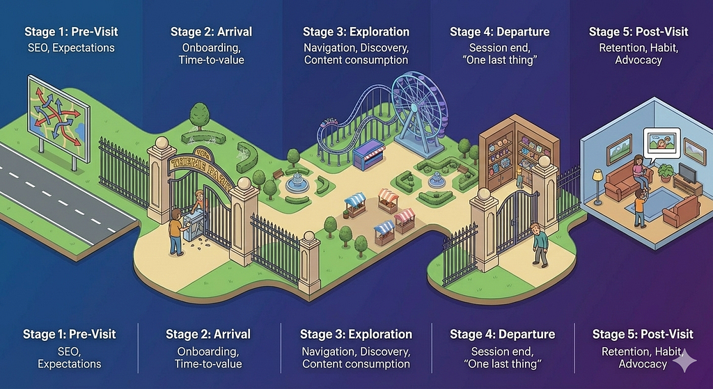
Not your org chart. Not your feature list. A simple five-stage journey is enough to organize truth:
- Pre-Visit
- Arrival
- Exploration
- Departure
- Post-Visit
And in every stage, we ask the same questions:
- What does quant show?
- What does qual reveal?
- What do we trust after triangulation?
- What renovation does it imply?
Let’s walk through it.
1) Pre-Visit: before they enter the gate
This is where your users decide whether your park is even worth visiting.
Quant signals
- acquisition mix (SEO, social, referral, direct)
- CTR from entry surfaces
- bounce rate / immediate exits
- first-time conversion rate
Qual signals
- expectation mismatch (“I thought this would be X…”)
- unclear value proposition
- credibility gaps (trust cues missing)
- wrong promise from headlines/thumbnails
Typical park symptom
People saw the billboard, but didn’t buy a ticket.
Renovation implication
Don’t touch rides yet. Fix the promise. Fix the sign. Fix the first impression.
2) Arrival: the entrance and the first 60 seconds
Some products lose users not because the core value is weak, but because the gate is painful.
Quant signals
- load speed, crash rate
- onboarding completion
- login friction and drop-off
- “time to first meaningful action”
Qual signals
- “I don’t know what to do here”
- confusing navigation
- paywall shock (“why am I blocked already?”)
- unclear next step
Typical park symptom
The gate is the problem, not the rides.
Renovation implication
Reduce friction. Make the first step obvious. Remove unnecessary checkpoints.
3) Exploration: when they roam and choose attractions
This is where your product either feels alive… or exhausting.
Quant signals
- module CTR (recommendations, related content, navigation blocks)
- scroll depth, continuation rate
- search success rate
- feature adoption (save, follow, share, comment)
- content or video completion rates
Qual signals
- “I can’t find what I want”
- “why are you showing me this?”
- “too many choices”
- visual fatigue / clutter
Typical park symptom
Crowds in one corner, dead zones everywhere else.
Renovation implication
Improve routing. Reduce noise. Make discovery feel guided, not forced.
4) Departure: how the session ends
Most teams measure the session.
Few teams truly evaluate the ending.
But the ending is what decides whether the day felt worth it.
Quant signals
- exit pages
- rage clicks, back-and-forth navigation
- session ends after friction events
- abandonment before conversion / before finishing content
Qual signals
- “I got tired quickly”
- “it’s too heavy to continue”
- “I don’t trust this”
- “I didn’t get what I came for”
Typical park symptom
Visitors leave without closure.
Renovation implication
Design satisfying endings: “one more good ride,” “save for later,” “continue tomorrow,” “wrap-up bundles.”
5) Post-Visit: return, habit, advocacy
A successful park isn’t one that’s busy today. It’s one that people plan to revisit.
Quant signals
- D1/D7 retention
- frequency and recency
- notification opt-in and re-open rate
- return from shares
- repeat conversion/subscription/transaction
Qual signals
- “I’ll come back because…”
- identity fit (“this is for people like me”)
- habit triggers (“it fits my routine”)
- trust and emotional resonance
Typical park symptom
A good day, but forgettable.
Renovation implication
Give visitors a reason to return: personalization, continuity, progress, familiarity, rituals.
The weather outside the park: add the market lens
Sometimes teams evaluate only what happens inside their product.
But parks compete.
And the world changes.
A complete evaluation adds an external lens:
- Market size and direction: is the audience expanding, shrinking, shifting?
- Competitive parks: what experience do others provide that sets new expectations?
- Audience preferences: why do visitors choose other parks?
- Trends: new “ride styles” people now consider normal (format, speed, personalization, AI, community)
- External factors: algorithm shifts, platform policy changes, distribution collapse, regulation
- Pricing/value exchange: is the ticket worth it, and do people feel respected?
A line worth remembering:
Sometimes the park didn’t change. The world did.
From insight to action: prioritization + belief narrative
By now, you’ll have many “truths.” Evaluation is not the same as a backlog. So we need a decision mechanism.
Prioritize with four factors:
- User impact (how much it improves the visitor day)
- Business impact (growth/revenue leverage)
- Confidence (triangulation strength)
- Effort & risk (time, complexity, side effects)
Then translate the chosen renovation into a shared story. This is the anti-tunnel step: it prevents sprint planning from becoming a negotiation where every micro-feature looks equally important.
The belief narrative (a template that forces clarity)

We believe (audience segment)
will (behavior change)
if we (renovation)
because (triangulated insight)
measured by (KRs across journey + outcomes).
A practical Key Results (KR) basket:
- 1 KR for the journey step metric (where the issue lives)
- 1 KR for experience quality (satisfaction / friction reduction)
- 1 KR for business impact (growth/revenue)
This is how you stop debating opinions and start debating evidence.
A mini case (to make this real)
Imagine this situation:
Revenue per session is down.
The immediate impulse is: “Increase ads,” or “Push more products,” or “Add more CTAs.”
But evaluation asks: where is the leak?
- Quant shows: sessions are shorter, and fewer people reach the conversion surfaces.
- Qual shows: “I got tired,” “too noisy,” “I can’t find what I need.”
- Triangulation says: the problem is not the shop. It’s exploration fatigue, people leave before they even arrive at the shop.
So the renovation isn’t “more selling.”
It’s:
- reduce clutter in exploration
- improve routing to relevant attractions
- design endings that invite “one more step”
- ensure the shop appears when it’s contextually welcome, not random
Same business goal. Different truth. Different fix. Better outcome.
What looked like a “missing conversion feature” was actually a visitor problem: fatigue and uncertainty that stopped them from reaching any value, commercial or editorial.
Back to Saturday afternoon
Now imagine the same park, six weeks after renovation.
The entrance is still busy, but the queue moves. The first step is clearer. People don’t argue at the gate anymore.
Inside, the map feels intuitive. The zones have identity. Visitors don’t cluster only in one corner. They discover more naturally.
The feedback booth still has complaints — because it always will.
But now the team knows how to evaluate them:
- where in the journey it happens
- what quant says
- what qual reveals
- what we trust after triangulation
- what renovation is worth doing next
That’s the real win. Not “we shipped a feature.”
But:
We respected visitors’ time and earned their return.
References
- Colette Kolenda, “Simultaneous Triangulation: Mixing User Research & Data Science Methods” (Spotify Design, July 2019).
- Alicja Suska, “Design Process Step by Step | Double Diamond Model Explained”
- Pavel Samsonov, “Stop inventing product problems; start solving customer problems”.
- Avi Siegel, “Product Tunnel Vision — When Every Feature Feels Critical (But Isn’t)”.
Your product is a theme park was originally published in UX Collective on Medium, where people are continuing the conversation by highlighting and responding to this story.