Two years ago, I thought that designing dashboards for B2B SaaS products was like going through a mental decision tree.
- Designing for execs? Use a strategic dashboard.
- Designing for analysts or subject matter experts (SMEs)? Use an analytical dashboard.
- Want to show “X” metrics? Use the “Y” type of data visualisation.
If a designer approached any problem like a decision tree, the natural response in the brain would be: SNOOZE.
That used to be my feeling about dashboards, too, because I didn’t understand the messy, layered decisions that had to be made while designing dashboards that solved real-world problems.
This article is for designers like my past self — those who think dashboards are dull or formulaic — and shows how my perspective shifted after designing multiple dashboards that worked for both users and the business.
Use this article as a checklist you can revisit throughout your design process.
TLDR;
Here’s the problem-solving approach I now take for dashboards, which, in my opinion, is no different from how I approach any other design problem.
- Get clear on the user goals, business goals, and any existing usage patterns or behavioural data to define the purpose of the dashboard
- Identify which key decisions the dashboard should support and how they would help to track the goals
- Decide on the type of dashboard, select the right KPIs, and choose the clearest way to visualise them
- Map out a layout and flow that surfaces the right insights at the right time. Then iterate on what works
- Loop in stakeholders early and often, to avoid surprise revelations that rock the foundation of your work
- Validate with users based on the goals and functionality identified in the first step, not just on the visual design
Disclaimer: While dashboards may include many metrics, this article uses ‘KPIs’ to refer to the goal-aligned, decision-making data points that should guide your design.
Now let’s dive deep into each step with real examples.
1. Get clear on the user goals, business goals, and any existing usage patterns or behavioural data to define the purpose of the dashboard
Who is using this dashboard, and what decisions are they making?
There may be different types of users of your dashboard, and their goals may vary significantly from one another.
Take a logistics company, for example:
- The CFO wants a bird’s-eye view of financial health and cost savings
- A regional operations manager needs to monitor hub performance and track SLA compliance
- A warehouse supervisor is focused on today’s shipments, delays, and staffing issues
- And a data analyst is deep-diving into patterns and inefficiencies
Now, imagine showing the same dashboard to both the CFO and the analyst. One might want summaries; the other wants drill-downs. Neither gets what they need.
Which is why it is crucial to know who your users are.
What is the business trying to achieve?
Your users might want insights, but the business is likely hoping to move the needle by reducing churn, increasing conversions, and lowering support tickets, among other goals.
I usually go straight to the product team and ask:
“How will this help our business, and what KPIs are we hoping to improve?”
For example, when I was designing a no-code, low-code form builder, I had to design a form analytics page. Our business goal was to reduce the number of incomplete job applications, and the user goal was to figure out why candidates were dropping off.
We approached the design of the analytics page such that it:
- Allowed users to apply filters and spot trends
- Included AI suggestions to surface potential fixes
- Let users explore the data deeper if needed
This way, the dashboard supported decisions that aligned with both user needs and business outcomes.

2. Identify which key decisions the dashboard should support and how they would help to track the goals
What should you measure to do right by your goals?
That’s where KPIs (Key Performance Indicators) come in. They’re the specific metrics that tell you whether your dashboard is helping move the needle.
A good KPI is:
- Directly tied to a goal
- Actionable
- Easy to interpret at a glance
I usually ask:
“How well will this data tell us about whether or not we are acheiveing our goal?”
For example, while designing an error resolution monitoring tool, our goal was to help users quickly resolve errors in job application forms to reduce expired applications. The business wanted faster resolution times, while the user wanted to know what needed urgent attention.
So, we made the number of critical and unresolved errors the initial KPIs on the dashboard. It was large and impossible to miss. Everything else followed after that.
The right KPI, when tied to a goal, can act like a lighthouse for a ship out at sea, as long as it is not being tracked for vanity.

How frequently will this dashboard be used?
After identifying the right KPIs, the next step is to determine how frequently the dashboard will be used. This affects not just which KPIs are prioritised, but also how the layout and navigation should be designed.
For example, I worked on a dashboard that was used only once every few months or even just once a year. The initial version didn’t include any KPIs. But we realised that users needed context quickly after long gaps, so we suggested surfacing top KPIs upfront.
Infrequent-use dashboards may also benefit from re-orientation cues like tooltips or brief onboarding guidance. Or letting the user know what date’s data they are seeing, the way Shopify shows it.

On the other hand, the error resolution dashboard I mentioned earlier showed real-time data and was checked at least once a week, if not more. One constraint we had to work with was that the tool could only display 7 days’ worth of data at a time. So it was crucial to show the active date range clearly in the first fold.
Frequent-use dashboards can support more advanced, power-user interactions, like allowing users to see up-to-date data with an “Auto-refresh” option, like ClickUp.
The goal of this step is to match the rhythm of the dashboard to the rhythm of the user’s workflow.

3. Decide on the type of dashboard, select the right KPIs, and choose the clearest way to visualise them
Which type of dashboard should you use?
The research you have done so far should help you identify the purpose of the dashboard, as it is closely tied to the user and business goals. Based on that purpose, you need to choose the dashboard type.
While you don’t need to label your dashboard formally, it’s useful to understand the different kinds of decisions dashboards are meant to support. Here’s a rough guide.
- Focus on long-term trends and complex data patterns that evolve over months or years
- Display high-level KPIs tied to overarching business goals and outcomes
- Help monitor strategic initiatives and assess their progress over time
- Used primarily by senior leadership, such as the C-suite and key decision-makers
- Emphasise clarity and alignment, ensuring every stakeholder can interpret the data and take action
- Prioritise insights that inform top-level decisions rather than day-to-day operations
For example, this Beehiiv dashboard lets the owner of the newsletter get a quick overview of how their newsletter is performing by showing them the number of active subscribers over the past month.

- Rely on real-time or near-real-time updates to reflect current performance
- Support immediate action by flagging anomalies, delays, or system issues
- Trigger alerts or notifications when something deviates from expected performance
- Help optimise ongoing operations, track KPIs, and identify bottlenecks
- Primarily used by subject matter experts (SMEs), frontline teams, or junior decision-makers
For example, this dashboard in ClickUp can help the design team lead identify the status of their project and the team’s productivity by showing how many tasks are unassigned, pending and completed.

- Focus on medium-term data that supports performance evaluation over weeks or months
- Offer a comprehensive overview of KPIs and dimensions to enable comparison and analysis
- Present trends, correlations, and summaries in a digestible format (often through digital reports)
- Meant for extended use — users may spend more time interacting with filters, views, or data slices
- Support strategic and tactical decision-making by surfacing meaningful patterns
- Commonly used by middle managers who bridge operational teams and executive leadership
For example, Stripe allows users to compare complex billing data between different periods to analyse it.

- Help teams track and optimise operations that contribute to broader strategic goals
- Best for monitoring ongoing projects, team output, or workflow efficiency
- Offer a focused lens on key areas, often tailored to a specific department or function
- Can be seen as zoomed-in analytical dashboards, supporting mid-term decisions
- Used by department heads, team leads, and project managers
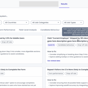
For example, this dashboard in Customer.io is specifically used to track a sign-up confirmation flow. It breaks down their journey into multiple steps and helps the user analyse each.

You don’t have to choose the type of dashboard upfront. You discover it as an outcome of understanding goals, KPIs, and frequency.
You don’t sit down saying, “I’m going to build an operational dashboard.” Instead, you say, “My user needs to resolve errors daily and take quick action.” And that naturally leads to a tactical or operational dashboard.
So the type is a byproduct, not a prerequisite.
How can you best represent the data in your dashboard?
This leads us to the burning question:
“Pie charts? Bar graph? Spider chart? Which should I use?”
There are 4 pillars of data visualisation which should help you identify them:
- Distribution to show the spread or frequency of values (e.g., How frequently do candidates drop off at each form step?)
- Relationship to show correlations between variables (e.g., Is there a link between form length and drop-off rate?)
- Comparison to compare across categories (e.g., Which departments get the highest number of complete applications?)
- Composition to show parts of a whole (e.g., How do application sources contribute to total submissions?)
The diagrams below are great references for arguing pie charts vs bar graphs in stakeholder meetings. But in practice, two factors often trump theory:
- Scalability — Will the visualisation still work if the data grows?
- Usability — Is it easy to read and interpret for your actual users?


I once used a pie chart in a data panel to break the visual monotony of a data-heavy page.
Practically, however, my users were non-tech-savvy folks in their 50s who found the interactions (hover, click, read tooltips) confusing. I switched to a simpler layout that scaled better and was easier to digest at a glance.
No framework could have helped me to take that design decision.
So the question I ask myself while choosing the dataviz is:
“If this data scales, would this dataviz scale with it?”
This question naturally leads to thinking about interactions, of which the Stripe dashboard is a really good example:
- It has tooltips for additional insights without cluttering the view
- It shows a glimpse of some data, like 6 of 25 failed payments. And the user can then view the rest by redirecting somewhere else
- Displays data freshness (when it was last updated)

How to decide where to place your KPIs on the dashboard?
The way to do this is to prioritise your metrics. Ask:
“Out of these metrics, which are the most crucial ones to be shown upfront so that they help in achieving the user goals and business goals?”
One interesting example of this is for the form analytics page I was working on, where our goal was to reduce incomplete job applications. There were a LOT of metrics which the product team wanted to show, and everything seemed important during the requirement gathering phase. So to help get a better understanding of what is important, I made a list of all the metrics we were intending to show and I asked the product team to prioritise them as high, medium and low based on 3 things:
- Impact: Does it help reduce incomplete applications?
- Actionability: Can the end user use this data to make improvements in the form?
- Clarity: Is the data easy to understand and act upon?

After getting their response, I did the same exercise, but from a design perspective. For whichever metrics we disagreed on, we discussed them and made sure that we were on the same page about the importance of each metric before I even designed one pixel in Figma.
4. Map out a layout and flow that surfaces the right insights at the right time. Then iterate on what works.
Once your KPIs and their priorities are in place, the next challenge is to bring structure to the chaos by designing a layout that surfaces the right insights at the right time, in the right order.
This step can feel overwhelming, especially when you’re staring at a blank canvas, wondering how to arrange everything. A few principles help me move forward quickly and meaningfully.
Use familiar scanning patterns to structure widgets

Eye-tracking studies show that users tend to scan top-left to bottom-right. Place high-value metrics like KPIs or charts along this visual path.
Shopify does this well by placing high-impact metrics front and centre, avoiding unnecessary scrolling.

Be mindful of the scroll and the page fold
Users shouldn’t have to scroll endlessly to find key insights, especially if your dashboard is aimed at quick monitoring or executive decisions. Dashboards like Shopify’s do this well by surfacing the most important KPIs upfront, minimising friction in scanning.

That said, scrolling isn’t always a bad thing. If the dashboard is meant for detailed exploration or analysis (like for data analysts), more information may be needed, and some scrolling can be expected.
A good practice is to show high-priority metrics above the fold, and push secondary or optional widgets below.
Giving users the ability to customise their view ensures they see what matters most to them. Monarch does with drag-and-drop widgets.

Size widgets according to content
The widgets should be placed such that there is enough breathing room for the user to consume the information. You can play around with the width of the widget based on what kind of data is being shown in it.
For instance:
- KPI tiles can be compact and grouped together
- Time-series charts may need wider space for trend visibility


Beehiiv does this well with a two-column layout that draws the eye first to the KPIs and line chart.
On the other hand, Supabase uses a uniform layout approach, offering consistency and predictability in the layout.

Consider first-time user needs
Some dashboards may also serve as a space for onboarding the user, like Binance, which uses the primary real estate for the critical setup steps. As the user completes the onboarding, these widgets may disappear to make space for more relevant data.

Prioritise by importance and logical sequence
Arrange widgets based on priority and the logic of how a user will consume them.
For example, in my form analytics page example:
- “Total fields” in the form came first, as it gave a sense of scale
- “Average fields filled per user” came next, because it was a high-priority metric
- “Unique fields refilled” came after, because it was more diagnostic
It’s not just about data hierarchy, but also data narrative.

These principles help to ensure that the dashboard layout is not limited to fitting things into grids, but about creating a logical rhythm that aligns with user goals and business priorities. The more clarity you have on what matters, the easier it becomes to design how it shows up.
If I had to sum up the principles in one sentence, it would come down to the 5 Second Rule:
“Users should be able to identify the information they are looking for within 5 seconds.”
5. Loop in stakeholders early and often, to avoid surprise revelations that rock the foundation of your work
Designing dashboards isn’t a solo mission. Looping in the right stakeholders after each major design phase helps avoid misalignment, technical blockers, or last-minute feedback that could force you to rethink your entire layout.
Here’s how cross-functional feedback has helped me in past projects:
- Clarify user journeys and business Form analytics wireframe
- Validate if the KPIs truly reflect user and business goals
- Confirm technical feasibility and data availability
- Pre-empt challenges with implementation and responsiveness
- Catch usability or accessibility issues
- Design system check
- Refine visual hierarchy and layout
- Identify over-cluttered sections or insufficient padding
The earlier you collect feedback, even if through a casual low-stakes review, the less expensive and frustrating changes become, especially when dashboards are expected to scale across teams or user roles.
6. Validate with users based on the goals and functionality identified in the first step, not just on the visual design
It’s tempting to validate a dashboard by asking, “Does this look good?” But more important is:
“Can users accomplish the tasks they came here to do?”
Visual polish doesn’t amount to much if users don’t understand what action to take next, or are unable to find a key metric, or interpret a graph incorrectly.
During validation, go back to the goals you defined in Step 1 — both user and business goals. Ask:
- Can the user find the KPI they care about quickly?
- Do they understand what the data means and what action to take?
- Can they interpret trends without needing additional explanation?
- Does this dashboard help them solve their problem or answer their key questions?
Instead of surface-level feedback like “Is this neat?”, ask task-based questions such as:
- “If you were trying to accomplish [X], where would you look first?”
- “What would you change based on this data?”
- “If a red flag appears here, do you know what it means and what to do next?”
For one task of mine, where I was designing a dashboard for internal engineers, the Product Manager and I once took quick feedback in a stand-up from the engineering director of that team, which proved helpful in rethinking the metrics we were thinking of prioritising — they simply weren’t as important as we thought they were!
While this was a very short way to get feedback in the initial stage, depending on how much time one has, there are other ways to validate your dashboard:
- Use think-aloud protocols: Ask users to narrate their thought process while using the dashboard
- Run usability tests with scripts that simulate real business questions
- Try first-click testing: where do users click first when asked a question?
- Don’t forget to test with users across different roles, devices, and data familiarity levels
Avoid these mistakes while designing a dashboard
Structuring and layout
- Designing rigid layouts for dynamic needs: Not every user needs the same information. For more complex or internal dashboards, allow users to customise widgets or rearrange the layout based on their role or goals.
- Highlighting low-priority information: Respect the user’s time. Don’t place vanity metrics or secondary details in prime spots. That space is for high-impact, high-frequency insights.
Data
- Overloading the dashboard with data: Trying to show everything at once leads to decision fatigue. Use progressive disclosure: let users explore more detailed views via filters, tabs, or drill-down links.
- Presenting data without a logical order: If the user’s eye doesn’t know where to go first, the dashboard fails its purpose. Always organise information hierarchically, show the most critical metrics first, then progressively drill down.
- Treating the dashboard like a data dump: Dashboards are not Excel spreadsheets. They are curated views to inform decisions, not mirror the backend database. Filter ruthlessly.
User context
- Omitting timestamps or updated context: Users need to trust the data. Always indicate when it was last updated, what time range it covers, and whether it is real-time or delayed
- Showing numbers without context: “14% drop-off” is just a metric. But “14% drop-off at ‘Upload Resume’ field from mobile users” tells a story. Context helps users understand what the data is saying and what to do next.
Colour usage
- Ignoring accessibility (especially colour usage): Relying only on colour to show differences (e.g., red vs. green) can alienate users with colour vision deficiencies. Use icons or labels with colour, sufficient contrast, and screen-reader-friendly text
- Jumping into visuals without solving for structure: A dashboard that looks great but doesn’t solve the right problem is still bad. Nail the user goals, KPIs, and flows before opening your Figma file
- Overusing colours: Colour should be used sparingly to indicate meaning, like change, alerts, or categories. Too many colours create noise. Stick to a limited palette and use greys or neutral tones for background data
- Showing trends without purpose: Don’t include graphs just for visual flair. If a trend doesn’t offer insight or actionability, leave it out or replace it with a better visual cue or plain number
Recap checklist
During your next dashboard project, ask yourself:
☐ Who is using this dashboard, and what decisions are they making?
☐ What is the business trying to achieve here?
☐ What should we measure to know if we’re doing right by our goals?
☐ How frequently will this dashboard be used?
☐ Which type of dashboard should I use?
☐ How do I best represent the data in my dashboard?
☐ How do I decide where to place these metrics on the dashboard?
☐ Is my layout and structure usable and scalable?
☐ Would the users be able to identify the information they are looking for within 5 seconds?
☐ Are my stakeholders onboard with this dashboard?
☐ Can users accomplish the tasks they came here for?
And don’t forget to iterate, iterate, and iterate.
References:
- From Good To Great In Dashboard Design: Research, Decluttering And Data Viz
- 10 rules for better dashboard design
- Three types of Dashboards
- Presenting Your Data
- Mobbin for product inspiration
- Dashboard Design UX Patterns
- What are KPI dashboards?
- 4 pillars of data visualization: distribution, relationship, composition, comparison
- Top 30 Best Dashboard UI/UX Design Principles You Must Know in 2025
- Interaction Design Foundation (IxDF) — Design Thinking
- What is the UX Design Process? 5 Steps to Success
- Why and how to make a decision tree
- 4 Types of Dashboards: Operational, Analytical, Strategic & Tactical
6 steps to design thoughtful dashboards for B2B SaaS products was originally published in UX Collective on Medium, where people are continuing the conversation by highlighting and responding to this story.