
Ratio, efficiency, shape & language support.
I conducted research to introduce and compare several commonly used UI font metrics, highlighting their pros and cons. This analysis may help you define the most suitable font to meet the product’s needs.
The key metrics I examined include x-height ratio, top-to-bottom leading ratio, spatial efficiency, shape, number and multi-language support.
x-height ratio
Before discussing x-height ratio, it’s important to first understand the concepts of visual arc.
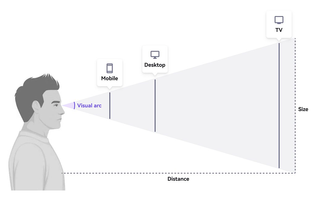
Visual arc refers to the angular size of an object based on its distance and size. In typography, this concept helps determine how easily text can be read at different sizes and distances — the smaller the visual arc, the harder it is to perceive fine details.
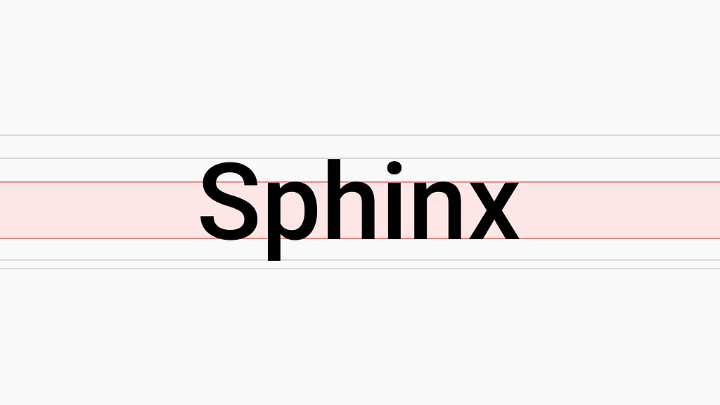
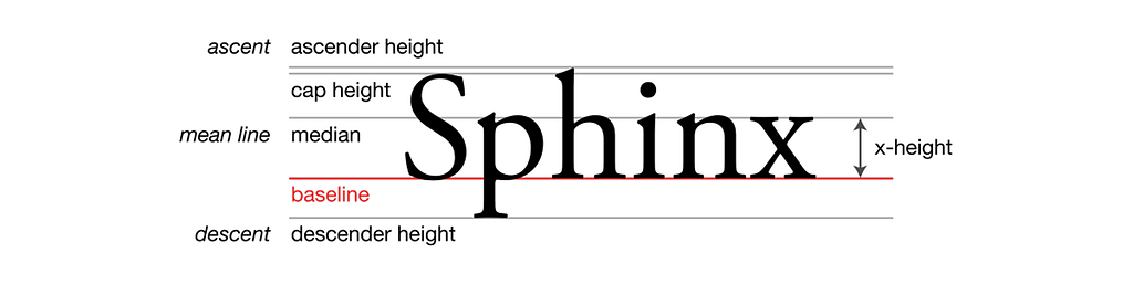
X-height is the height of the lowercase letters in a typeface, measured from the baseline to the top of characters like “x,” excluding ascenders and descenders. Typefaces with a relatively high x-height tend to appear larger at the same point size, which significantly enhances legibility, particularly on screens and digital interfaces. This is why many modern, screen-optimized fonts feature a higher x-height.
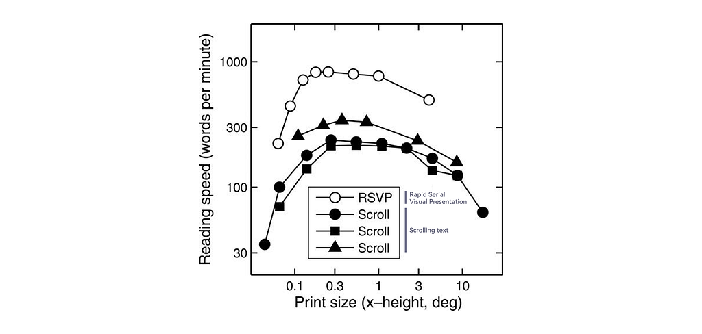
To evaluate a font’s minimum readable size, we need to consider both the viewing distance and the size of the font’s characters. Research from imarc suggests that an optimal x-height falls around 0.3° of visual arc. Beyond this point, reading speed tends to decline. The lower threshold for readability is approximately 0.2°.
A useful tool for assessing this is the x-height Readability Calculator, where you can input values such as font size, x-height, screen resolution, and viewing distance to calculate the visual arc and evaluate readability.
The product I worked on is primarily designed for mobile devices, so I used 167 ppi, as it’s the reference scale many mobile browsers use to map CSS pixels to physical pixels. Viewing distance can vary — for example, when sitting and browsing, it’s typically around 12–14 inches, whereas lying down (such as in bed) often brings the device closer, around 25–30 cm (10–12 inches). Therefore, I tested both 14 inches (as a general distance) and 10 inches (for closer viewing). I tested font sizes at 16px(=12pt) and 12px(=9pt), as these represent the common maximum and minimum body text sizes in UI design. Below are the minimum x-height ratios I tested:
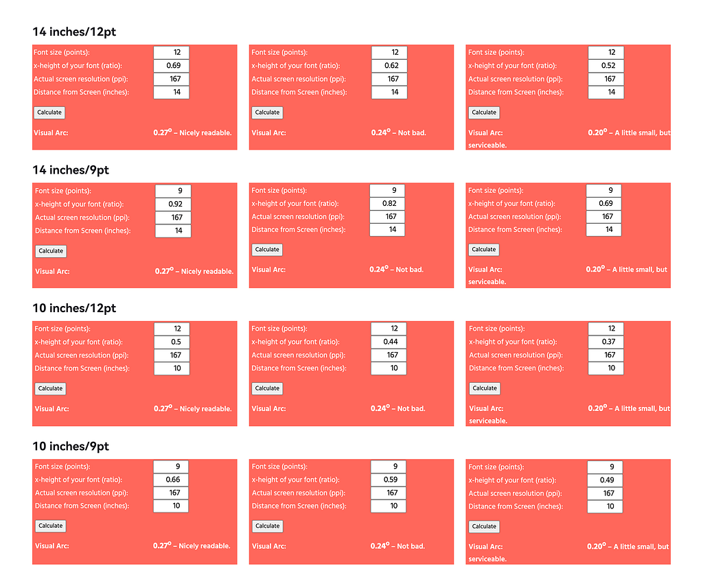
- 14 inches/12pt: Minimum x-height ratio = 52%
- 14 inches/9pt: Minimum x-height ratio = 69%
- 10 inches/12pt: Minimum x-height ratio = 37%
- 10 inches/9pt: Minimum x-height ratio = 49%
Below are several common fonts I evaluated by calculating their x-height values using the x-height calculator.
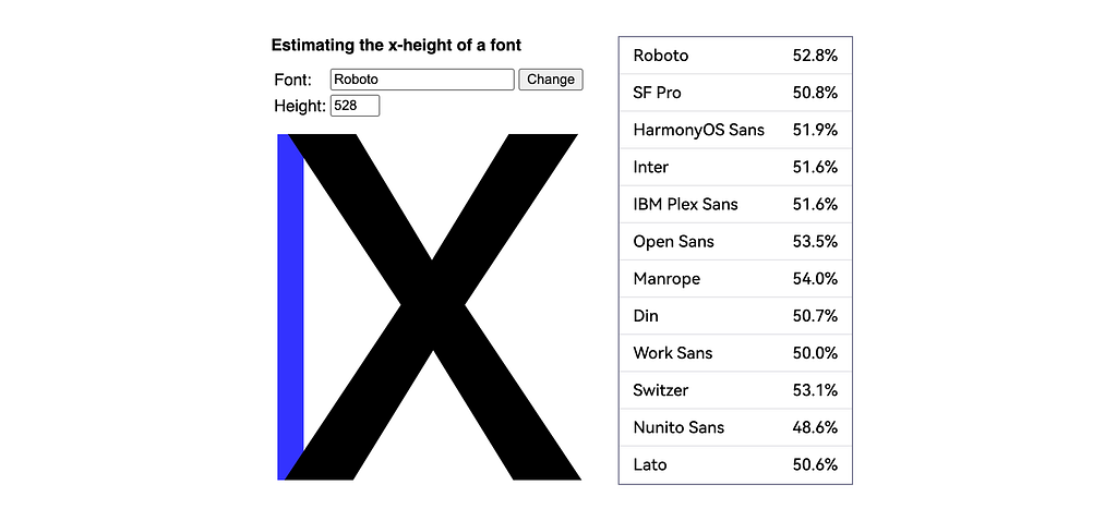
While a higher x-height improves readability on smaller screens, it doesn’t mean that bigger is always better. Once the x-height exceeds a certain threshold, the text can actually become harder to read, and the typeface’s overall character or personality may also be affected.
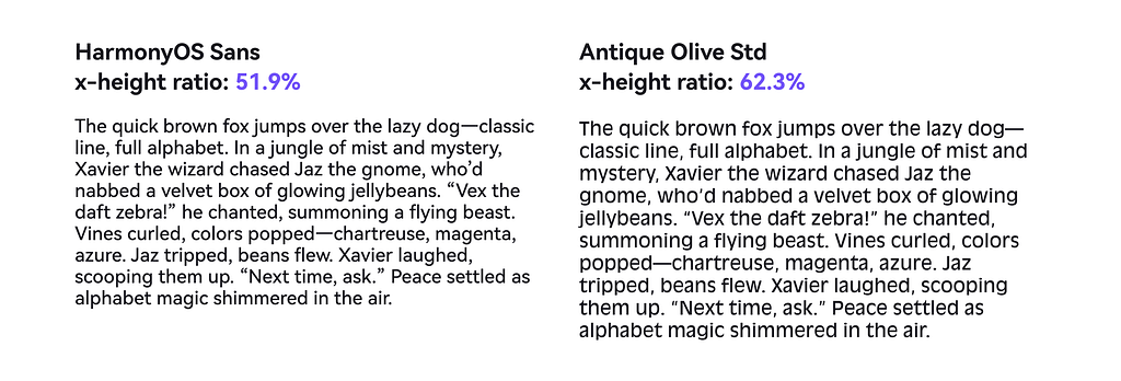
Although the minimum x-height ratio for legibility on mobile screens at typical viewing distances is above 69%, this benchmark is somewhat unrealistic. Most fonts do not have such a high x-height, and pushing for this ratio can actually reduce readability by making the text feel cramped or unnatural.
Based on this, I’ve established a standard that a minimum x-height ratio above 49% helps maintain legibility at closer viewing distances. Ideally, aiming for above 52% provides a better balance — making larger body text more comfortable to read at typical distances on mobile screens.
Top-to-bottom leading ratio
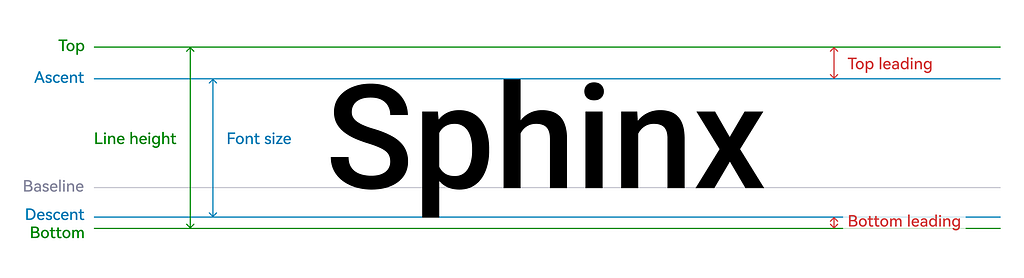
The leading here refers to the vertical space between the font size and the line height — specifically, from the top of the line height to the ascent, and from the bottom of the line height to the descent. Refer to top leading and bottom leading in the image below.
I tested Open Sans and SF Pro at 16px, center-aligned within a 24px-high container, and measured their top-to-bottom leading ratios:
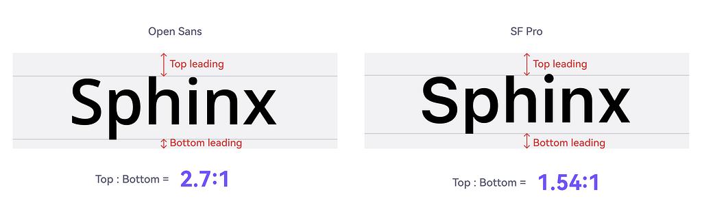
- Open Sans: 2.7:1
- SF Pro: 1.54:1
These ratios impact how text sits within a container — like in tags or badges. Typically, the top leading is larger than the bottom. However, a smaller ratio tends to create more balanced vertical spacing, making the text feel more visually centered and stable.
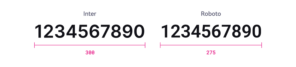
Spatial Efficiency
When displaying content in a UI using the same font size and line height, different fonts occupy different amounts of horizontal space. In the image below, the same content is shown using three fonts: Roboto, HarmonyOS Sans, and Work Sans. Roboto takes up the least horizontal space, followed by HarmonyOS Sans, while Work Sans occupies the most.
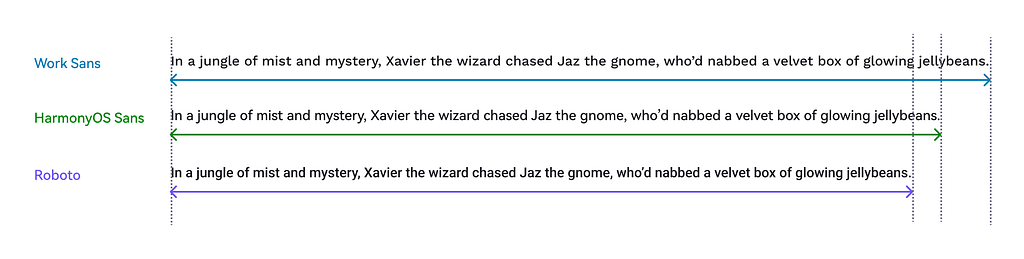
With the same line height and content, a font that uses less horizontal space is more efficient — it enables more information to fit within the same layout. However, spatial efficiency can also be affected by adjustments to letter spacing.
Shape
Character Differentiation
Distinct letterforms improve legibility by making it easier to differentiate between similar characters, such as “0” (zero) and “O” (uppercase o), or “I” (uppercase i), “l” (lowercase L), and “1” (one). Clear distinctions between letterforms reduce confusion.

Open Letter Shapes
For example, when the ends of the letter “c” are more open and separated, the shape appears lighter and more minimal. Open letterforms generally create a cleaner, more approachable visual impression.
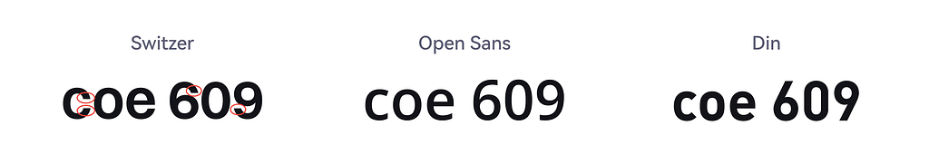
Currency Symbols
The design of currency symbols, like the dollar sign ($), can vary. Some fonts include a vertical line through the “S”, while others do not. While stylistic preferences play a role, using standardized and easily recognizable symbols contributes to a more user-friendly and intuitive reading experience.

Number
Numbers play a crucial role in interfaces — especially in financial, technical, and data-driven products. Typography choices directly impact how clearly and consistently numerical data is displayed.
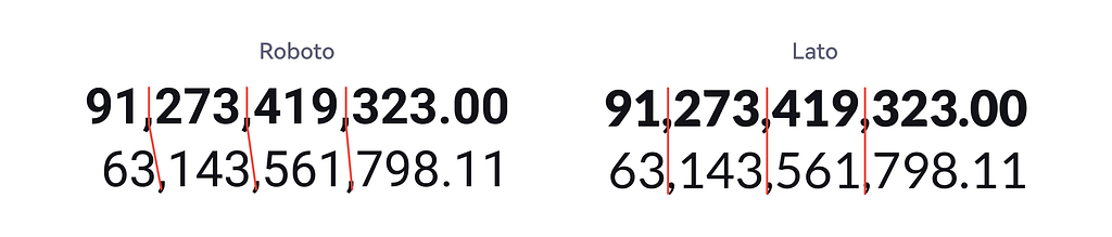
Monospaced numbers
Monospaced numbers have a uniform width, allowing them to align vertically in tables, forms, and dashboards. This improves readability and supports clear data comparison. Some typefaces offer monospaced numbers by default, while others provide a dedicated font or style variant specifically for monospaced numerals. In some cases, designers choose a separate typeface for numbers to ensure alignment.
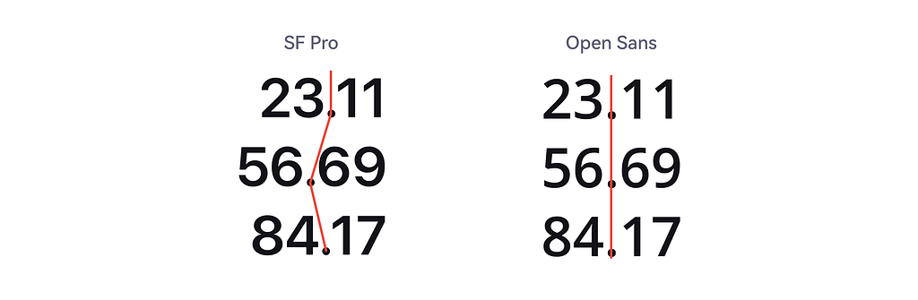
Consistent width across weights
Some fonts maintain monospaced numeral width across different font weights — light, regular, bold, etc. — ensuring visual alignment even when emphasizing certain values. This is especially helpful in tables or financial summaries where totals are bolded but must remain in line with other figures.
Number length
Shorter numeral lengths make more efficient use of space, allowing more digits to be displayed within the same horizontal area. This is especially valuable in data-dense layouts, such as tables, dashboards, or mobile screens, where space is limited and clarity is essential.
Multilingual support
Different fonts support different scripts and character sets, so it’s essential to identify the language systems your product requires before selecting a typeface. Tools like a charset checker can help you verify which characters are supported.
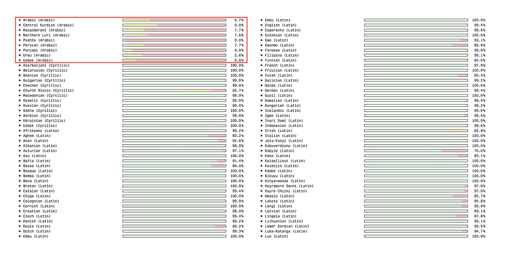
For example, I tested the Open Sans font for Latin, Cyrillic, and Arabic scripts. As shown in the image below, green indicates supported punctuation, yellow represents auxiliary characters, and red highlights required characters that are not supported. Based on this analysis, Open Sans provides strong support for Latin and Cyrillic, but lacks coverage for Arabic.
In my experience, it’s rare to find a single font that supports all writing systems. This is often due to the size limitations of font files — especially for scripts like Chinese, which require thousands of characters. As a result, products that support multiple languages typically use different fonts tailored to specific scripts, such as separate fonts for Arabic and Chinese.
The metrics discussed above focus primarily on objective, rational criteria. However, it’s also important to consider more subjective aspects, such as brand identity and user preferences. I hope this article provides useful insights to help you make more informed decisions when selecting a font.
References
- https://www.imarc.com/blog/best-font-size-for-any-device
- https://en.wikipedia.org/wiki/X-height
- https://en.wikipedia.org/wiki/X-height
- https://www.gate39media.com/design-spotlight-fonts-in-financial-services/
- https://www.myfonts.com/pages/fontscom-learning-fontology-level-1-type-anatomy-x-height
How to be strategic when picking a typeface was originally published in UX Collective on Medium, where people are continuing the conversation by highlighting and responding to this story.